A Killer Fix for Scrunched Axes, Step-by-step
Large-magnitude outliers, tiny features, and sharp spikes are common frustrations to data visualization. All three can make visual details illegible by scrunching plot components into too small an area.
Sometimes a fix can be had by simply excluding unruly data. When including such data is chief to a question at hand, applying a log scale to axes can realign spacing for better separation among lower magnitude data. This approach can only go so far, however.
In this article, we'll take a look at another option: zoom plots, which augment a visualization with panels providing magnified views of areas of interest.

Zoom plots are commonly arranged as inserts into the main plot, but can also be combined as a lattice with the original plot. We'll delve into both.
This article provides a code-oriented tutorial on how to use matplotlib with specialized tools from the outset library to construct zoom plots. We'll build a visualization of rainfall data from Texas made available by Evett et al. via the USDA. This data set comprises a full year of rain gauge readings from two nearby sites, taken at 15 minute intervals.
The short duration of rain events and extreme intensity of the heaviest rainfall complicates matters. Throwing a month's worth of Evett et al.'s rainfall data into a simple line plot of reveals the visualization problem we're up against.
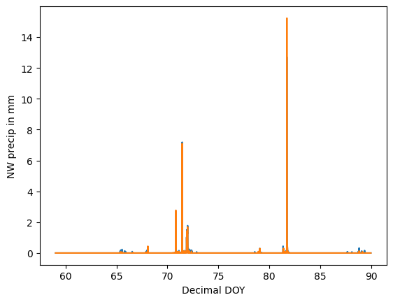
We've certainly got some work to do to nice this up! In our visualization, we'll focus on recovering three particular components of the data.
- the little shower around day 72,
- the big rainstorm around day 82, and
- light precipitation events over the course of the entire month.
To better show these details, we'll create a zoom panel for each.
Our plan is laid out, so let's get into the code
