An Alternative Approach to Visualizing Feature Relationships in Large Datasets

The easiest way to understand relationships between data features is by visualizing them. In the case of numeric features, this usually means producing a scatterplot.
This is fine if the number of points is small, but for large datasets, the problem of overlapping observations appears. This can be partially mitigated for medium-sized datasets by making the points semi-transparent, but for very large datasets, even this doesn't help.
What to do then? I will show you an alternative approach using the publicly available Spotify dataset from Kaggle.
The dataset contains audio features of 114000 Spotify tracks, such as danceability, tempo, duration, speechiness, … As an example for this post, I will examine the relationship between danceability and all other features.
Let's first import the dataset and tidy it up a bit.
#load the required packages
library(dplyr)
library(tidyr)
library(ggplot2)
library(ggthemes)
library(readr)
library(stringr)

#load and tidy the data
spotify <- readr::read_csv('spotify_songs.csv') %>%
  select(-1) %>%
  mutate(duration_min = duration_ms/60000,
         track_genre = as.factor(track_genre)) %>%
  mutate(across(c(2:4, 20), toupper)) %>%
  relocate(duration_min, .before = duration_ms) %>%
  select(-duration_ms)
❔The issue
As I mentioned previously, the simplest way to visualize two-variable relationships is by drawing scatterplots with each point representing a single song. The first four columns contain track id information, so I left them out. I also renamed the features so that the first letter is uppercase and then reshape the data to prepare it for plotting.
spotify %>%
  select(5:19) %>%
  mutate(across(everything(), as.numeric)) %>%
  rename_with(str_to_title) %>% #capitalize first letters of feature names
  rename("Duration (min)" = Duration_min,
         "Loudness (dB)" = Loudness,
         "Time Signature" = Time_signature) %>%
  pivot_longer(-Danceability, names_to = "parameter", values_to = "value") %>%
  ggplot(aes(value, Danceability)) +
  geom_point(col = "#00BFC4", alpha = 0.5) + #reduce point opacity with the alpha argument
  facet_wrap(~ parameter, scales = "free_x") +
  labs(x = "", y = "Danceability") +
  theme_few() +
  theme(text = element_text(size = 20))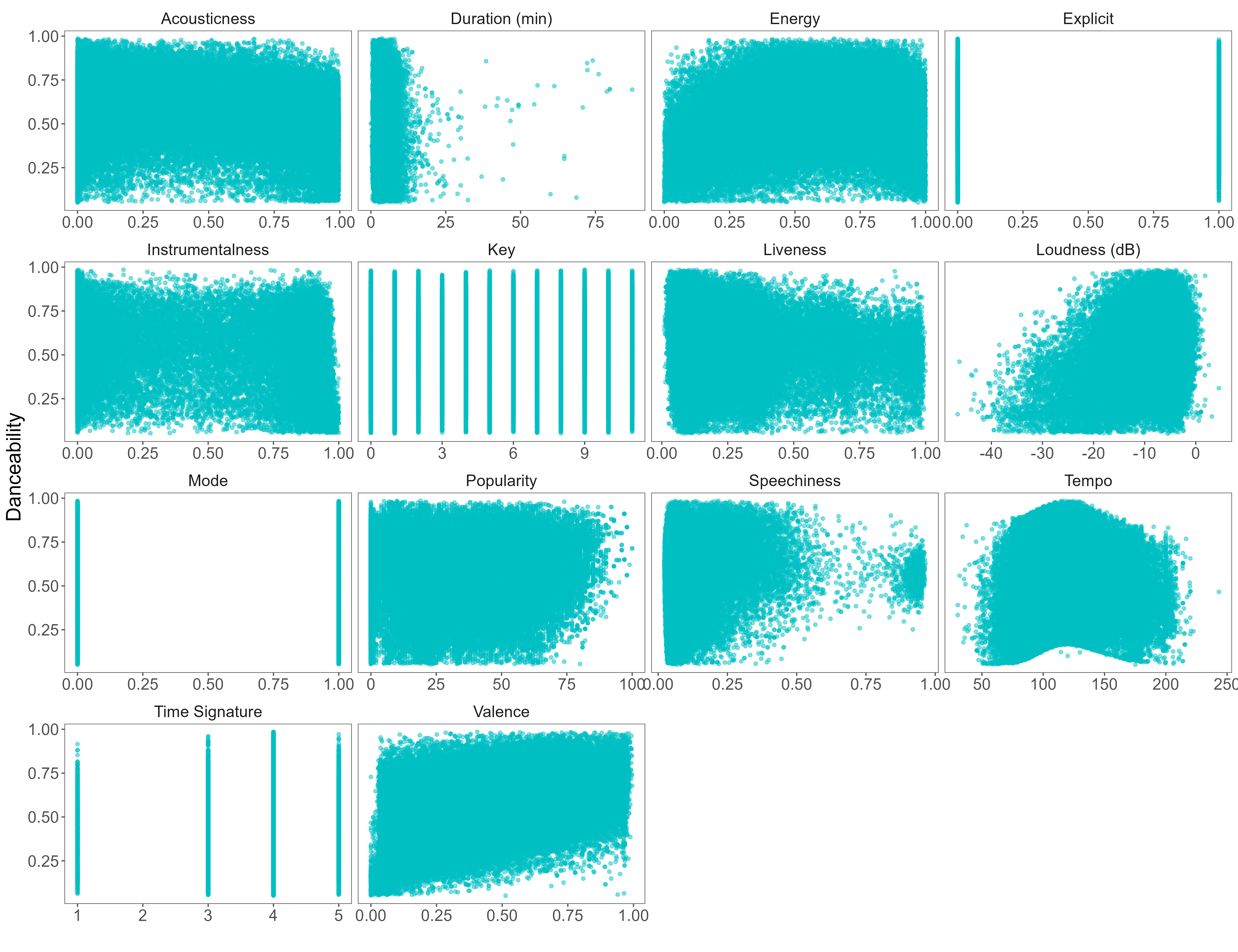
Even though a decreased point opacity was used (alpha = 0.5 as opposed to the default value of 1), the overlap is still too high. Although we can detect some general trends, the charts aren't that informative since there are too many overlapping points.
We can try pushing this further by reducing the opacity to alpha = 0.05.

This improved things, and some might advocate that the chart is informative enough now. However, I disagree as I still have to focus too much to extract the trend and value distribution information.
