Awesome Plotly with Code Series (Part 6): Dealing with Long Axis Labels

Welcome to the sixth post in my "Plotly with code" series! If you missed the first one, you can check it out in the link below, or browse through my "one post to rule them all" to follow along with the entire series or other topics I have previously written about.
Awesome Plotly with Code Series (Part 1): Alternatives to Bar Charts
A short summary on why I am writing this series
My go-to tool for creating visualisations is Plotly. It's incredibly intuitive, from layering traces to adding interactivity. However, whilst Plotly excels at functionality, it doesn't come with a "data journalism" template that offers polished charts right out of the box.
That's where this series comes in – I'll be sharing how to transform Plotly's charts into sleek, professional-grade charts that meet data journalism standards.
PS: All images are authored by myself unless otherwise specified.
Intro – Making axis labels work for you (not against you)
When we think about designing a bar chart, the visual focus often lands on the bars themselves – their heights, colours, and arrangement. But while the bars show the magnitude of values, the axis is what tells us what those values represent. There are some very common axis adjustments that we have seen at some point; for example, should gridlines be removed or how many axis ticks should be included.
In this blog, I want to cover the design decisions related to formatting number and text labels. Things can get tricky when you have to deal with long strings or massive numbers. How do we present this information without stealing the attention from the bars?
What will we cover in this blog?
- Scenario 1: Dealing with long y-axis titles. Why do we always see vertical 90-degree rotated text?
- Scenario 2: Dealing with numerical axis representing big orders of magnitude. When numerical axes handle massive numbers, like in trillions, and how to scale them without overwhelming the visual.
- Scenario 3: Dealing with long strings. When category labels are long and awkwardly formatted, and whether to rotate, abbreviate, or supplement them with icons.
- Scenario 4: Dealing with small strings, but with the constraint of having very little space for a chart. Could abbreviations be the solution?
As always, code and links to my GitHub repository will be provided along the way. Let's get started!
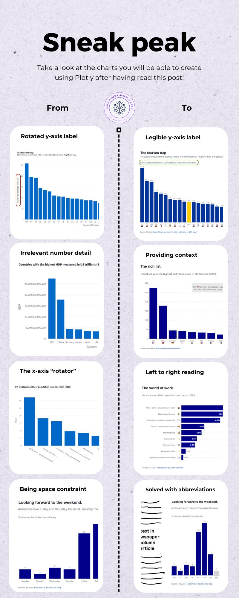
Scenario 1: The infamous rotated y-axis title.
I have always wondered who decided that rotating a text 90 degrees for the y-axis was a good idea. First, at least in Western countries, we read left to right, not bottom to top. Second, if you rotate the text, you will have to be the exorcist child to read the text parallel to your eyes. And third, it can crowd the chart – especially when you're working with multiple subplots or small-scale visuals. Vertical text often eats up more space than it should, pushing other important elements aside or making the chart feel cluttered.
Even in the most used plotting tool in the world (Excel), you have default templates to rotate your y-axis titles. No wonder other less popular data visualisation toolkits follow suit.

In the first post of the series Awesome Plotly with code series (Part 1): Alternatives to bar charts, I introduced the concept of not rotating the y-axis, although I didn't cover it in detail. The first screenshot below shows how plotly.express rotates the y-axis automatically. The second, removes the y-axis title and adds it horizontally just above the bar chart.


Why do I think horizontally adjusting is better?
- The most important reason is that I naturally read the text left to right.
- In addition, you can use the extra horizontal space to actually write a proper descriptive phrase.
Sure, it is a small adjustment which you might think doesn't grant a section in this blog. But I disagree. I tend to be the outlier using this horizontally adjusted plot, and still readers positively comment about the legibility of my plots. I believe horizontally adjusting the y-axis helps a lot.
Tips on how to create this plot
How to remove the y-axis title?
- Easy. In
fig.update_layout, tell theyaxisto not be visible.
fig.update_layout(
        ...
        yaxis=dict(title="", visible=False),
    )
How to place a horizontal y-axis title above the bar chart?
- 1st, you need to force adding white space above the chart. This is done through adding margins at the top.
fig.update_layout(
        ...
        margin=dict(t=100, pad=0),
)- 2nd, make use of annotations specifying the point of reference and the coordinates of where the text should be plotted.
fig.update_layout(
   annotations=[
      # Second paragraph annotation
      dict(
          text="Travel and tourism share of GDP in the EU-27 and the UK in 2023",
          xref="paper", yref="paper",
          x=0, y=1.07,
          showarrow=False,
          font=dict(size=14),
          align="left"
          ),
)
Scenario 2: When you work with many orders of magnitude as your data labels
Did you know that a billion means completely different things in Spanish and English? Did you also know that large numbers are also grouped differently across different countries? If you knew (and now you know because I have told you so), then you understand the importance of being clear and specific with the data labels you present. You don't want any misunderstandings because you used an abbreviated label or a comma where it should be a point.
Let's imagine you are presented with the following scenario. You want to present the total GDP by country, but, the GDP numbers are massive! We are talking here about 27 trillion for the US!

The question is, how do you present these massive numbers in a chart? Let's begin with a basic attempt of providing the audience with trillions in their full extent.
1st attempt: writing all the zeroes that make up a trillion.
In the plot below, we have ensured that the audience has the full context from a numbers perspective…

… but, oh my god, it is a bad experience reading this chart. There are so many redundant zeroes that don't provide me any extra info. And they take so much space! Ok, let's move to our next attempt: abbreviating numbers.
2nd attempt: abbreviate the trillions
Here we will break our rule of providing clear context. Because we can't afford to take up so much space from the chart, we will reduce the y-axis labels with abbreviations. You can see below how 25 trillion = 25T.

The issue? First, that trillions could mean different things in different countries. But even if that wasn't the case because your audience understood exactly the concept of trillions, they would probably have to actually sit down and mentally count zeroes in order to tell you that trillions has 12 zeroes… In other words, the magnitude of trillions kind of gets lost inside that little T symbol.
3rd and final attempt: abbreviations + context
Ideally, we would like to mix the 1st and 2nd attempt. Below you can see my attempt at doing so.

Tips on how to create this plot
How to show the numbers with T for trillions (or other abbreviations depending on the order of magnitude)?
- You don't actually need to do anything. Plotly will automatically abbreviate numbers with the default international grouping.
How to add the annotated grey box?
- You need 2 elements: 1 shape to paint the box, and 1 annotation for the text.
fig.add_shape(
type="rect",
xref="x",
yref="y",
x0='India
