Creating Maps with QGIS
More than 10 years ago when I started my data career as a GIS (Geographic Information System) analyst, two pieces of do-it-all GIS software were prominent. 10 years later, it is still the same two software. ArcGIS by ERSI is by far the dominant king, which is very easy to use with many features and an excellent Python library that came with it. However, it costs money and only works on Windows.
QGIS (Quantum GIS) on the other hand is the best open-source alternative. It ships to most operating systems and has a very active open-source community. You won't do wrong committing to either software, but as I went deeper into my programming career, using Windows became more difficult, and I generally tried to avoid enterprise software to avoid any procurement administrative work. Hence I deviate more towards QGIS now.

The below tutorial is shown in QGIS 3.34 Prizren and may differ slightly in previous and future versions.
Table of Contents
Keyboard Shortcuts Add a Base Map Create a New Layer Adding a Feature Editing a Feature Symbology Using the Toolbox The Field Calculator Adding Labels Map Themes Map Layout
What You Will Learn
At the end of this walkthrough, you will learn how to make a map like this, which I will use for a forest survey.

Keyboard Shortcuts
There are a few commonly used actions whereby implementing keyboard shortcuts that will make your life easier. I will customise them so they are easier to reach. This might seem unimportant, but trust me, it just optimises everything when you want to move and toggle around your mapping project.

These five actions and the custom shortcuts are:
- Pan Map: C
- Zoom in: V
- Zoom out: X
- Toggle Edit: E
- Select Feature: R
Of course, you can feel free to use your shortcut keys.

Add a Base Map
The base map is the background of your entire mapping project. We usually use authoritative Maps as the background to get a sense of the land details when we add our layers on top of it. In QGIS, base maps can be added by first installing the plugin at Plugins > Manage and Install Plugins > QuickMapServices. These maps are retrieved via external APIs, so an internet connection is required.

We can then search and add base layers to our project. In this instance, I added Google Satellite imagery, and it will appear in your layers panel on the left.
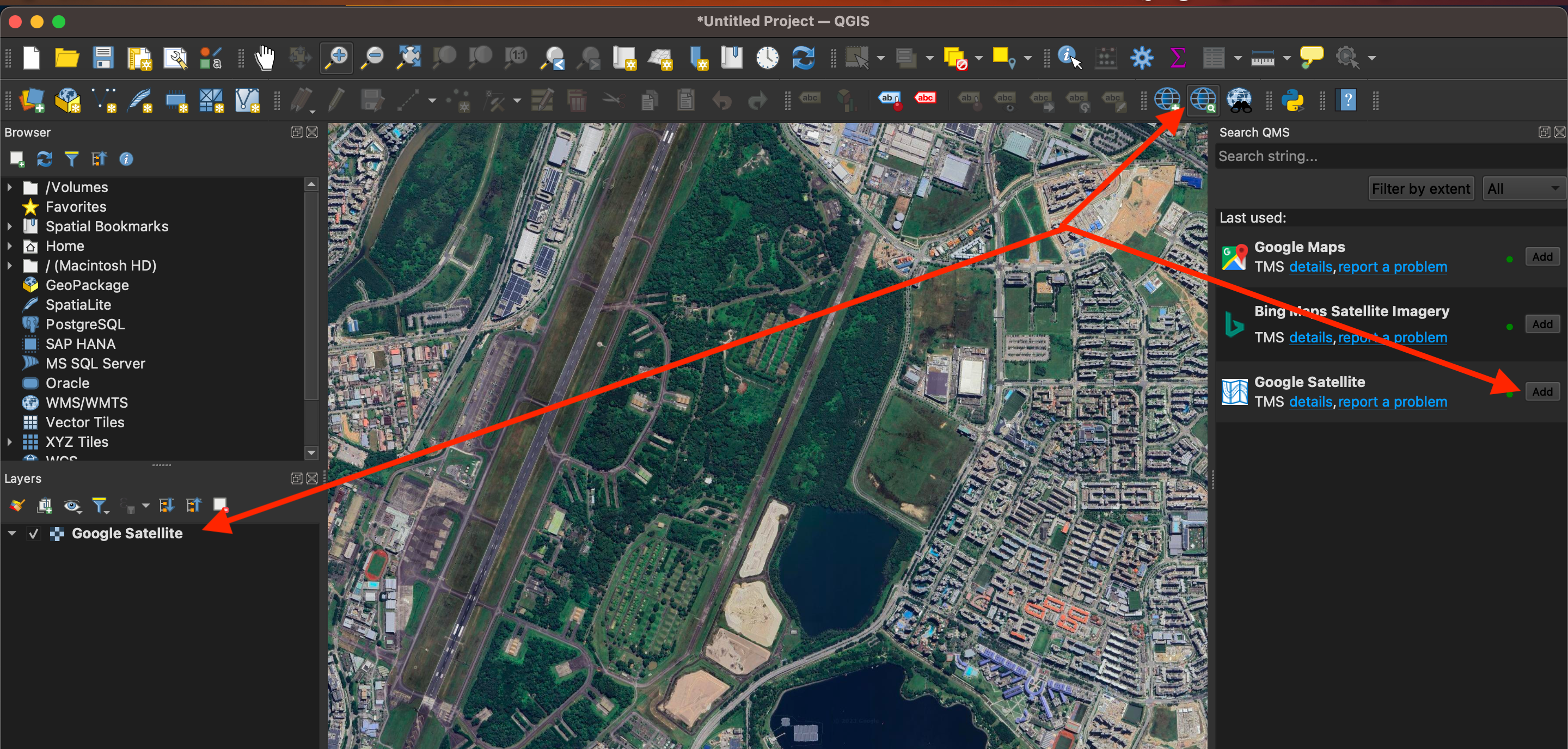
We can access the plugin to select other base layers later at the shortcut in the previous screenshot, or as shown below.

Create a New Layer
There are two types of graphics used in GIS. The earlier Google satellite imagery was made up of a grid of colour pixels, and this is known as a raster. This has a resolution where if you zoom in enough, will eventually see the individual pixels.
Vectors only the other hand do not have a resolution and will always remain clear and sharp when zoomed in. These vectors are made up of various geometry types, i.e., polyline, polygon, and point. The most common format for vector storage in GIS is an ESRI shapefile. To create this go to Layer > Create Layer > New Shapefile Layer.

A pop-up to define the shapefile is required as shown below. Shapefiles will include an attribute table, where we can store information on each feature being created. We can define any new fields in the table here. Upon creation, you should see the new layer added to your Layers menu bar on the left.

One thing to note is that a shapefile consists of more than one file. Of particular note are the .shp which contains the geometry coordinates, .dbf which contains the attribute table and .prj which contains the coordinate reference system.

Adding a Feature
It is quite straightforward to create a feature, in this case, a polygon. We just need to select the layer on the menu, enable the Toggle Edit (pencil icon), and then the Add Polygon icon. Then, we point our mouse over the base map and trace a polygon over the area by clicking on it. Finally, when we are done, we can right-click, and a popup will appear, prompting us to enter the attributes for the feature into the attribute table, if required.

Editing a Feature
There are many editing methods, and in this instance, I will show how to split an existing polygon into parts. First, as before select the layer and Toggle Edit. Then go to Edit > Edit Geometry > Split Features.

Your mouse arrowhead will be changed to a bullseye circle and you can then click from the outside of the polygon and slice it accordingly into smaller parts by drawing polylines, ending outside the polygon, and with a right click.

Using this, we have split the survey area into six different sections where I know the vegetation types have some differences.
Symbology
To adjust a layer's fill and border colours, we can right-click a layer > Properties > select the Symbology tab. If the features in the layer have a category or numerical scale assigned in its attribute table, we can also change the colour display from Single Symbol to Categorized or Graduated.
In this case, we only want to remove the fill colour and make the border red, so we can click on the Fill, and later Simple Line to change them consecutively.

Using the Toolbox
The processing toolbox contains all the possible spatial processing for your work. And they can be accessed at Processing > Toolbox, with a simple search box to get whatever you need. In this case, we want to create some stratified random samples by adding random points within each survey area.

The tool pop-up will then be shown and we can enter the appropriate inputs for three points per area with a distance of at least 10 meters apart.

And with that, the points are generated as a new layer in the map.

The Field Calculator
We talked a little about the attribute table earlier, which is a table in a shapefile or layer, where every feature can have corresponding data stored in it. With the spatial attributes of the features in the layer, we can do calculations in the table using a Field Calculator. In this instance, we want to create two new fields X and Y in the attribute table of the random points showing their coordinates.
First, we right-click on the layer and open the attribute table. Then, we Toggle Edit > open Field Calculator.

In the field calculator, we want to create a new field called X, using the decimal format. In the expression, we enter the calculation for the X coordinates. In this instance, I am using the local coordinate system in meters, but I wanted the labels to show the global coordinate system in latitudes and longitudes, hence I did a transformation.

Repeat the same this time to get the Y coordinates and we should get something like this. Toggle the Edit icon again to save these two new fields.

Adding Labels
Now that we have the X and Y coordinates created for each point, how can we display them on the map? This is done by turning on the labelling options from the toolbar (or right-click the layer > Properties > Labels). We then select the layer > Single Labels > and click on the expression dialog to craft how the label should look like.
In the expression dialog box, we add the X and Y labels and concatenate them with a new line "X" || 'n' || "Y" so that the text labels will appear as such.

We then make some changes to the labels by increasing the font size and colour and then adding a black buffer to the labels so that they will stand out in the dark base map background.

Finally, we add a white callout line which will link each point feature to the label.

With that, the labels look like these on the map. Not too bad, but not the neatest as some of them are clustered together and blocking the survey polygons too.

We can resolve that by manually shifting the labels away from each other and out of the polygons by selecting the Move Label icon, clicking on one of the labels and shifting them to another position.

Now the end state is cleaner in my opinion. Some fine adjustments may be necessary when building the layout when other map symbols are added.

Map Themes
Map themes are important when within the same project, you want to display different layers and do not want the hassle of switching them on and off. Themes are also important when we are creating multiple maps within the same map layout as you will see in the next section, where we need our main map, as well as an inset.
We have already prepared the main map earlier, so we will add a theme called base.

To prepare the inset, I add a Singapore country layer which I have on hand and switch off the other layers.

Next, we want to add the survey boundary to the country map. To do that, we first duplicate the survey boundary layer.

Then, we add a red fill colour to the layer by right-clicking the duplicated layer > properties > symbology and editing the colour accordingly. With just these two layers, it becomes clear where the survey is located in the country.

Last, we add this as another theme, called inset. On the dropdown menu, we should be able to switch between each of these two themes.

Map Layout
The final part is to add all the necessary items to make it a proper map. This is done by creating a layout.

In the layout page, we first define the page properties, making it in portrait mode.

The first item to add is, of course, the map we just created. To that we need to select the add map icon, and then drag a rectangle around the blank canvas.

Then we can make some fine adjustments by selecting the move item icon. and then we can pan the contents on the map. We can zoom in and out with our mouse, but for fine adjustment, we can input a specific scale. Of particular importance is to select the map theme created earlier.

Next, we add another map called an inset, which represents the same area of the initial map but shows where it is at a much wider scale. Again, we need to lock the map with the map theme created earlier for the inset.

Now, we can prepare for the rest of the map items to be added within a blank rectangular background. The corners were rounded for a nicer look. At the top right panel, we can adjust the ranking of each map element so that the inset will be on top of the rectangle background.

With that done, we first add a legend to it. We can customise the legend with a title, and delete some entries which we do not need.

The north arrow is also an essential map component. There are several arrow types to choose from.

Last, we will add a scale bar to it. We can change the bar symbol type and customise the scale at the item properties.

Finally, we can touch up the map elements, and export the completed map as a raster image, or retain the vector graphics as SVG or PDF.

Summary
Spatial analysis and cartography is a niche field of data analytics and visualisation. In the years when I worked in this field, I have created maps for display in public walking trails and also published them in magazines, newpapers, books and journals. It was a fun and interesting endeavour, and I believe you can do the same with the fundamentals I provided above and expand from there.
