How Can You Improve Your Forecasting Metrics and Process without Sophisticated Algorithms?
Introduction
Demand planning is at the forefront of an Integrated Business Planning (IBP) process. The outcomes from this stage form the basis for other stages (e.g. supply planning, production planning). This stage usually begins with the generation of a statistical forecast based on historical sales and combining it with sales inputs to arrive at an initial baseline forecast. This projection is then refined to yield a consensus forecast after reviewing and aligning with sales and marketing stakeholders. We typically track Forecast Accuracy and Bias as the key performance indicators (KPIs) in this phase of IBP. Supply chain, sales and marketing teams can spend considerable time and effort (and money) to get the forecast right, oftentimes investing in expensive forecasting tools. While it is certainly helpful to have a suite of advanced algorithms to improve forecast accuracy, descriptive Analytics derived from historical sales and forecast data can also help streamline the demand planning process and enhance KPIs.
Why Do We Need such Analytics?
For the most part, analytics serve two main purposes:
1) They help recognize opportunities for improving KPIs
2) They help identify process steps with inefficiencies
For instance, comparing the sales forecast accuracy with the statistical forecast accuracy for each product and customer can help understand where spending time on gathering sales inputs yields more accurate results than a system generated statistical forecast. The sales team can focus on only those specific items and save time and effort, all the while generating a better forecast.
The analytics also help drive home a clear message to senior leadership on actionable items. Instead of trying to make sense of obscure KPI data, analytics highlight specific areas to improve as well as high performing entities to leverage learnings from across the business. This is highly effective in getting buy in from management to work towards specific, tangible goals.
Designing Analytics
One of the more intuitive approaches is to look at the individual components of the demand planning process (Figure 1) and develop descriptive analytics for each of these sub-processes.

- All images in this article, unless otherwise noted, are by the author
First, we analyze historical sales and clean up outliers. In the statistical forecast generation step, historical sales adjusted for outliers are used to generate a system-based forecast. In the next step, the sales teams gather customer feedback or provide their estimate for demand, which becomes the sales forecast. The statistical and sales forecasts along with historical sales, information on special events are analyzed by the demand manager using the analytics dashboards to come up with a baseline forecast. The baseline forecast is reviewed by stakeholders in sales, marketing, and supply planning teams in a recurrent meeting (oftentimes, monthly or weekly) to align on a consensus forecast. The analytics are reviewed by all stakeholders in this meeting to establish focused action items. After this discussion, supply constraints (if any) are incorporated into the forecast to arrive at a final forecast.
Prior to implementing the analytics, it is imperative to decide on their granularity. Different business units within an organization may plan their demand, supply and logistics at different product and customer hierarchies. Product planning may be done at the SKU, product family (or other) levels depending on the manufacturing setup. Customer planning may be done at the customer level or market segment level among others depending on how the accounts are set up. Instead of developing and showing descriptive analytics for each individual entity, it may be worthwhile developing flexibility to choose the levels at which you want to see the analyses and insights. The analytics design is also influenced by the KPIs that we want to improve. In this article, we will focus on volume-based descriptive analytics that should help improve a weighted mean absolute percent error (MAPE) as an indicator of forecast accuracy.
Analytics Templates
In this section, we will discuss descriptive analytics that use forecasts and historical Sales (actuals) in the calculations. Let's note that all forecasts and actuals are for volumes sold at the granularity chosen. The chosen granularities (in terms of product and customer hierarchies, historical time periods, forecast types etc.) in the visualizations below are simply examples and can be updated to match a business setup. The blue boxes at the top of each visualization are dropdowns where the user can select multiple items (with the exception of Display Entity, where we can select only one entity). Display Entity is the level at which the analysis is visualized. Time period denotes the most recent past period (in months in the examples shown in this section) over which the analysis is done.
I. Scale and Variability of Demand

In Figure 2, we display actual sales at the SKU level over the past 12 months. This is displayed in the form of a boxplot highlighting the median, 25th percentile, 75th percentile, minimum and maximum of sales over the historical time period.
Insight(s): The boxplots as shown in Figure 2 provide a sense of the scale of demand (denoted by the median) over a historical time period and the variability in the demand as expressed using the interquartile range (IQR). We may choose to sort by the median or IQR to identify the largest volume or largest variability items, respectively.
Action(s): Typically, we focus our forecasting efforts on high volume and high variability items, while using a statistical forecast for low volume or low variability items.
II. Historical Sales Pareto

In Figure 3, we plot the actuals lifted by each customer over the past 6 months.
Insight(s): The chart in Figure 3 shows customers listed side-by-side in descending order of volume lifted over 6 months. This view also enables us to calculate cumulative sales over this past period for a set of customers.
Action(s): Oftentimes, a small percentage of customers are responsible for a majority of the demand (80–20 rule). It would be prudent to focus on forecasting these items for a higher return on time investment.
III. Consistent Poor Performers


In Figure 4A and Figure 4B, we look at the raw and absolute deviation of the forecast from actuals, respectively, at the SKU level summed over the past 6 months.
Insight(s): The positive deviations in Figure 4A show areas where we consistently over-forecast and the negative deviations highlight items where there is consistent under-forecasting. The second chart (Figure 4B) shows where we get the forecast timing wrong for the item (intermittently over- and under-forecasted).
Action(s): Ideally, we would lower the forecast for items with a consistent positive bias and increase the forecast for ones that have been persistently under-forecasted unless the business conditions have changed. For the ones, where we are not able to capture the timing right, we may want to collaborate with the customers to understand the root causes and capture the timing better.
IV. Segment Items based on Forecast Accuracy

In Figure 5, we display the deviation between the sales forecast error and the statistical forecast error at the SKU-customer combination aggregated over the past 6 months.
Insight(s): The positive bias in Figure 5 shows where the sales forecast had higher cumulative error over 6 months than the corresponding statistical forecast. The negative deviations show where the sales adjustments are making the forecast better than the statistical forecast (i.e. the cumulative sales forecast error is lower than the cumulative statistical forecast error over the selected time period).
Action(s): To improve the metrics, we would use the statistical forecast for the items with the positive deviations and the sales forecast for the entities with the negative deviations. This is again assuming business conditions remain stable.
V. Outliers based on Recent Sales

In Figure 6, we investigate the deviation of the sales forecast for the next month from the average of the past 3 months.
Insight(s): The positive errors in Figure 6 show where we are over-forecasting compared to recent sales while the negative deviations show where we anticipate sales to be much lower than recent history.
Action(s): We would want to closely review the outliers, and verify if the forecast is out of line, or if there was an anomaly in recent sales, and adjust the forecast if needed.
VI. Outliers based on Growth and Seasonality


For these visuals, we typically choose product family or higher level since a lower-level attribute (e.g., SKU) may lead to noise in growth rates. For the same reason, we tend to look at outliers at a quarterly basis instead of monthly. In Figure 7A, we look at product families with sales forecast deviation from expected Q2 sales. The expected sales in Q2 are simply a product of the last available Q2 sales and the average growth rate for Q2 sales across multiple years. In Figure 7B, we deep dive into growth rates (%) for multiple quarters looking year-over-year for the past 3 years.
Insight(s): The positive errors in Figure 7A show where we are over-forecasting compared to expected sales accounting for average YoY growth and seasonality, while the negative deviations show where we anticipate sales to be lower than expected seasonality adjusted YoY growth. Deep diving into a product family (e.g., PF21) in Figure 7B, we find that Q2 estimated growth rate for next year is much lower than the average Q2 growth rate of the past 3 years and warrants further scrutiny.
Action(s): The largest deviations (positive and negative) need to be reviewed to understand why the forecasts are not in line with expected growth and seasonality and adjusted accordingly.
VII. Price-Volume Outliers

In Figure 8, we plot the normalized price against the volume for product family PF23. While the price is normalized using the price of relevant feed ‘Feed3', the volume is not normalized as we may not have data on overall industry demand for this or a comparable product family. For historical periods, historical prices and volumes are used to generate the scatter plot, while the forecasted prices and volumes are used to generate the forward-looking normalized price and volume forecast.
Insight(s): The scatter plot shows how the price (normalized) and volume (normalized) are correlated at different granularities. While this approximates how volume moves with price changes (note that the normalizing entities themselves are approximations), the chart can help identify forecast outliers (e.g., too high a forecasted (normalized) volume for a given forecasted (normalized) price, when comparing against (normalized) historical price vs volume trends).
Action(s): We explore forecast outliers on the price vs volume chart for the forecasting horizon and review historical business context and current market demand and supply conditions to assess if the outlier values are justified. If not, the volumes or prices are adjusted to bring the forecasts in line with historical trends.
VIII. Entities with Consistent Forecast Degradation or Improvement over Time


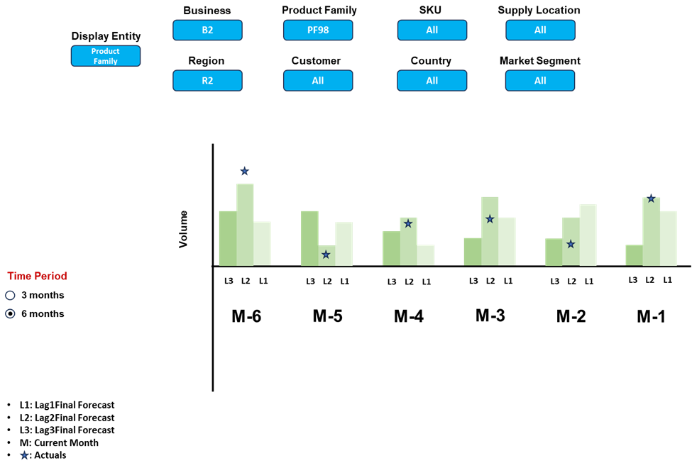
In Figure 9A, we analyze the performance of the Lag2Final Forecast (forecast finalized 2 months prior to month with the actuals being analyzed) at the SKU level over the past 6 months. Going further, we also investigate the product family items that have the smallest Lag2Final Forecast absolute error over 6 months as shown in Figure 9B. To understand the trends for each of these items, we plot the different lag forecasts vs actuals in Figure 9C.
Insight(s): From Figure 9A, we can identify the entities that are consistently over- or under-forecasted based on whether errors are positive or negative, respectively. Figure 9B shows the items that have the highest accuracy for a selected Lag forecast over a period of time. We peel the onion (as shown in Figure 9C) to investigate each item from the table in Figure 9B as to how it performed compared to other Lag forecasts across the past period.
Action(s): We would like to reduce the error for all Lag forecasts and consequently would focus on poor performers across all of these forecasts. Another actionable item is to learn from the consistently best performing Lag forecast at any granularity of interest and use it for future reference. For example, if we make the forecast worse going from Lag3Final to Lag2Final to Lag1Final for any item, we may first want to understand the root cause – if it is deemed to be poor forecast updates not related to any business anomaly, we may just stop updating the forecast after Lag3Final for the particular item in question.
Summary
While we discussed a set of key descriptive demand planning analytics, these are not exhaustive. For instance, a detailed list can be found here. It is important, however, to consider the trade-off between having too many and too few analytics. Too few don't provide enough insights, and too many consume a lot of time and effort defeating the original purpose of forecast management by exception. The objective is to look for consistency in insights from multiple analytics. At the end of the day, regardless of the number of analytics, we want to use these to identify areas that require additional attention to improve an organization's demand planning process and forecast accuracy.
Thanks for reading. Hope you found it useful. Feel free to send me your comments to [email protected]. Let's connect on LinkedIn
