How to Design a Data-Driven Story

What's in this post?
Today, everything relies on data!
In my September post last year, I mentioned that being unable to handle data – meaning to analyze and interpret it – is today's "standard" for illiteracy.
Consider the vast amount of data surrounding us, not just used by companies or governments but also by us. Think about how much time you spend on your phone, browsing tweets, reading messages, and watching videos i.e. absorbing tons of data, often while doing other data-intensive tasks like commuting. Crafting a business case for investing in a new market is not much more complicated, give or take subject expertise. You might argue that tools like Large Language Models (LLMs) or Generative AI exist to assist. And you'd be right. However, these tools' abundance and increasing complexity have turned their use into a challenge on its own.
Almost no area of today's world can function without data, especially in business. From the intricacies of core operations to the fundamentals of back-office tasks, every aspect of business operations is dependent on data. Sales and marketing? They focus on the customer funnel, constantly seeking creative ways to boost monetization. HR examines staff retention, salary competitiveness, or office utilization. And production?
But business isn't the sole user of data. Consider medicine or education. Or our daily lives: managing a family budget amid rising inflation, planning holidays with the help of comparison sites, or reducing household energy use by choosing electric vehicles or installing solar panels.
My question, and the focus of this article, offers at least a partial answer on how to navigate this chaos.
A good story can solve anything.
Have you, by chance, seen this video?
At its core, the video depicts a prank where the main character gains access to various places using a ladder. But the real key to success wasn't the ladder but the character and the story he crafted. This mix turned out to be incredibly effective. Similarly, data-driven Storytelling relies on a "ladder" of its own: visualization. While important, it's not the crucial element. The essence lies in the story itself, specifically, an effective one.
So, what's in this post?
I must confess that creating good, compelling stories has always been a challenge for me, and it remains so. Honestly, there aren't many resources out there that can TRULY help. Those that exist often come with their own set of issues. For example, they might be more theoretical than practical. Or the advice is scattered across various posts or articles. In this post, I'm excited to share my latest insights into crafting data-driven narratives, offering a structured and impactful methodology for approaching this task.
Why do we need data-driven storytelling?
Before we delve into the nuances of crafting a compelling narrative for our storytelling, let's take a moment to understand its importance. Consider the impact of not having a good story. Think about historical figures like Dr. Ignaz Semmelweis, who pioneered antiseptic procedures; Alfred Wegener, who proposed the theory of continental drift; Nikola Tesla, known for his revolutionary inventions; Gregor Mendel, the father of modern genetics, and Galileo Galilei, famous for his contributions to physics and astronomy, including his support for the heliocentric model.
These pioneers encountered challenges in communicating their revolutionary discoveries, highlighting the intricate factors that influence the acceptance of scientific ideas. Success in science involves more than mere facts. The experiences of these innovators demonstrate, to some extent, that storytelling is an invaluable tool. It simplifies complex ideas, fosters emotional connections, humanizes the essence of science, crafts engaging narratives, dispels skepticism, underlines significant implications, and captures the interest of many audiences.
Compelling storytelling can transform how discoveries are shared and understood, potentially increasing their acceptance and recognition.
Data-driven storytelling must be genuinely rooted in data, serving as a bridge from discovering insights to understanding and then leading to specific actions. This means the narrative should be action-oriented, guiding the audience towards a concrete outcome, whether making a decision, agreeing on follow-up steps, or deciding on a product sunset. The story must resonate with the audience, making it memorable by ensuring it's relevant and impactful. This requires a deep understanding of the context in which the story is told. Additionally, the story should be simple and coherent, presenting complex data insights in an easy-to-understand manner without overwhelming the audience. While it's essential for the narrative to be compelling, it must also maintain honesty and integrity, avoiding misleading, whether intentionally or unintentionally. It's essential to recognize that data-driven storytelling can, and often does, embody a degree of subjectivity. This tendency stems from its utilization in furthering the specific objectives or agendas of the storyteller or their organization. Provided this is approached with transparency and ethical considerations, it should raise no concerns. The core objective is to leverage data in weaving a narrative that is informative and engaging and prompts action, all while maintaining unwavering integrity and clarity.
How to build a story?
Let's begin with the basics. To make our story compelling, we must answer three fundamental questions before crafting it.

To address the "why?", we need to grasp our audience's context:
- Who are we talking to?
- What matters to them?
- Who makes the decisions?
Suppose you're interested in identifying the proper context and the implications of failing. In that case, I strongly recommend exploring one of my earlier posts from last year.
Next, we tackle the "how?". This involves our strategy for guiding the audience from our insights to making decisions. This is where storytelling plays a pivotal role. The conclusion they reach answers the "what?" question. This is a straightforward, one-sentence response to: "What are we here for today?" or "What do you want us to do?" From my experience, having a clear answer to this is crucial. Without it, your storytelling might falter before starting your PowerPoint presentation.
Data story narrative: existing literature so far
There are multiple approaches to structuring the narrative of your data story. One highly recommended method is the narrative arc concept by Brent Dykes [1].

I've been utilizing the narrative arc for some time as the primary method for organizing my stories: the order and content of the slides, how I present the problem and explain its significance, and finally, how I conclude to drive action. Another helpful framework was introduced by Dave McKinsey [2]. He suggests two approaches for crafting stories: depth and breadth.

In the depth order approach, you organize your story into sections. Each section is tackled independently. For example, if there are 2–3 aspects of the topic you wish to address, you fully explore each aspect individually, presenting arguments and conclusions before moving on to the next. On the other hand, the breadth order involves first outlining these aspects, then collectively providing arguments for all of them, followed by a separate section for conclusions. I often blend the McKinsey concept with the narrative arcs in my stories. The choice between depth and breadth depends on the context of your audience and the complexity of the issues you're discussing.
Another notable expert on story structure is Cole Nussbaumer Knafflic [3]. She advocates for the "vertical logic" approach to organizing slides. This method begins with a summary (for instance, an "executive summary slide") followed by a more detailed presentation as necessary.

These concepts share two common characteristics: they are handy, individually or blended. Yet, they miss a crucial point – storytelling is not always linear. This implies that these frameworks might appear overly broad, particularly to those new to developing presentations. Consequently, I've been searching for a methodology that delivers more precision, offering a detailed, step-by-step guide to constructing a captivating narrative.
My recent exploration led me to an exceptional resource, "The Data Storyteller's Handbook" by Kate Greenbrook, which has been a significant source of inspiration for this post. I will outline her methodology in the upcoming sections, enriched with my insights and experiences. The goal is to illustrate that while constructing a data-driven narrative may present its challenges; it can be approached methodically, akin to any scientific or business endeavor.
Types of data stories
Data-driven storytelling can fundamentally take two forms.

The time data storyThis narrative focuses on how a specific phenomenon, such as a metric or character, has evolved. For example, it might highlight a significant increase in net profit, stating, "Our net profit increased by 50%." Alternatively, it could reflect on broader societal changes, such as, "Between 2019 and 2021, the life expectancy of people in the Americas decreased by 3 years."
The character data storyThis form of storytelling illustrates the differences between two entities or characters. It often addresses questions about comparative analysis, like life expectancy differences between regions: "What is the difference in life expectancy between Asia and the Americas in 2021?" with a possible answer being, "The life expectancy of people in Asia was by 2.5 years higher than that of the people in the Americas." It could also compare organizational performance metrics, such as net profit comparisons between companies, answering questions like, "What is the difference in net profit between our company and our biggest competitor?"
The time and character stories share certain foundational elements despite their differences in focus.
- Character: This is the entity the story revolves around. It can be an individual, a group, a company, or any other subject of interest. A story may involve more than one character.
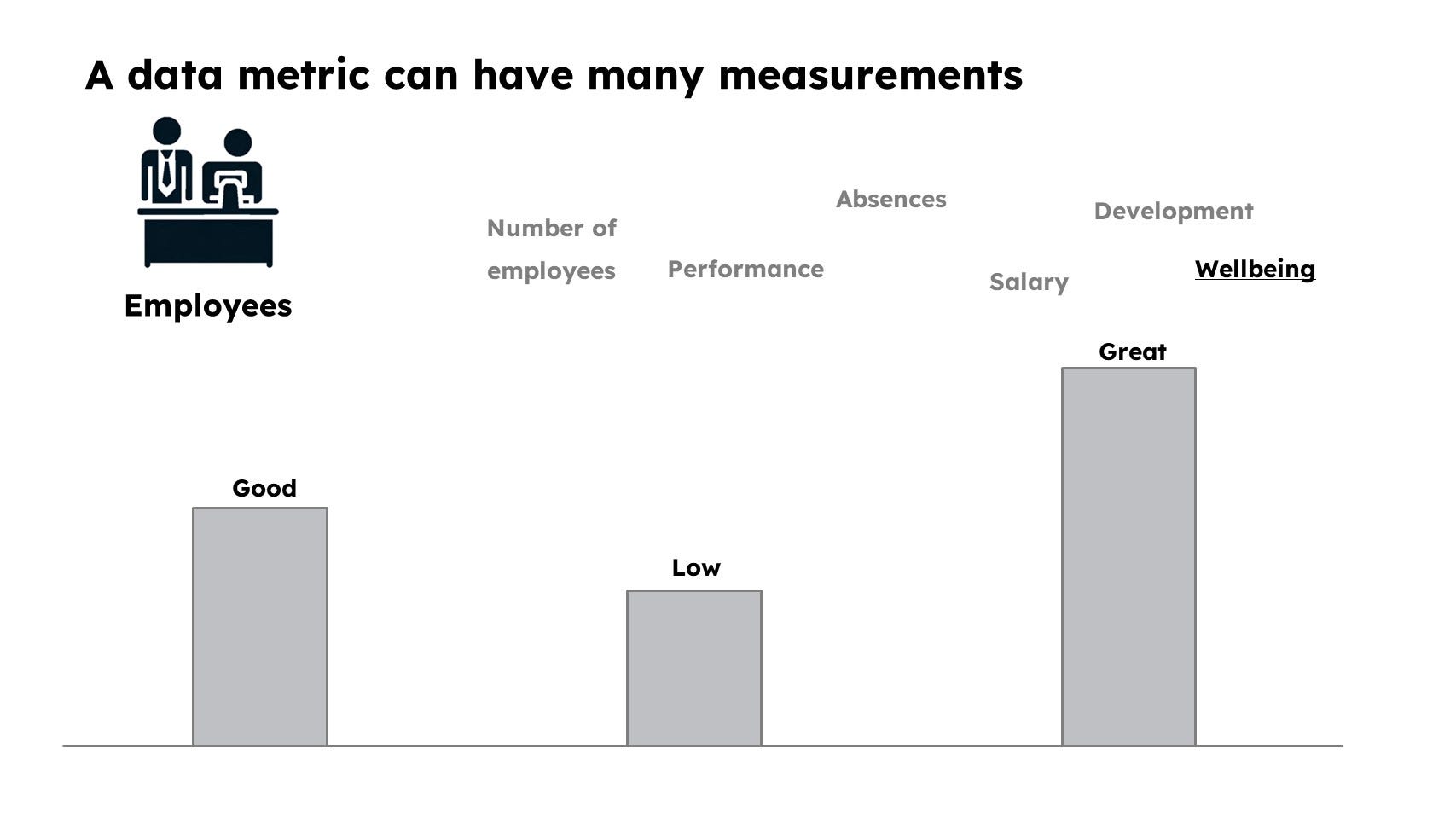
- Data metric refers to the specific measurement or aspect being analyzed about the character. The quantitative or qualitative aspect provides insight into the character's performance, state, or changes over time.
- Time: This provides a temporal context to the data metric, indicating when the measurement was taken. In a narrative, data can be measured and compared across multiple points in time to illustrate change or stability.
At its core, the data metric is what the story is truly about. Yet, identifying all three elements clearly before crafting the data story is essential for clarity and effectiveness.

The concept of "character" in data-driven storytelling is broad and adaptable, encompassing virtually any subject of your analysis or decision-making focus. Characters can vary widely, from individuals to objects or even abstract processes. Here are some examples:
- People: For instance, when discussing employees, customers, or demographic groups, these individuals or collectives become the "characters" of your story. They are the subjects whose actions, behaviors, or characteristics you analyze and discuss.
- Things: Products, assets, or tangible items can also be characters. In stories focusing on product performance, sales trends, or customer preferences, the products are at the narrative's center.
- Processes: More abstract entities, such as entire businesses, societal trends, or political movements, can serve as characters too.

Every character can be defined by various metrics, whether quantitative or qualitative. Choosing the right metric is an important part of our story. It's the trait of the character that resonates with our audience and, as such, forms the foundation of our narrative.

Finally, it's crucial to acknowledge that each metric can be quantified through diverse measurements, subject to interpretation. The significance of a metric may be perceived as positive or negative, high or low, good or bad, among other distinctions. Its representation could range from 1 to 10 or be communicated via color coding – whatever method suits your needs and resonates with your audience. Here, context plays a pivotal role, emphasizing the importance of tailoring your approach to ensure clarity and relevance.
Both time and character stories revolve around comparisons. We discuss changes or differences in the character, with time as the primary distinguishing factor. However, it's important to distinguish between valid and non-standard comparisons.
For example, we can examine the same character at different times (a time data story). For instance, comparing our company's workforce this year with its status five years ago. We can explore changes in the number of employees, engagement levels, and salaries.
Alternatively, we can compare different characters at the same time (the essence of a character story). For example, comparing two countries' life expectancy or contrasting salary levels between manual laborers and office clerks.
We should avoid mixing both approaches, i.e., discussing different characters at different times. Actually, it's a common pitfall, which results in biased or meaningless conclusions. For example, when discussing societal changes today versus 10 or 20 years ago, we must consider different movements that could have a significant impact, such as a substantial level of immigration to a country.

The comparison we should avoid at all costs is contrasting different metrics for one character, such as a company's profit and revenue. This is a classic fallacy, akin to comparing apples and oranges.

How do we build time data stories?
Time data stories focus on the changes in a character or metric over time. This allows for comparing the status of, for example, a client base or a society at two different points without analyzing the dynamics but rather the end-states. Comparisons can span both distant and close periods. For instance, during the COVID-19 pandemic, companies often avoided the usual year-over-year comparisons due to the abnormal data influenced by the pandemic and restrictions. Instead, they looked at more distant periods before the pandemic to form more meaningful predictions about the future. Typically, analysis involves comparing the current year's performance with the previous one.

Selecting the proper measures for your story is crucial and should be guided by the specific goals you aim to achieve and what's significant to your audience. This relevance is determined by answering the "Why?" and "What?" questions, which help clarify your story's purpose and the actions you wish your audience to take. For instance, if a metric directly impacts the personal goals of your audience or aligns with the broader corporate strategy, it becomes a more integral part of your narrative than other metrics might be. This strategic selection ensures that your story resonates more deeply with your audience, making it more likely to influence their thoughts or actions. Understanding your character's most meaningful changes or aspects sets the foundation for a compelling and impactful story, guiding your audience toward the insights or conclusions you intend to share.
Determining the impact of change within your story is a critical initial step that directly influences the narrative's direction and emotional tone. Whether a change is positive, negative, or neutral , this assessment is the narrative's foundation, guiding the subsequent storytelling approach.
- Negative change: Indicates a problem or challenge that needs addressing. Stories centered around negative changes are often designed to motivate action to correct or mitigate the issue.
- Positive change: Suggests progress, success, or beneficial outcomes. Positive changes are opportunities to celebrate achievements, reinforce successful strategies, and encourage further investment of time or resources to maintain or accelerate positive trends.
- Neutral change: Implies stability or insignificant change. While neutral changes might seem less compelling initially, they can still be valuable in specific contexts. For example, demonstrating stability in turbulent times can be reassuring.
Providing the reason(s) for the observed change in a time data story is crucial because it rationalizes the recommendations for action presented after the narrative. Sometimes, the reason behind a change may not be immediately apparent during the story-crafting process, which could lead to a recommendation for further analysis. Understanding the context – in this more specific sense – means explaining to your audience the broader background and significance of the change being discussed. It involves clarifying why the change is relevant and why they should care about it. This more profound understanding of context helps engage the audience more effectively, making the story informative but also compelling and actionable.
The final element of a data story, the action, is a critical component that turns insights into tangible outcomes. It's about delineating clear steps or strategies that a local society, business, or organization can implement to capitalize on positive or mitigate negative changes. This part of the story is where the narrative moves from observation and analysis to decision-making and implementation. By identifying specific actions, the story doesn't just inform or persuade; it empowers the audience to act, making the data story engaging but also practical and impactful. The storyteller's ability to influence decisions and outcomes becomes evident in this section, demonstrating the power of effectively communicated data-driven insights.
Time data story canvas
Let's combine all elements into a single story design tool: the canvas. This fascinating concept helps us gather all the components needed to craft our story. Picture it as a storyboard filled with questions we need to ask ourselves or might be asked by others. We'll construct our story with the material from the canvas in the following step. I will illustrate this with two examples.
The canvas is divided into three sections.
In the first section, we determine (and note) our main character or subject, the metric(s) we'll use to discuss it, and the relevant time points for our narrative.
The second section involves evaluating the impact. This includes identifying reasons for any changes, providing context, and acknowledging uncertainties.
In the final section, we concentrate on the response. We reflect on our learnings from the change, our actions in response, and what else is needed to enhance this reaction.
Example 1. Retail company facing e-commerce competition

The canvas for this story could look like this:

Example 2. A leading telecommunications provider


How do you build character data stories?
In a character data story, we typically have at least two characters. A main character is usually the one that interests us and our audience most (e.g., our company), and a supporting one is the one against which we compare. This can be, for instance, our competitor.
A characteristic feature of a character data story is that the data metric comparison is made over the same period.
Another characteristic element is the advantage indication. Which character is in a better position? Is it the main or supporting character, or is there no difference?
Example 3. Retail company vs. major retail platform: character-based canvas exercise
Let's continue our example of a retail company. As a follow-up, we decided to compare it against one of the biggest competitors, a central retail platform.

And here is what our character data story canvas could look like.

Building your story scenario
After creating these detailed canvases and answering numerous questions, you might wonder where our story is. The answer is closer than you think, but we need one more tool to tie everything together.
This essential tool is the PGAI framework. The Problem-Goal-Action-Impact (PGAI) Framework outlines the business rationale behind the data story.
By clearly understanding the specific business problem, goal, action, and impact, it becomes much easier to explain your contribution to business success.

What's excellent about this framework is its flexibility in shaping our stories. Essentially, it provides a backbone that can be customized according to the type of story we choose, our audience's needs, and any specific requirements during the story-building process. Below, I'll show how the PGAI framework can be applied to the two types of data stories discussed in this article.

To illustrate its practical application, let's continue with example 1 provided earlier (retail company facing e-commerce competition).

It's important to emphasize that the techniques presented in this article represent the foundational and critical first step. Enriching our narratives with additional layers, whether through adding arguments or presenting more nuanced character changes, is entirely possible. Yet, the scope of these enhancements depends on your unique needs and the particular context of your audience.
What' the takeaway from all that?
Combining the two frameworks has enabled us to create the skeleton for our story. You can quickly transfer the above structure onto slides, document paragraphs, and additional points, or extend already-included ones.
In my opinion, following the above described steps offers two benefits. Firstly, it allows you to systematize the work on your story and prepare for the moment it will be presented. Secondly, the final products can be easily transformed into a document, whether a slide presentation or a written report.
The last step in our story-crafting endeavor is providing evidence. So far, we have focused on selecting data points and the appropriate data in the examples above. However, it is also crucial to present it effectively.
For instance, selecting the right visuals is critical. A bar or column chart might be suitable if you compare characters at a specific time. A line chart could be more appropriate if you show characters over time.
The next step is to highlight elements essential for your story. The most effective method is to do that through color coding. But any other form of highlighting that your audience understands and accepts will work. From my perspective, these two issues – choosing the right visual and correctly indicating essential elements – are crucial to achieving 80% success in effectively communicating with charts. I write more about it here. In the near future, I plan to write an entire article on crafting effective visualizations: stay tuned.
Don't forget about the CALL TO ACTION (CTA)!
I intentionally left this paragraph for last for a reason. It's easy to overlook this critical element of our story, especially after delving into a complicated, nuanced explanation of a complex issue or after a lengthy, animated discussion with numerous questions. We might leave the meeting room only to realize we suddenly don't know what comes next. Is someone supposed to take action? Is a follow-up expected? What should we do now? I've addressed this matter in several of my articles. Here is a concise wrap-up.
The rule of thumb is that the Call to Action (CTA) must naturally emerge from our story. If this recommendation isn't closely connected or fails to demonstrate such a connection, we risk failure. Additionally, we need to gauge the audience's emotions. Is this the right moment to present our CTA? Or perhaps the discussion has shown that the CTA isn't entirely appropriate, and we should return to the drawing board?
Lastly, it's important to assign responsibility. Who will do what next? It's ideal if this decision is agreed upon and documented. Moreover, it's our responsibility to ensure that the agreed-upon actions are carried out.
Conclusions
In conclusion, this article emphasizes the vital role of data-driven storytelling in today's world, where data influences every aspect of our lives, spanning business, education, and personal decision-making. The ability to construct compelling narratives that effectively bridge the gap between complex data insights and actionable decisions isn't just a valuable skill – it's a necessity. We've delved into various aspects of data-driven storytelling, covering its essential characteristics, the significance of context, and the distinction between time and character data stories.
Through practical examples and frameworks like data story canvas and PGAI (Problem-Goal-Action-Impact), the article offers a structured approach to crafting impactful narratives that resonate with the audience and drive meaningful action. Whether tackling the challenges of a retail company against e-commerce competition or comparing different entities in character data stories, the strategies discussed here are instrumental in leveraging data as a potent tool for communication and decision-making.
Ultimately, mastering the art of data-driven storytelling is indispensable for navigating and making sense of the ever-expanding data landscape in our modern world.
Did you like this post?
Consider a subscription to get notified about my new stories, follow me, or leave a
