How to Implement Hierarchical Clustering for Direct Marketing Campaigns- with Python Code
Motivation
Imagine being a Data Scientist at a leading financial institution, and your task is to assist your team in categorizing existing clients into distinct profiles:low , average , medium and platinum for loan approval.
But, here is the catch:
There is no such historical label attached to these customers, so how do you proceed with the creation of these categories?
This is where Clustering can help, an unsupervised machine-learning technique to group unlabeled data into similar categories.
Multiple clustering techniques exist, but this tutorial will focus more on the hierarchical clustering approach.
It starts by providing an overview of what hierarchical clustering is, before walking you through a step-by-step implementation in Python using the popular Scipy library.
What is hierarchical clustering?
Hierarchical clustering is a technique for grouping data into a tree of clusters called dendrograms, representing the hierarchical relationship between the underlying clusters.
The hierarchical clustering algorithm relies on distance measures to form clusters, and it typically involves the following main steps:

- Computation of the distance matrix containing the distance between each pair of data points using a particular distance metric such as Euclidean distance, Manhattan distance, or cosine similarity
- Merge the two clusters that are the closest in distance
- Update the distance matrix with regard to the new clusters
- Repeat steps 1, 2, and 3 until all the clusters are merged together to create a single cluster
Some graphical illustrations of the hierarchical clustering
Before diving into the technical implementation, let's have an understanding of two main hierarchical clustering approaches: agglomerative and divisive clustering.
#1. Agglomerative clustering
Also known as a bottom-up approach, agglomerative clustering starts by considering each data point as an individual cluster. It then iteratively merges these clusters until only one remains.
Let's consider the illustration below where:
- We begin by treating each animal as a unique cluster
- Then based on the list of animals, three different clusters are formed according to their similarities: Eagles and Peacock categorized as
Birds, Lions and bears asMammals, Scorpion and Spiders as3+ legs - We continue the merging process to create the
Vertebratecluster by combining the two most similar clusters:BirdsandMammals - Lastly, the remaining two clusters,
Vertebrateand3+ legsare merged to create a singleAnimalscluster.

#2. Divisive clustering
Divisive clustering on the other hand is top-down. It begins by considering all the data points as a unified cluster and then progressively splits them until each data point stands as a unique cluster.
By observing the graphic of the divisive approach:
- We notice that the entire
Animaldataset is considered a unified bloc - Then, this block is split into two different clusters:
Vertebrateand3+ legs - The division process is iteratively applied to the previously created clusters until each animal is distinguished as its own unique cluster

Choosing the right distance measure
The choice of an appropriate distance measure is a critical step in clustering, and it depends on the specific problem at hand.
For instance, a group of students can be clustered according to their country of origin, gender, or previous academic background. While each of these criteria is valid for clustering, they convey a unique significance.
The Euclidean distance is the most frequently used measure in many clustering software. However other distance measures like Manhattan, Canberra, Pearson correlation, and Minkowski distances also exist.
How to measure clusters before merging them
Clustering might be considered a straightforward process of grouping data. But, it is more than that.
There are three main standard ways to measure the nearest pair of clusters before merging them: (1) single linkage, (2) complete linkage, and (3) average linkage. Let's explore each one in more detail.
#1. Single linkage
In the single linkage clustering, the distance between two given clusters C1 and C2 corresponds to the minimum distances between all pairs of items in the two clusters.

Out of all the pairs of items from the two clusters, b and k have the minimum distance.

#2. Complete linkage
For the complete linkage clustering, the distance between two given clusters C1 and C2 is the maximum distance between all pairs of items in the two clusters.

Out of all the pairs of items from the two clusters, the ones highlighted in green (f and m) have the maximum distance.

#3. Average linkage
In the average linkage clustering, the distance between two given clusters C1 and C2 is computed using the average of all the distances between each pair of items in the two clusters.


From the above formula, the average distance can be computed as follows:

Implementing Hierarchical Clustering in Python
Now you have an understanding of how hierarchical clustering works, let's dive deep into the technical implementation using Python.
We start by configuring the environment, understanding the data along with the relevant preprocessing tasks, and lastly applying the clustering.
Configure the environment
[Python](https://www.python.org/downloads/) is required and needs to be installed along with the following libraries:
Pandasfor loading the data frameScikit-learnfor data normalizationSeaborn and Matplotlibfor data visualizationScipyto apply the clustering
All these libraries are installed using the pip command as follows from your notebook:
%%bash
pip install scikit-learn
pip install pandas
pip install matplotlib seaborn
pip install scipy
Instead of individually installing each library using the !pip [library] we use the %%bash statement instead so that the notebook cell is considered a shell command, which ignores the ! hence facilitates the installation.
Understanding the data
We use a subset of the bank marketing campaigns (phone calls) data of a Portuguese banking institution.
This dataset is from UCI and is licensed under a Creative Commons Attribution 4.0 International (CC BY 4.0) license.
Due to the unsupervised nature of this tutorial, we get rid of the target column y column specifying if the client subscribed to a deposit or not.
Using the head function only returns the first five entries, which does not provide enough information about the structure of the data.
import pandas as pd

URL = "https://raw.githubusercontent.com/keitazoumana/Medium-Articles-Notebooks/main/data/bank.csv"
bank_data = pd.read_csv(URL, sep=";")
bank_data.head()
However, if we use the info function, we can have more granular information about the dataset such as:
- The total number of entries (4,521) and columns (17)
- The name of each column and its type. We can observe that there are two main types of columns:
int64andobject - The total number of missing values in each column
bank_data.info()Output:

Preprocessing the data
Data preprocessing is a major step in every Data Science task, and clustering is not an exception. The main tasks applied to this data include:
- Filling missing values with appropriate information
- Normalizing the column values
- Finally, dropping irrelevant columns
#1. Dealing with missing values
Missing values can significantly damage the overall quality of the analysis and multiple imputation techniques can be applied to efficiently tackle them.
The percent_missing reports the percentage of missing value in each column, and luckily, there is no missing value in the data.
percent_missing =round(100*(loan_data.isnull().sum())/len(loan_data),2)
percent_missing
Output:

#2. Drop irrelevant columns
Keeping the object columns in the dataset would require more processing tasks such as using the relevant encoding technics to encode categorical data into their numerical representation.
Only int64 (numerical) columns are used in the analysis for simplicity's sake. With the select_dtypes function, we select the desired column type to preserve.
import numpy as np

cleaned_data = bank_data.select_dtypes(include=[np.int64])
cleaned_data.info()
Output:

#3. Analyze outliers
A notable drawback of hierarchical clustering is its sensitivity to outliers, which can skew the distance calculations between data points or clusters.
A simple way to determine those outliers is to analyze the distribution of the data using a boxplot as illustrated below in the show_boxplot helper function which leverages the Seaborn built-in boxplot function.
import matplotlib.pyplot as plt
import seaborn as sns
def show_boxplot(df):
plt.rcParams['figure.figsize'] = [14,6]
sns.boxplot(data = df, orient="v")
plt.title("Outliers Distribution", fontsize = 16)
plt.ylabel("Range", fontweight = 'bold')
plt.xlabel("Attributes", fontweight = 'bold')
show_boxplot(cleaned_data)Output:
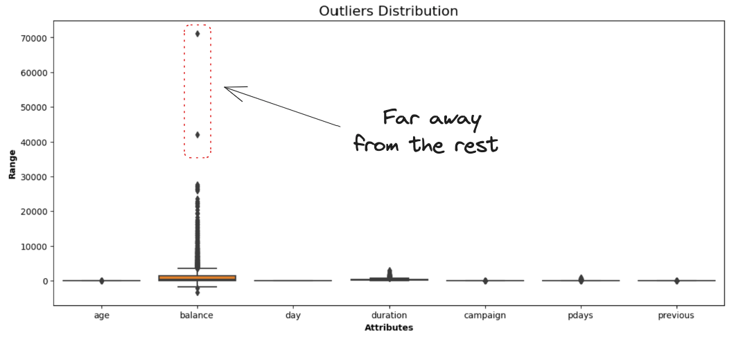
The balance attribute representing the clients' average yearly balance is the only one having data points far away from the rest.
By using the interquartile range approach, we can remove all such points that lie outside the range defined by the quartiles +/-1.5*IQR, where IQR is the InterQuartile Range.
The overall logic is implemented in the remove_outliers helper function.
def remove_outliers(data):

  df = data.copy()

  for col in list(df.columns):

        Q1 = df[str(col)].quantile(0.05)
        Q3 = df[str(col)].quantile(0.95)
        IQR = Q3 - Q1
        lower_bound = Q1 - 1.5*IQR
        upper_bound = Q3 + 1.5*IQR

        df = df[(df[str(col)] >= lower_bound) & (df[str(col)] <= upper_bound)]

  return df
Then, we can apply the function to the data set, and compare the new boxplot to the one before removing the outliers.
without_outliers = remove_outliers(cleaned_data)

# Display the new boxplot
show_boxplot(without_outliers)
Output:

without_outliers.shape

# (4393, 7)
We ended up having a dataset of 4,393 rows and 7 columns, which means that the remaining 127 observations dropped from the data were outliers.
#4. Rescale the data
Given that hierarchical clustering uses Euclidean distance, which is sensitive to variables on different scales, it's better to rescale all the variables prior to distance computing.
The fit_transform function from the StandardScaler class transforms the original data so that each column has a mean of zero and a standard deviation of one.
from sklearn.preprocessing import StandardScaler

data_scaler = StandardScaler()

scaled_data = data_scaler.fit_transform(without_outliers)
scaled_data.shape

# (4393, 7)
The shape of the data remains unchanged (4,393 rows and 7 columns) since the normalization does not affect the shape of the data.
Apply the hierarchical clustering algorithm
We are all set to dive deep into the implementation of the clustering algorithm!
At this stage, we can decide which linkage approach to adopt for the clustering of the method attribute of linkage() function.
Instead of focusing on only one method, let's cover all three linkage techniques using the Euclidean distance.
from scipy.cluster.hierarchy import linkage, dendrogram

complete_clustering = linkage(scaled_data, method="complete", metric="euclidean")
average_clustering = linkage(scaled_data, method="average", metric="euclidean")
single_clustering = linkage(scaled_data, method="single", metric="euclidean")
After computing all three clusterings, the respective dendrograms are visualized using the dendogram function from scipy.cluster module and the pyplot function from matplotlib.
Each dendrogram is organized as follows:
- The
x-axisrepresents the clusters in the data - The
y-axiscorresponds to the distance between those samples. The higher the line, the more dissimilar are those clusters - The appropriate number of clusters is obtained by drawing a horizontal line through that highest vertical line
- The number of intersections with the horizontal line corresponds to the number of clusters
dendrogram(complete_clustering)
plt.show()
Output:

dendrogram(average_clustering)
plt.show()
Output:

When running the single clustering we might face the recursion limit issue. This is tackled by using the setrecursionlimit function with a large enough value:
import sys
sys.setrecursionlimit(1000000)
Now we display the dendrogram:
dendrogram(single_clustering)
plt.show()
Output:

Determine the number of optimal clusters in the dendrograms
The optimal number of clusters can be obtained by identifying the highest vertical line that does not intersect with any other clusters (horizontal line). Such a line is found below with a red circle and green check mark.
- For complete linkage: there is no significant number of clusters generated

- For the average linkage: the difference between the two horizontal orange lines is slightly more than one. We can consider two clusters instead.

- For the single linkage: no clear number of cluster can be determined

Based on the analysis above, the average linkage seems to provide the optimal number of clusters compared to the single and complete linkages which do not provide a clear understanding of the number of clusters.
Now that we have found the optimal number of clusters let's interpret these clusters in the context of the clients' average yearly balance using the cut_tree function.
cluster_labels = cut_tree(average_clustering, n_clusters=2).reshape(-1, )
without_outliers["Cluster"] = cluster_labels

sns.boxplot(x='Cluster', y='balance', data=without_outliers)
From the above boxplot, we can observe that:
- Clients from cluster 0 possess the highest average annual balance
- Borrowers from cluster 1 have a comparatively lower average annual balance
Conclusion
Congratulations!!!
