Leveraging management dashboards for storytelling: a viable pathway?
The phrase "storytelling with data" has been enjoying a surge in popularity recently. This trend is evident for me in the growing viewership of my articles and the increasing number of attendees at the workshops I facilitate on this topic. Concurrently, there has been an encouraging uptick in the valuable resources in this field. This represents a stark contrast to the landscape in 2018 or 2019 when I first delved into this subject and found scarce useful information except for excellent books and other content published by Cole Nussbaumer Knafflic or Brent Dykes.
In one of his posts, Brent Dykes[1], splits the process of crafting a compelling story into three steps:
- Storyframing: this stage involves an in-depth exploration of data, with a specific focus on unique dimensions and metrics.
- Storyforming: at this phase, any anomalies or trends detected previously are subjected to a thorough investigation. Essentially, this is where we cultivate insights. It's vital at this stage to evaluate the importance of our findings for the business, understand their origins, and identify the reasons behind their occurrence. Typically, this process requires multiple cycles of discovery, analysis, and conclusion drawing, which further refines the research scope and necessitates a more focused analysis of the data.
- Storytelling: at this stage, we make decisions about how to use the insights we've unearthed. If we decide to share these findings with a broader audience, the act of storytelling becomes crucial. In this step, we polish the narrative, design supportive visuals, and prepare appropriate commentary.
According to Dykes, management dashboards primarily demonstrate their worth during the initial stage. They facilitate multi-dimensional data analysis through effective filtering techniques and enable the user to delve into details or take a broader view of the data using drill-down or drill-up functions. Consequently, they assist in identifying patterns or anomalies in the data.
Dykes says:
… there was a major problem – I have never believed dashboards tell data stories. Nothing I saw in this BI platform (or any other) has convinced me otherwise. Because the data in automated dashboards is constantly refreshing, potential story points become moving targets – coming and going, shifting, and evolving.
On one hand, it's challenging not to agree with his viewpoint, isn't it? However, on the other hand, is that the case? I propose that management dashboards might play a more crucial part in the Storytelling process. Let's dive deeper into their functionality and explore how we can enhance their role in this process.
What is a management dashboard?
In essence, a management dashboard serves as an information management tool that enables users to track key performance indicators (KPIs) and/or key result indicators (KRIs), both financial and non-financial, that are crucial for running any business. Generally, these dashboards are employed to present current or historical data, but increasingly, they are also incorporating forecasting or scenario planning capabilities. There are three key types of management dashboards:
• Operational: these are typically used to address the query, "What is the current situation?" They often house real-time or very recent data.
• Strategic: utilized primarily by senior managers to monitor KRIs and KPIs, these usually showcase historical data for a broader perspective and frequently include financial data.
• Analytical: these dashboards are data-rich and used to analyze trends, relationships, or anomalies based on historical or predicted data.
Each of these dashboard types is fundamentally unique, catering to different users, fulfilling distinct needs, and hence, necessitating varied design approaches.
This implies that they can also be designed in alignment with storytelling principles, especially the operational and strategic dashboards.
How to design a management dashboard following storytelling with data principles?
This can be achieved through:
- Applying narrative structure
- Applying visual hierarchy
- Using correct visuals
- Using interactivity
- Communicating with the recipients.
1.Applying narrative structure
Here we could use the concept of "storytelling arch" Brent Dykes advocates [2] for static storytelling exercises (such as PowerPoint presentations).

Here is how I translated this concept to the management dashboard:

The guiding principle behind this concept centers on the organization of information within the dashboard. At the very top, we should showcase the most vital, consolidated, and high-level information. Depending on the issue at hand, the user can then decide whether to engage with the rest of the dashboard. As we move further down the report page, the analysis can become increasingly intricate, encompassing additional dimensions or offering the capacity to drill down for more detail. Toward the end (or perhaps to the side) of the report or key visual, a dedicated recommendation area should be included. This should help users understand whether the observed changes are positive or negative, and what implications they may hold for the business. For example, this could take the form of a forecast generated directly within the dashboard.
2. Applying visual hierarchy
Another critical aspect of dashboard design is the creation of a visual hierarchy. The goal is to ensure that all important elements are easily visible and readily accessible. This can be achieved by manipulating colors, sizes, or spatial positioning.
Below, I present two examples illustrating the application of visual hierarchy. The top image demonstrates how a chart can alter upon selecting a measure ("Current year"). The bottom image, on the other hand, offers a perspective on visual hierarchy applied at the report level. Both these visualizations were crafted using Power BI.

Alignment also plays a crucial role in establishing a visual hierarchy. It's essential to align all visuals appropriately to avoid inadvertently implying that one is more or less significant than the other. Most contemporary dashboard tools offer alignment features, with guidelines being particularly handy. The following image illustrates the use of such guidelines in Power BI.

Another key suggestion is to incorporate as much "white space" as possible: allow your dashboard to breathe. Keeping this in mind while designing your report will lead to a more user-friendly layout. It will help prevent information overload and enhance the likelihood of effectively communicating the intended message. Here's my rendition of what a well-balanced dashboard might resemble (white is actually grey).

3. Using correct visuals
What is a correct visual?
Let me clarify by sharing what it's not. Simply input "Best storytelling interactive visualization" into the Google search engine and you'll be flooded with countless examples. Don't misunderstand me, the majority of these are incredibly effective and visually appealing. However, they also require a significant investment of time and resources to create, making them less feasible for real-world use. So, what visuals will indeed be utilized? Undoubtedly, the following three stand out:

Does it always have to be only these three graphs?
Fortunately, no. Depending on the specific purpose, several other chart types may also serve effectively. For example, you might contemplate incorporating a bullet or summary chart into the "Problem" area.


I'm particularly fond of utilizing mini charts, as they fulfill two functions. First, they provide information. Users can gain a general understanding of the trend at hand. Second, they serve a navigational purpose. Users can click on a chart that catches their interest or highlights a significant disruption.

4. Using interactivity
Interactivity is an area where management dashboards should truly shine. In my opinion, interactivity spans two dimensions – one at the level of the tool or process, and the other at the level of the data or report.
Looking at the tool or process level, interactivity can be evaluated from three perspectives:
- The frequency of data updates within each dashboard.
- The ease of accessing data and enabling collaboration. For example, can users share the dashboard internally and externally (keeping security concerns in mind)? Is IT intervention required to access a report or can users manage this independently?
- The speed of the dashboard. Trust me, in this day and age, no one has the patience for slow-performing dashboards.
At the data or report level, interactivity can be introduced through the following tools:
- Filters and sliders: these are commonly used. The higher the recipient is in the corporate hierarchy, the fewer filters should be present on a single dashboard page. These filters should also function across tabs and allow for a global reset (i.e., removing all filters from a specific tab or the entire dashboard).
- Alerts: emails or push notifications help motivate users to visit the dashboard when new data is availalbe. They must be balanced in terms of content and frequency to prevent them from ending up in spam folders.
- Zoom-in feature: this is particularly useful for cluttered report pages with multiple visualizations.
- Links: connections between pages or visualizations can improve user navigation.
- Drill-through and drill-down options (and occasionally, drill-up): allow to dive deep into data or take a broader perspective if needed.
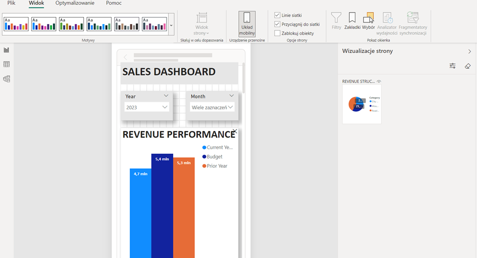
Lastly, consideration should be given to creating a mobile-optimized view of the report for better accessibility.
5. Communicating with the recipients
One aspect that often gets overlooked by many designers is the dialogue with the recipients. It can manifest in various forms. One such form includes documenting all necessary definitions, calculation assumptions, or even the name of the report's author or owner, making it easier for individuals to seek clarification about the report.
A novel form that's available in Power BI is the "intelligent narrative." While it's not flawless (especially in languages like Polish), it can provide some fundamental information about the visualizations displayed on a particular page.
Finally, tool-tips represent another mode of communication, and they can typically be customized to suit user preferences. Thanks to tool-tips, users can obtain precise information on a specific data point.

Conclusions
In summary, I hope this piece has painted a clear picture of how, with a touch of effort, dashboards can become powerful tools in the storytelling process. By focusing on thoughtful report design and visual hierarchy, selecting the right visuals, incorporating interactivity, and actively engaging with dashboard users, you can elevate your data presentation to a whole new level. Let's harness the power of dashboards to craft compelling narratives from our data!
Visit my YouTube (in Polish, films with EN subtitles available).
References:
[1] Dykes, Brent, Storyframing And Storyforming: Two Essential Steps That Precede Data Storytelling, February 22, 2023.
[2] Dykes, Brent, Effective Data Storytelling: How to Drive Change with Data, Narrative and Visuals, December 17, 2019.
