Live Graphs with FFmpeg to Enhance your Data Storytelling
Introduction
There are tons of open source data visualization libraries available for creating graphs but most have limited functionality for creating dynamic moving plots. The most common approach is to generate various images and animate them together into a .mp4 or .gif file using online converters subject to various limitations which you can only get avoid by paying.
Below are a few of the restrictions I found for the free online converters:
- 200 mb upload max
- 100 image upload max
- Up to 800 pixel resolution
- Watermark on output video

FFmpeg is an open-source software tool for efficiently manipulating audio and visual data. The spelled out form of FFmpeg is Fast Forward Moving Picture Experts Group and is used in the backend by major companies such as VLC and Youtube. Despite its wide use behind the scenes in these big applications, it remains a largely unused tool by the typical data scientist.

In this article, we will demonstrate how high quality videos without any major restrictions can be done using FFmpeg. We'll use some public S&P 500 data available here in GitHub with all the corresponding code.
Generalized Approach
For this tutorial we'll use Matplotlib and FFMpeg. FFmpeg can be downloaded here and there are various online guides to assist with the installation process.
Generating the live graphs is straightforward and just requires a single line of code on FFmpeg. In this tutorial we will first generate a series of imaged which we will compile into a video .mp4 file by following the three simple steps illustrated below.

In the next section we will compile images using FFmpeg but running the visualization code in a loop and saving each image needs to be done beforehand.

Developing Live Graphs
First create a folder where all the generated images are stored. With the command prompt, navigate to that directory.
Now we can use the line below to generate a video taking in frames names from Figure0001.png to Figure000N.png and outputs the file as out1.mp4. The name can be changed to whatever you labeled your images as. Also the -r 60 controls the framerate so with the code below, the output video will have 60 frames per second.
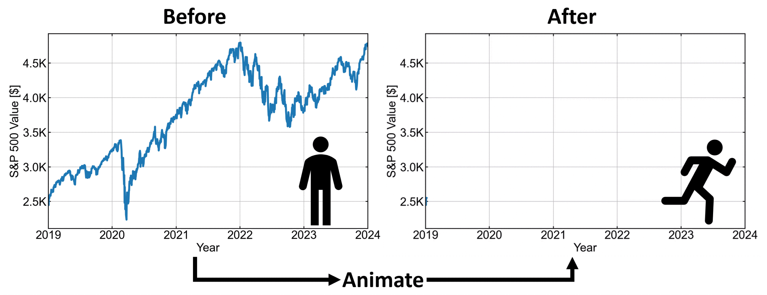
ffmpeg -r 60 -i Figure000%d.png -pix_fmt yuv420p out1.mp4After running that code in the working directory with all the images we get our first neat Animation of our S&P 500 data from 2019–2024.

Since we're now plotting in time we can style our graph to better highlight whatever it is we want to show. We can just change how we are plotting each image and them compile them again with the same Ffmpeg code. For example with the new animation below we can talk through the data more easily showing the impact from covid and how quickly the S&P 500 recovered from it.

The generated .mp4 files can also be easily converted to gif using the following code where the fps can be defined:
ffmpeg -i out1.mp4 -filter_complex "[0:v] fps=24,scale=1000:-1, split [a][b];[a] palettegen [p];[b][p] paletteuse" output.gifNote that the gifs generated with the above code will have the same duration as the original video and modifying the fps just changes the steps between when a frame is taken from the original video as shown below:


Other Uses of FFmpeg
FFmpeg has various other uses than just compiling images into videos. With just matplotlib for example images can be annotated and then created into videos on FFmpeg. FFmpeg can also be used to extract frames from a video, change the audio or formatting, and many other uses.
Below is an example from my masters where I used drone footage as the background to visualize object detection and tracking data. I found FFmpeg to be the best way for creating high quality videos for enhanced data storytelling.

