Machine Learning, Illustrated: Evaluation Metrics for Classification
I realized through my learning journey that I'm an incredibly visual learner and I appreciate the use of color and fun illustrations to learn new concepts, especially scientific ones that are typically explained like this:

From my previous articles, through tons of lovely comments and messages (thank you for all the support!), I found that several people resonated with this sentiment. So I decided to start a new series where I'm going to attempt to illustrate machine learning and Computer Science concepts to hopefully make learning them fun. So, buckle up and enjoy the ride!
Let's begin this series by exploring a fundamental question in machine learning: how do we evaluate the performance of classification models?
In previous articles such as Decision Tree Classification and Logistic Regression, we discussed how to build classification models. However, it's crucial to quantify how well these models are performing, which begs the question: what metrics should we use to do so?
To illustrate this concept, let's build a loan repayment classification model.
Our goal is to predict whether an individual is likely to repay their loan based on their credit score. While other variables like age, salary, loan amount, loan type, occupation, and credit history may also factor into such a classifier, for the sake of simplicity, we'll only consider credit score as the primary determinant in our model.
Following the steps laid out in the Logistic Regression article, we build a classifier that predicts the probability that someone will repay the loan based on their credit score.

From this, we see that the lower the credit score, the more likely it is that the person is not going to repay their loan and vice-versa.
Right now, the output of this model is the probability that a person is going to repay their loan. However, if we want to classify the loan as going to repay or not going to repay, then we need to find a way to turn these probabilities into a classification.
One way to do that is to set a threshold of 0.5 and classify any people below that threshold as not going to repay and any above it as going to repay.

From this, we deduce that this model will classify anyone with a credit score below 600 as not going to repay (pink) and above 600 as going to repay (blue).

Using 0.5 as a cutoff, we classify this person with a credit score of 420 as…

…not going to repay. And this person with a credit score of 700 as…

…going to repay.
Now to test out how effective our model is, we need way more than 2 people. So let's dig through past records and collect information about 10,000 people's credit scores and if they repaid or did not repay their loans.

NOTE: In our records, we have 9500 people that repaid their loan and only 500 that didn't.
We then run our classifier on each person and based on their credit scores we predict if the person is going to repay their loan or not.
Confusion Matrix
To better visualize how our predictions compared with the truth, we create something called a confusion matrix.

In this specific confusion matrix, we consider an individual who repaid their loan as a Positive label and an individual who did not repay their loan as a Negative label.
- True Positives (TP): People that actually repaid their loan and were correctly classified by the model as going to repay
- False Negatives (FN): People that actually repaid their loan, but were incorrectly classified by the model as not going to repay
- True Negatives (TN): People that in reality didn't repay their loans and were correctly classified by the model as not going to repay
- False Positives (FP): People that in reality didn't repay their loans, but were incorrectly classified by the model as going to repay
Now imagine, we passed information about the 10,000 people through our model. We end up with a confusion matrix that looks like this:

From this, we can deduce that –
- Out of 9500 people that repaid their loan – 9000 were correctly classified (TP) and 500 were incorrectly classified (FN)
- Out of the 500 people that didn't repay their loan – 200 (TN) were correctly classified and 300 (FP) were incorrectly classified.
Accuracy
Intuitively, the first thing we ask ourselves is: how accurate is our model?

In our case, accuracy is:

92% accuracy is certainly impressive, but it's important to note that accuracy is often a simplistic metric for evaluating model performance.
If we take a closer look at the confusion matrix, we can see that while many individuals who repaid their loans were correctly classified, only 200 out of the 500 individuals who did not repay were correctly labeled by the model, with the other 300 being incorrectly classified.
So let's explore some other commonly used metrics that we can use to assess the performance of our model.
Precision
Another question we can ask is: what percentage of individuals predicted as going to repay actually repaid their loans?

To calculate precision, we can divide the True Positives by the total number of predicted Positives (i.e., individuals classified as going to repay).

So when our classifier predicts that a person is going to repay, our classifier is right 96.8% of the time.
Sensitivity (aka Recall)
Next, can ask ourselves: what % of individuals who actually repaid their loan does our model correctly identify as going to repay?

To compute sensitivity, we can take the True Positives and divide them by the total number of individuals who actually repaid their loans.

The classier correctly labeled 94.7% of people that actually repaid their loan and the rest it incorrectly labeled not going to repay.
NOTE: The terms used in Precision and Sensitivity formulas can be confusing at times. One simple mnemonic to differentiate between the two is to remember that both formulas use TP (True Positive), but the denominators differ. Precision has (TP + FP) in the denominator, while Sensitivity has (TP + FN).
To remember this difference, think of the "P" in FP matching the "P" in Precision:

and that leaves FN, which we find in the denominator of Sensitivity:

F1 Score
Another useful metric that combines sensitivity and precision is the F1 score, which calculates the harmonic mean of precision and sensitivity.

F1 Score in our case:

Usually the F1 score provides a more comprehensive evaluation of model performance. Thus, the F1 score is typically a more useful metric than accuracy in practice.
Specificity
Another critical question to consider is specificity, which asks the question: what % of individuals who did not repay their loans were correctly identified as not going to repay?

To calculate specificity, we divide the True Negatives by the total number of individuals who didn't repay their loans.

We can see that our classifier only correctly identifies 40% of individuals who didn't repay their loans.
This stark difference between specificity and the other evaluation metrics emphasizes the significance of selecting the appropriate metrics to assess model performance. It is crucial to consider all evaluation metrics and interpret them appropriately, as each may provide a distinct perspective on the model's effectiveness.
NOTE: I often find it helpful to combine various metrics or devise my own metric based on the problem at hand
In our scenario, accurately identifying individuals who will not repay their loans is more critical, as providing loans to such individuals can incur significant costs compared to rejecting loans for those who will repay. So we need to think about ways to improve its performance to do that.
One way to achieve this is by adjusting the threshold value for classification.
Although doing so may seem counterintuitive, what is important to us is to correctly identify the individuals who are not going to repay their loans. Thus, incorrectly labeling people who are actually going to repay is not as essential to us.
By adjusting the threshold value, we can make our model more sensitive to the Negative class (people who aren't going to repay) at the expense of the Positive class (people who are going to repay). This may increase the number of False Negatives (classifying people who repaid as not going to repay), but can potentially reduce False Positives (failing to correctly identify people who didn't repay).
Until now we used a threshold of 0.5, but let's try changing it around to see if our model performs better.
Let's start by setting the threshold to 0.

This means that every person will be classified as going to repay (represented by blue):

This will result in this confusion matrix:

…with accuracy:

…sensitivity and precision:

…and specificity:

At threshold = 0, our classifier is not able to correctly classify any of the individuals who didn't repay their loans, rendering it ineffective even though the accuracy and sensitivity may seem impressive.
Let's try a threshold of 0.1:

So any person with a credit score of below 420 will be classified as not going to repay. This results in this confusion matrix and metrics:


Again we see that all the metrics except specificity are pretty great.
Next, let's go to the other extreme and set the threshold to 0.9:

So any person below a credit score of 760 is going to be labeled not going to repay. This will result in this confusion matrix and metrics:


Here, we see the metrics are almost flipped. The specificity and precision are great, but the accuracy and sensitivity are terrible.
You get the idea. We can do this for a bunch more thresholds (0.004, 0.3, 0.6, 0.875…). But doing so will result in a staggering number of confusion matrices and metrics. And this will cause a lot of confusion. Pun definitely intended.

ROC Curve
This is where Receiver Operating Characteristics (ROC) curve comes in to dispel this confusion.
The ROC curve summarizes and allows us to visualize the classifier's performance over all possible thresholds.
The y-axis of the curve is the True Positive Rate, which is the same as Sensitivity. And the x-axis is the False Positive Rate, which is 1-Specificity.

The False Positive Rate tells us the proportion of people that didn't repay that were incorrectly classified as going to repay (FP).
So when threshold = 0, from earlier we saw that our confusion matrix and metrics were:

We know that the and the True Positive Rate = Sensitivity = 1 and the False Positive Rate = 1 - Specificty = 1 - 0 = 1.
Now let's plot this information on the ROC curve:

This dotted blue line shows us where the True Positive Rate = False Positive Rate:

Any point on this line means that the proportion of correctly classified people that repaid is the same as the proportion of incorrectly classified people that didn't repay.
The key is that we want our threshold point to be as far away from the line to the left as possible and we don't want any point below this line.
Now when threshold = 0.1:

Plotting this threshold on the ROC curve:

Since the new point (0.84, 0.989) is to the left of the blue dotted line, we know that the proportion of correctly classified people that repaid is greater than the proportion of incorrectly classified people that didn't repay.
In other words, the new threshold is better than the first one on the blue dotted line.
Now let's increase the threshold to 0.2. We calculate the True Positive Rate and False Positive Rate for this threshold and plot it:

The new point (0.75, 0.98) is even further to the left of the dotted blue line, showing that the new threshold is better than the previous one.
And now we keep repeating the same process with a couple of other thresholds (=0.35, 0.5, 0.65, 0.7, 0.8, 1) until threshold = 1.

At threshold = 1, we are at the point (0, 0) where True Positive Rate = False Negative Rate = 0 since the classifier classifies all the points as not going to repay.
Now without having to sort through all the confusing matrices and metrics, I can see that:
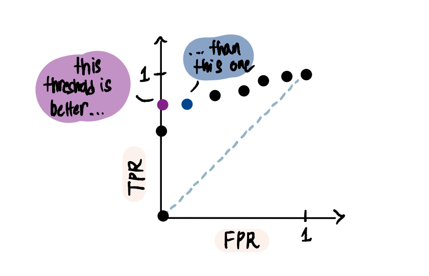
Because at the purple point when TPR = 0.8 and FPR = 0,

In other words, this threshold resulted in no False Positives. Whereas at the blue point, although 80% of the people that repaid are correctly classified only 80% of the people that did not repay are correctly classified (as opposed to 100% for the previous threshold).
Now if we connect all these dots…

…we end up with the ROC curve.
AUC
Now let's say we want to compare two different classifiers that we build. For instance, the first classifier is the logistic regression one we were looking at so far which resulted in this ROC curve:

And we decided to build another decision tree classifier that resulted in this ROC curve:

Then a way to compare both classifiers is to calculate the areas under their respective curves or AUCs.

Since the AUC of the logistic regression curve is greater, we conclude that it is a better classifier.
In summary, we discussed commonly used metrics to evaluate classification models. However, it is important to note that the selection of metrics is subjective and depends on understanding the problem at hand and the business requirements. It may also be useful to use a combination of these metrics or even create new ones that are more appropriate for the specific model's needs.
Massive shoutout to StatQuest, my favorite statistics and Machine Learning resource. And please feel free to connect with me on LinkedIn or shoot me an email at [email protected].
