Pearson vs Spearman Correlation: Find Harmony between the Variables
Consider a symphony orchestra tuning their instruments before a performance. Each musician adjusts their notes to harmonize with others, ensuring a seamless musical experience. In Data Science, the variables in a dataset can be compared to the orchestra's musicians: understanding the harmony or dissonances between them is crucial.

Correlation is a statistical measure that acts like the conductor of the orchestra, guiding the understanding of the complex relationships within our data. Here we will focus on two types of correlations: Pearson and Spearman.
If our data is a composition, Pearson and Spearman are our orchestra's conductors: they have a singular style of interpreting the symphony, each with peculiar strengths and subtleties. Understanding these two different methodologies will allow you to extract insights and understand the connections between variables.
Pearson Correlation
The Pearson correlation coefficient, denoted as r, quantifies the strength and direction of a linear relationship between two continuous variables [1]. It is calculated by dividing the covariance of the two variables by the product of their standard deviations.

Here X and Y are two different variables, and _Xi and _Yi represent individual data points. bar{X} and bar{Y} denote the mean values of the respective variables.
The interpretation of r relies on its value, ranging from -1 to 1. A value of -1 implies a perfect negative correlation, indicating that as one variable increases, the other decreases linearly [2]. Conversely, a value of 1 signifies a perfect positive correlation, illustrating a linear increase in both variables. A value of 0 implies no linear correlation.
Pearson correlation is particularly good at capturing linear relationships between variables. Its sensitivity to linear patterns makes it a powerful tool when investigating relationships governed by a consistent linear trend. Moreover, the standardized nature of the coefficient allows for easy comparison across different datasets.
However, it's crucial to note that Pearson is susceptible to the influence of outliers. If a dataset contains extreme values they can impact the calculation, leading to inaccurate interpretations.
Technical concepts can be better understood through practical examples. Let's use Python to show the computation of Pearson correlation and its visualization. Suppose we have two lists representing the hours spent studying (X) and the corresponding exam scores (Y).
import numpy as np
from scipy.stats import pearsonr
import matplotlib.pyplot as plt
import seaborn as sns

# Generating data points
np.random.seed(42)  # For reproducibility
hours_studied = np.random.randint(8, 25, size=50)
exam_scores = 60 + 2 * hours_studied + np.random.normal(0, 5, size=50)

# Calculate Pearson correlation coefficient
pearson_corr, _ = pearsonr(hours_studied, exam_scores)

# Calculate Pearson correlation line coefficients
m, b = np.polyfit(hours_studied, exam_scores, 1)  # Fit a linear regression line

# Scatter plot
fig, ax = plt.subplots()
ax.scatter(hours_studied, exam_scores, color=sns.color_palette("hls",24)[14], alpha=.9, label='Data points')
plt.plot(hours_studied, m * np.array(hours_studied) + b, color='red', alpha=.6, label='Pearson Correlation Line')
plt.title("Hours Studied vs. Exam Scores")
plt.xlabel("Hours Studied")
plt.ylabel("Exam Scores")
plt.legend(loc='lower right')
ax.spines['top'].set_visible(False)
ax.spines['bottom'].set_visible(False)
ax.spines['right'].set_visible(False)
ax.spines['left'].set_visible(False)
ax.xaxis.set_ticks_position('none')
ax.yaxis.set_ticks_position('none')

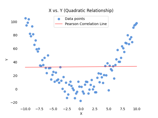
Pearson correlation effectiveness diminishes when faced with curvilinear patterns. This limitation arises from Pearson's inherent assumption of linearity, making it ill-suited to capture the nuances of non-linear relationships.

Consider a scenario where the relationship between two variables follows a quadratic curve. Pearson correlation might inaccurately suggest a weak or nonexistent relationship due to its inability to capture the non-linear relation.
# Generating quadratic data
np.random.seed(42)
X = np.linspace(-10, 10, 100)
Y = X**2 + np.random.normal(0, 10, size=len(X))

# Calculate Pearson correlation coefficient
pearson_corr, _ = pearsonr(X, Y)

m, b = np.polyfit(X, Y, 1)  # Fit a linear regression line

# Scatter plot
fig, ax = plt.subplots()
ax.scatter(X, Y, color=sns.color_palette("hls",24)[14], alpha=.9, label='Data points')
plt.plot(X, m * X + b, color='red', alpha=.6, label='Pearson Correlation Line')
plt.title("X vs. Y (Quadratic Relationship)")
plt.xlabel("X")
plt.ylabel("Y")
plt.legend(loc='upper center')
ax.spines['top'].set_visible(False)
ax.spines['bottom'].set_visible(False)
ax.spines['right'].set_visible(False)
ax.spines['left'].set_visible(False)
ax.xaxis.set_ticks_position('none')
ax.yaxis.set_ticks_position('none') 
Spearman Correlation
Spearman correlation addresses the limitations of Pearson when applied to non-linear relationships or datasets containing outliers [3]. Spearman's rank correlation coefficient (ρ), denoted as rho, operates on the ranked values of variables, making it less sensitive to extreme values and well-suited for capturing monotonic relationships.

In the above formula, _di represents the difference between the ranks of corresponding pairs of variables, and n is the number of data points.
Similar to Pearson, Spearman's coefficient ranges from -1 to 1. A value of -1 indicates a perfect negative monotonic correlation, meaning that as one variable increases, the other consistently decreases. A value of 1 signifies a perfect positive monotonic correlation, illustrating a consistent increase in both variables. A value of 0 denotes no monotonic correlation.
Unlike Pearson, Spearman does not assume linearity and is robust in case of outliers. It focuses on the ordinal nature of data, making it a valuable tool when the relationship between variables is more about the order than the specific values.

Consider the following practical application using Python, where we have two variables ‘A' and ‘B' with a non-linear relationship:
import numpy as np
from scipy.stats import spearmanr
from scipy.stats import pearsonr
import matplotlib.pyplot as plt

# Generating non-linear data
np.random.seed(42)
A = np.linspace(-10, 10, 100)
B = A**5 + np.random.normal(0, 4000, size=len(A))

# Calculate Spearman correlation coefficient
spearman_corr, _ = spearmanr(A, B)
# Calculate Pearson correlation coefficient
pearson_corr, _ = pearsonr(A, B)
m, b = np.polyfit(A, B, 1)  # Fit a linear regression line

# Scatter plot
fig, ax = plt.subplots()
ax.scatter(A, B, color=sns.color_palette("hls",24)[14], alpha=.9, label='Data points')
plt.plot(X, m * X + b, color='red', alpha=.6, label='Pearson Correlation Line')
plt.title("A vs. B (Non-linear Relationship)")
plt.xlabel("A")
plt.ylabel("B")
ax.spines['top'].set_visible(False)
ax.spines['bottom'].set_visible(False)
ax.spines['right'].set_visible(False)
ax.spines['left'].set_visible(False)
ax.xaxis.set_ticks_position('none')
ax.yaxis.set_ticks_position('none')

plt.legend()
In this example, the scatter plot visualizes a non-linear relationship between variables ‘A' and ‘B.' Spearman correlation, which does not assume linearity, will be better suited to capture and quantify this non-linear association. You can see that the red line, representing the Pearson Correlation Line, misses the nature of the variables' relationship.
We can quantify this measure by comparing the two coefficients:

Spearman coefficient is sensibly higher, as it is more suited for this type of relationship.
Conclusion: Pearson vs. Spearman
Concluding this introductory guide, let's point out the pros and cons of the two measures.

Pearson Correlation coefficient is indeed efficient for linear relationship, and can provide a standardized measure for easy comparison across different datasets.
On the other hand, Pearson coefficient is highly sensitive to outliers. Also, assuming linearity may mislead in non-linear scenarios.
Most of Pearson coefficient's downsides are addressed by Spearman Correlation coefficient: it is robust in the presence of outliers, and, as it relies on the rank of data points, it is suitable for non-linear relationships.
It is important, however, to keep in mind that Spearman coefficient has also some criticalities. In my opinion the most relevant ones are its lower efficiency on large datasets, and the potential loss of information in case of tied ranks.
In order to keep this guide concise and practical, my advice is to choose Pearson for linear relationships in normally distributed data without outliers. Opt for Spearman when facing non-linear relationships, ordinal data, or datasets with outliers, as it excels in capturing monotonic associations.
Remember that this choice heavily relies on the characteristics of the data. Keep also in mind that this introduction, while touching most important aspects, merely scratched the surface of statistical methodologies. For further study, you can find an interesting set of resources below!
References
In-text references:
[1] Laerd Statistics – Pearson Product-Moment Correlation
[2] Boston University – Correlation and Regression with R
[3] Analytics Vidhya – Pearson vs Spearman Correlation Coefficients
[4] Statistics by Jim – Spearman's Correlation Explained
Other material:
- An Introduction to Statistical Learning by Gareth James, Daniela Witten, Trevor Hastie, and Robert Tibshirani
- Statistics by Robert S. Witte and John S. Witte
- Understanding Correlation by Kristoffer Magnusson
- A Gentle Introduction to Correlation and Causation by David M Diez
- Discovering Statistics Using IBM SPSS Statistics by Andy Field
- Applied Multivariate Statistical Analysis by Richard A. Johnson and Dean W. Wichern
