Plotly and Pandas: Combining Forces for Effective Data Visualization

"My data visualization skill sucks. My audiences seemed unimpressed with my work, and worse, they are not convinced."
There was once upon a time many of us bumped into this issue. Unless you are gifted or happened to take up a design course before, it could be quite challenging and time-consuming to produce visually aesthetic charts that are intuitive to the audiences at the same time.
Here is what crosses my mind back then: I want to be more intentional in crafting my charts such that it conveys information to my audience intuitively. By that, I mean not expending their brainpower and consuming their time excessively just to make sense of what is happening.
I used to think that switching from Matplotlib to Seaborn and finally to Plotly solve the aesthetics concern. Indeed, I was wrong. Visualization is not simply about aesthetics. Below are two visualizations I attempted to replicate from Storytelling with Data¹ by Cole Nussbaumer Knaflic that really inspire me to change my approach to visualization. They look clean, elegant, and purposeful. We are going to attempt to replicate these charts in this article!

Here is the takeaway of this post. If you are looking for an in-depth explanation of the concepts behind great visualization, check out Storytelling with Data¹, every page is a gem worth your time. If you are looking for tool-specific and practical advice, you are at the right place. Cole mentioned at the start of her book that the advice she presented is universal and tool-agnostic, although she admitted that she created the examples in the book using Excel. Some people, myself included, are not fans of Excel and drag-and-drop tools for many reasons. Some prefer creating visualizations using Python, R, and some other programming languages. If you are part of this segment and use Python as your primary tool, then this article is for you.
Table of Contents
Chaining—Pandas Plot
If you are somewhat of an expert or a seasoned player in using Pandas for data wrangling, you might encounter or even adopt the idea of "Chaining" yourself. In short, chaining allows your code to be a lot more readable, easier to debug, and production ready. Here is a simple example of what I am referring to. You don't have to read line by line, just take a quick look to get the idea behind "Chaining". Every step is clear and easy to explain, and the code is well organized with no unnecessary intermediary variables.
(epl_10seasons
 .rename(columns=lambda df_: df_.strip())
 .rename(columns=lambda df_: re.sub('W+|[!,*)@#%(&$_?.^]', '_', df_))
 .pipe(lambda df_: df_.astype({column: 'int8' for column in (df_.select_dtypes("integer").columns.tolist())}))
 .pipe(lambda df_: df_.astype({column: 'category' for column in (df_.select_dtypes("object").columns.tolist()[:-1])}))
 .assign(match_date=lambda df_: pd.to_datetime(df_.match_date, infer_datetime_format=True))
 .assign(home_team=lambda df_: np.where((df_.home_team == "Arsenal"), "The Gunners", df_.home_team),
         away_team=lambda df_: np.where((df_.away_team == "Arsenal"), "The Gunners", df_.away_team),
         month=lambda df_: df_.match_date.dt.month_name())
 .query('home_team == "The Gunners"')
)
This is great, but did you know that you can continue the chaining process to create basic visualization charts as well? Pandas Plot, by default, uses Matplotlib backend for this purpose. Let's see how it works and reproduce some of the examples Cole created in her book.
import pandas as pd
import numpy as np
import matplotlib.pyplot as plt
import seaborn as sns
import plotly.graph_objects as go
%matplotlib inline

pd.options.plotting.backend = 'plotly'

df = pd.DataFrame({"concerns": ["Engine power is less than expected",
                                "Tires make excessive noise while driving",
                                "Engine makes abnormal/excessive noise",
                                "Seat material concerns",
                                "Excessive wind noise",
                                "Hesitation or delay when shifting",
                                "Bluetooth system has poor sound quality",
                                "Steering system/wheel has too much play",
                                "Bluetooth system is difficult to use",
                                "Front seat audio/entertainment/navigation controls"
                                 ],
                   "concerns per 1,000": [12.9, 12.3, 11.6, 11.6, 11.0, 10.3, 10.0, 8.8, 8.6, 8.2],},
                  index=list(range(0,10,1)))
We have a DataFrame that looks like this.

(df
 .plot
 .barh()
)
This is the fastest way to generate a basic visualization chart. By chaining the .plot attribute and .line method directly from a DataFrame, we obtain the plot below.

Hold your reaction and judgment if you think the plot above does not pass the aesthetic check. Indeed, it looks ugly, to say the least. Let's spice this up and do better. Here's the trick, switch your Pandas plotting backend from Matplotlib to Plotly for the magic that is about to unravel.
pd.options.plotting.backend = 'plotly'You might be questioning, "Why do I change it to Plotly? Isn't Matplotlib capable of doing the same thing?" Well, here's the difference.
If we use the Matplotlib backend in Pandas, it returns an Axes object, try verifying yourself using the built-in type() method. This is great because the axes object allows us to access methods to further modify our chart. Check out this documentation² for the possible methods to perform on Axes object. Let's pick one to illustrate quickly.
(df
 .plot
 .barh()
 .set_xlabel("concerns per 1,000")
)
We successfully set the x-axis label to "concerns per 1,000", but in doing so, we return a Text object and lost our precious Axis object that allows us access to precious methods to further modify our chart. Too bad!
Here is an alternative to get around the limitation above,
(df
 .plot
 .barh(xlabel="Concerns per 1,000", ylabel="Concerns", title="Top 10 design concerns")
)
However, we are still unable to do extensive modification as the integration is quite limited by the Pandas' implementation here.
Plotly, on the other hand, does not return an Axes object. It returns a go.Figure object. The difference here is that the methods responsible for updating the charts also return you a go.Figure object, which allows you to continue chaining your method to further update your chart. Let's try that out!
By the way, in case you are wondering how I get the combinations of methods and arguments below, they are all available on the official documentation here³.
Here are some important methods to get you started – .update_traces, .add_traces, .update_layout, .update_xaxes, .update_yaxes, .add_annotation, .update_annotations.
Horizontal Bar Chart
Let's define a set of color palettes for our visualization below.
GRAY1, GRAY2, GRAY3 = '#231F20', '#414040', '#555655'
GRAY4, GRAY5, GRAY6 = '#646369', '#76787B', '#828282'
GRAY7, GRAY8, GRAY9, GRAY10 = '#929497', '#A6A6A5', '#BFBEBE', '#FFFFFF'
BLUE1, BLUE2, BLUE3, BLUE4, BLUE5 = '#25436C', '#174A7E', '#4A81BF', '#94B2D7', '#94AFC5'
BLUE6, BLUE7 = '#92CDDD', '#2E869D'
RED1, RED2, RED3 = '#B14D4A', '#C3514E', '#E6BAB7'
GREEN1, GREEN2 = '#0C8040', '#9ABB59'
ORANGE1, ORANGE2, ORANGE3 = '#F36721', '#F79747', '#FAC090'

gray_palette = [GRAY1, GRAY2, GRAY3, GRAY4, GRAY5, GRAY6, GRAY7, GRAY8, GRAY9, GRAY10]
blue_palette = [BLUE1, BLUE2, BLUE3, BLUE4, BLUE5, BLUE6, BLUE7]
red_palette = [RED1, RED2, RED3]
green_palette = [GREEN1, GREEN2]
orange_palette = [ORANGE1, ORANGE2, ORANGE3]

sns.set_style("darkgrid")
sns.set_palette(gray_palette)
sns.palplot(sns.color_palette())
Here, we want to highlight the concerns that are equal to and above 10 percent by defining a separate color.
color = np.array(['rgb(255,255,255)']*df.shape[0])
color[df
      .set_index("concerns", drop=True)
      .iloc[::-1]
      ["concerns per 1,000"]>=10] = red_palette[0]
color[df
      .set_index("concerns", drop=True)
      .iloc[::-1]
      ["concerns per 1,000"]<10] = gray_palette[4]
We then create the plot right from the DataFrame.
(df
 .set_index("concerns", drop=True)
 .iloc[::-1]
 .plot
 .barh()
 .update_traces(marker=dict(color=color.tolist()))
)
Updating the layout yields the following. Here, we specify the template, add a title and margin to our plot, and specify the size of our figure object. Let's comment on the annotations for the moment.
(df
 .set_index("concerns", drop=True)
 .iloc[::-1]
 .plot
 .barh()
 .update_traces(marker=dict(color=color.tolist()))
 .update_layout(template="plotly_white",
                title=dict(text="Top 10 design concerns
concerns per 1,000",
                           font_size=30,
                           font_color=gray_palette[4]),
                margin=dict(l=50,
                            r=50,
                            b=50,
                            t=100,
                            pad=20),
                width=1000,
                height=800,
                showlegend=False,
                #annotations=annotations
               )
)
Updating the x and y-axis properties yields the following.
(df
 .set_index("concerns", drop=True)
 .iloc[::-1]
 .plot
 .barh()
 .update_traces(marker=dict(color=color.tolist()))
 .update_layout(template="plotly_white",
                title=dict(text="Top 10 design concerns
concerns per 1,000",
                           font_size=30,
                           font_color=gray_palette[4]),
                margin=dict(l=50,
                            r=50,
                            b=50,
                            t=100,
                            pad=20),
                width=1000,
                height=800,
                showlegend=False,
                #annotations=annotations
               )
 .update_xaxes(title_standoff=10,
               showgrid=False,
               visible=False,
               tickfont=dict(
                        family='Arial',
                        size=16,
                        color=gray_palette[4],),
               title="")
 .update_yaxes(title_standoff=10,
               tickfont=dict(
                        family='Arial',
                        size=16,
                        color=gray_palette[4],),
               title="")
)
Last but not least, we will add some annotations to our chart. Here, we have a few annotations – adding data labels to the horizontal bar chart and footnote. Let's do this together. First, we define the annotations on a separate cell.
annotations = []

y_s = np.round(df["concerns per 1,000"], decimals=2)

# Adding data labels
for yd, xd in zip(y_s, df.concerns):
    # labeling the bar net worth
    annotations.append(dict(xref='x1',
                            yref='y1',
                            y=xd, x=yd - 1,
                            text=str(yd) + '%',
                            font=dict(family='Arial', size=16,
                                      color=gray_palette[-1]),
                            showarrow=False))

# Adding Source Annotations
annotations.append(dict(xref='paper',
                        yref='paper',
                        x=-0.72,
                        y=-0.050,
                        text='Source: Lorem ipsum dolor sit amet, consectetur adipiscing elit, sed do eiusmod tempor incididunt ut labore et dolore magna aliqua. Ut enim ad minim veniam, quis nostrud exercitation ullamco'
                             '
laboris nisi ut aliquip ex ea commodo consequat.',
                        font=dict(family='Arial', size=10, color=gray_palette[4]),
                        showarrow=False,
                        align='left'))
(df
.set_index("concerns", drop=True)
.iloc[::-1]
.plot
.barh()
.update_traces(marker=dict(color=color.tolist()))
.update_layout(template="plotly_white",
title=dict(text="Top 10 design concerns
concerns per 1,000",
font_size=30,
font_color=gray_palette[4]),
margin=dict(l=50,
r=50,
b=50,
t=100,
pad=20),
width=1000,
height=800,
showlegend=False,
annotations=annotations
)
.update_xaxes(title_standoff=10,
showgrid=False,
visible=False,
tickfont=dict(
family='Arial',
size=16,
color=gray_palette[4],),
title="")
.update_yaxes(title_standoff=10,
tickfont=dict(
family='Arial',
size=16,
color=gray_palette[4],),
title="")
)
Isn't this a much better chart relative to the initial default version? Let's continue to explore another popular chart – The Line Chart.
Just a heads up that the example below is more complicated than the one above. Nevertheless, the idea remains the same.
Line Chart
Let's take a quick look at the default Matplotlib plotting backend for Line Chart.
pd.options.plotting.backend = 'matplotlib'

df = pd.DataFrame({"Received": [160,184,241,149,180,161,132,202,160,139,149,177],
                   "Processed":[160,184,237,148,181,150,123,156,126,104,124,140]},
                  index=['Jan', 'Feb', 'Mar', 'Apr', 'May', 'Jun', 'Jul', 'Aug', 'Sep', 'Oct', 'Nov', 'Dec'])

(df
 .plot
 .line()
);
Let's switch our plotting backend to Plotly!
pd.options.plotting.backend = 'plotly'
(df
.plot(x=df.index,
y=df.Received,
labels=dict(index="", value="Number of tickets"),)
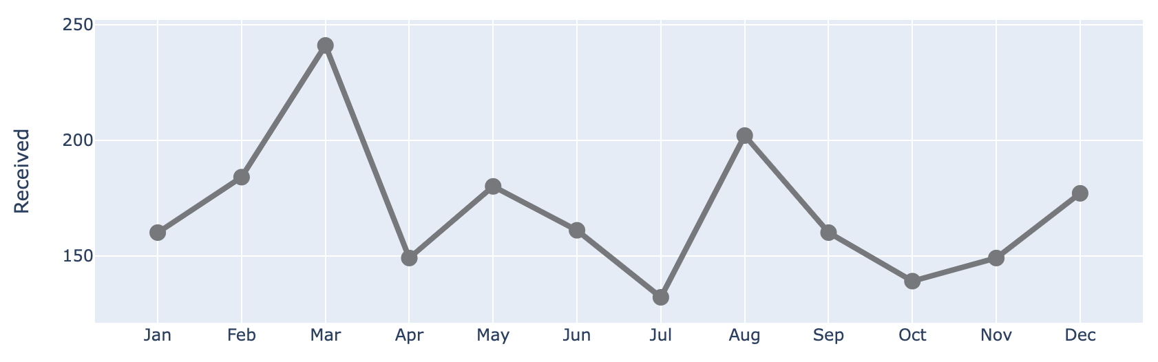
)After switching the Pandas plotting backend to Plotly, the code above gives us the following. Here, we start by plotting only the Received Series.

Let's update the line property by further chaining the method above. Here, we modify the color, width and placing markers at the data points.
(df
 .plot(x=df.index,
       y=df.Received,
       labels=dict(index="", value="Number of tickets"),)
 .update_traces(go.Scatter(mode='lines+markers+text',
                           line={"color": gray_palette[4], "width":4},
                           marker=dict(size=12)),)
)
Let's add the Processed Series to the chart!
(df
 .plot(x=df.index,
       y=df.Received,
       labels=dict(index="", value="Number of tickets"),)
 .update_traces(go.Scatter(mode='lines+markers+text',
                           line={"color": gray_palette[4], "width":4},
                           marker=dict(size=12)),)
 .add_traces(go.Scatter(x=df.index, #Add Processed col
                        y=df.Processed,
                        mode="lines+markers+text",
                        line={"color": blue_palette[0], "width":4},
                        marker=dict(size=12)))
)
Let's add a vertical line at index May in order to show the point at which the two lines start to diverge.
(df
 .plot(x=df.index,
       y=df.Received,
       labels=dict(index="", value="Number of tickets"),)
 .update_traces(go.Scatter(mode='lines+markers+text',
                           line={"color": gray_palette[4], "width":4},
                           marker=dict(size=12)),)
 .add_traces(go.Scatter(x=df.index, #Add Processed col
                        y=df.Processed,
                        mode="lines+markers+text",
                        line={"color": blue_palette[0], "width":4},
                        marker=dict(size=12)))
 .add_traces(go.Scatter(x=["May", "May"], #Add vline
                        y=[0,230],
                        fill="toself",
                        mode="lines",
                        line_width=0.5,
                        line_color= gray_palette[4]))
)
Next, let's update the overall layout by changing the background to white, and adding the title, margin, and some other elements. For annotations, we will comment out at the moment.
(df
 .plot(x=df.index,
       y=df.Received,
       labels=dict(index="", value="Number of tickets"),)
 .update_traces(go.Scatter(mode='lines+markers+text',
                           line={"color": gray_palette[4], "width":4},
                           marker=dict(size=12)),)
 .add_traces(go.Scatter(x=df.index, #Add Processed col
                        y=df.Processed,
                        mode="lines+markers+text",
                        line={"color": blue_palette[0], "width":4},
                        marker=dict(size=12)))
 .add_traces(go.Scatter(x=["May", "May"], #Add vline
                        y=[0,230],
                        fill="toself",
                        mode="lines",
                        line_width=0.5,
                        line_color= gray_palette[4]))
 .update_layout(template="plotly_white",
                title=dict(text="Please approve the hire of 2 FTEs
to backfill those who quit in the past year
Ticket volume over time


",
                           font_size=30,),
                margin=dict(l=50,
                            r=50,
                            b=100,
                            t=200,),
                width=900,
                height=700,
                yaxis_range=[0, 300],
                showlegend=False,
                #annotations=right_annotations,
                )
)
Next, we will perform an update to both the x and y-axes.
(df
 .plot(x=df.index,
       y=df.Received,
       labels=dict(index="", value="Number of tickets"),)
 .update_traces(go.Scatter(mode='lines+markers+text',
                           line={"color": gray_palette[4], "width":4},
                           marker=dict(size=12)),)
 .add_traces(go.Scatter(x=df.index, #Add Processed col
                        y=df.Processed,
                        mode="lines+markers+text",
                        line={"color": blue_palette[0], "width":4},
                        marker=dict(size=12)))
 .add_traces(go.Scatter(x=["May", "May"], #Add vline
                        y=[0,230],
                        fill="toself",
                        mode="lines",
                        line_width=0.5,
                        line_color= gray_palette[4]))
 .update_layout(template="plotly_white",
                title=dict(text="Please approve the hire of 2 FTEs
to backfill those who quit in the past year
Ticket volume over time


",
                           font_size=30,),
                margin=dict(l=50,
                            r=50,
                            b=100,
                            t=200,),
                width=900,
                height=700,
                yaxis_range=[0, 300],
                showlegend=False,
                #annotations=right_annotations,
                )
 .update_xaxes(dict(range=[0, 12],
                    showline=True,
                    showgrid=False,
                    linecolor=gray_palette[4],
                    linewidth=2,
                    ticks='',
                    tickfont=dict(
                        family='Arial',
                        size=13,
                        color=gray_palette[4],
                    ),
 ))
 .update_yaxes(dict(showline=True,
                    showticklabels=True,
                    showgrid=False,
                    ticks='outside',
                    linecolor=gray_palette[4],
                    linewidth=2,
                    tickfont=dict(
                        family='Arial',
                        size=13,
                        color=gray_palette[4],
                    ),
                    title_text="Number of tickets"
 ))
)
Last but not least, we will add some annotations to our chart. Here, we have a few annotations—adding labels to the line chart (Received, Processed), as well as adding labels to scatter points, which could be a little complicated. Let's do this together. First, we define the annotations on a separate cell.
y_data = df.to_numpy()
colors = [gray_palette[3], blue_palette[0]]
labels = df.columns.to_list()

right_annotations = []

# Adding labels to line
for y_trace, label, color in zip(y_data[-1], labels, colors):

    right_annotations.append(dict(xref='paper',
                                  x=0.95,
                                  y=y_trace,
                                  xanchor='left',
                                  yanchor='middle',
                                  text=label,
                                  font=dict(family='Arial',size=16,color=color),
                                  showarrow=False))

# Adding labels to scatter point
scatter_annotations = []

y_received = [each for each in df.Received]
y_processed  = [float(each) for each in df.Processed]
x_index = [each for each in df.index]
y_r = np.round(y_received)
y_p = np.rint(y_processed)

for ydn, yd, xd in zip(y_r[-5:], y_p[-5:], x_index[-5:]):

    scatter_annotations.append(dict(xref='x2 domain',
                                    yref='y2 domain',
                                    y=ydn,
                                    x=xd,
                                    text='{:,}'.format(ydn),
                                    font=dict(family='Arial',size=16,color=gray_palette[4]),
                                    showarrow=False,
                                    xanchor='center',
                                    yanchor='bottom',
                                    ))

    scatter_annotations.append(dict(xref='x2 domain',
                                    yref='y2 domain',
                                    y=yd,
                                    x=xd,
                                    text='{:,}'.format(yd),
                                    font=dict(family='Arial',size=16,color=blue_palette[0]),
                                    showarrow=False,
                                    xanchor='center',
                                    yanchor='top',
                                    ))
After we define the annotations, we just need to put the annotation variable inside the chaining method like the following.
(df
 .plot(x=df.index,
       y=df.Received,
       labels=dict(index="", value="Number of tickets"),)
 .update_traces(go.Scatter(mode='lines+markers+text',
                           line={"color": gray_palette[4], "width":4},
                           marker=dict(size=12)),)
 .add_traces(go.Scatter(x=df.index, #Add Processed col
                        y=df.Processed,
                        mode="lines+markers+text",
                        line={"color": blue_palette[0], "width":4},
                        marker=dict(size=12)))
 .add_traces(go.Scatter(x=["May", "May"], #Add vline
                        y=[0,230],
                        fill="toself",
                        mode="lines",
                        line_width=0.5,
                        line_color= gray_palette[4]))
 .update_layout(template="plotly_white",
                title=dict(text="Please approve the hire of 2 FTEs
to backfill those who quit in the past year
Ticket volume over time


",
                           font_size=30,),
                margin=dict(l=50,
                            r=50,
                            b=100,
                            t=200,),
                width=900,
                height=700,
                yaxis_range=[0, 300],
                showlegend=False,
                annotations=right_annotations,
                )
 .update_layout(annotations=scatter_annotations * 2)
 .update_xaxes(dict(range=[0, 12],
                    showline=True,
                    showgrid=False,
                    linecolor=gray_palette[4],
                    linewidth=2,
                    ticks='',
                    tickfont=dict(
                        family='Arial',
                        size=13,
                        color=gray_palette[4],
                    ),
 ))
 .update_yaxes(dict(showline=True,
                    showticklabels=True,
                    showgrid=False,
                    ticks='outside',
                    linecolor=gray_palette[4],
                    linewidth=2,
                    tickfont=dict(
                        family='Arial',
                        size=13,
                        color=gray_palette[4],
                    ),
                    title_text="Number of tickets"
 ))
 .add_annotation(dict(text="2 employees quit in May. We nearly kept up with incoming volume
in the following two months, but fell behind with the increase in Aug
and haven't been able to catch up since.",
                      font_size=18,
                      align="left",
                      x=7.5,
                      y=265,
                      showarrow=False))
 .add_annotation(dict(xref='paper',
                        yref='paper',
                        x=0.5,
                        y=-0.15,
                        text='Source: Lorem ipsum dolor sit amet, consectetur adipiscing elit, sed do eiusmod tempor incididunt ut labore et dolore magna aliqua. Ut enim ad minim veniam, quis nostrud exercitation ullamco'
                             '
laboris nisi ut aliquip ex ea commodo consequat.',
                        font=dict(family='Arial',
                                  size=10,
                                  color='rgb(150,150,150)'),
                        showarrow=False,
                        align='left'))
 .update_annotations(yshift=0)
 .show()
)
Bonus: Number Chart
Congratulations on getting to this part of the article! Here is an additional plot for you to take away! Here we are creating a chart to aesthetically present a number by itself. In short, this is what I am referring to.

Since this is not a result of a DataFrame, we can start off by creating an empty go.Figure object from scratch, then gradually add on the annotations. We then end off by updating the layout accordingly.
(go
 .Figure() # Create an empty figure
 .add_annotation(
    x=0.0,
    y=1,
    text='Pilot program was a success',
    showarrow=False,
    font={'size': 36, 'color': 'white'},
    bgcolor=gray_palette[-3],
    bordercolor='gray',
    borderwidth=0,
    xref='paper',
    yref='paper',
    xanchor='left',
    yanchor='top',
    align='left',
    ax=0,
    ay=-10
 )
 .add_annotation(
    x=-1.0,  # X-coordinate of the text position
    y=3.0,  # Y-coordinate of the text position
    text="After the pilot program,",  # The text content
    showarrow=False,  # Hide the arrow
    font=dict(size=20,
              color=blue_palette[1]),  # Customize the font size
    xanchor='left',
    yanchor='top',
    align='left',
 )
 .add_annotation(
    x=-1.0,  # X-coordinate of the text position
    y=1.6,  # Y-coordinate of the text position
    text="68%",  # The text content
    showarrow=False,  # Hide the arrow
    font=dict(size=160,
              color=blue_palette[1]),  # Customize the font size
    xanchor='left',
    align='left',
 )
 .add_annotation(
    x=-1.0,  # X-coordinate of the text position
    y=0.2,  # Y-coordinate of the text position
    text="of kids expressed interest towards science,",  # The text content
    showarrow=False,  # Hide the arrow
    font=dict(size=20,
              color=blue_palette[1]),  # Customize the font size
    xanchor='left',
    align='left',
 )
 .add_annotation(
    x=-1.0,  # X-coordinate of the text position
    y=-0.2,  # Y-coordinate of the text position
    text="compared to 44% going into the program.",  # The text content
    showarrow=False,  # Hide the arrow
    font=dict(size=20,
              color=gray_palette[-3]),  # Customize the font size
    xanchor='left',
    align='left',
 )
 .add_annotation(
    x=-1.0,  # X-coordinate of the text position
    y=-0.7,  # Y-coordinate of the text position
    text='Based on survey of 100 students conducted '
         'before and after pilot program '
         '(100% response rate on both surveys).',  # The text content
    showarrow=False,  # Hide the arrow
    font=dict(size=10.5,
              color=gray_palette[-3]),  # Customize the font size
    xanchor='left',
    align='left',
 )
 .update_layout(
    xaxis=dict(visible=False),  # Hide x-axis
    yaxis=dict(visible=False),  # Hide y-axis
    margin=dict(l=0,
                r=0,
                b=0,
                t=0,
                pad=0),
    font=dict(size=26,
              color=gray_palette[-3]),  # Customize the font size
    paper_bgcolor='rgba(0,0,0,0)',
    plot_bgcolor='rgba(0,0,0,0)'
 )
 .show()
)
Afterword
There you have it! The key is to update and refine your plot step by step until you achieve a desirable result. Of course, every technique comes with its own limitations. If your chart is getting way too complicated to produce, it might be beneficial to refer to Plotly Express or even build everything from scratch using Plotly Graph Objects. It may seem difficult and unfamiliar to adopt this technique at first, but keep practicing and soon you will create beautiful visualization that makes sense!
If you pick up something useful from this article, do consider giving me a Follow on Medium. Easy, 1 article a week to keep yourself updated and stay ahead of the curve!
