Professionally Visualize Data Distributions in Python

Exploratory data analysis and data visualization often includes inspecting a dataset's distribution. Doing so provides important insights into the data, such as identifying the range, outliers or unusual groupings, the data's central tendency, and skew within the data. Comparing subsets of the data can reveal even more information about the data on hand. A professionally built visualization of a dataset's distribution will provide immediate insights. This guide details several options for quickly using Python to create those clean, meaningful visualizations.
Visualizations covered:
- Histograms
- KDE (Density) Plots
- Joy Plots or Ridge Plots
- Box Plots
- Violin Plots
- Strip and Swarm Plots
- ECDF Plots
Data and Code:
This article uses completely synthetic weather data generated following the concepts in one of my previous articles. The data for this article and the full Jupyter notebook are available at this linked GitHub page. Feel free to download both and follow along, or reference the code blocks below.
The libraries, imports, and settings used for this are as follows:
# Data Handling:
import pandas as pd
from pandas.api.types import CategoricalDtype

# Data Visualization Libraries:
import seaborn as sns
import matplotlib.pyplot as plt
import plotly.express as px
from joypy import joyplot

# Display Configuration:
%config InlineBackend.figure_format='retina'
The Data:
First, let's load in and prepare the data, which is a simple synthetic weather dataframe showing various temperature readings for 3 cities across the 4 seasons.
# Load data:
df = pd.read_csv('weatherData.csv')

# Set season as a categorical data type:
season = CategoricalDtype(['Winter', 'Spring', 'Summer', 'Fall'])
df['Season'] = df['Season'].astype(season)
Note that the code sets the Season column to a categorical data type. This will be useful later in the article. The data's Location column is City A, B, or C; the Season column is the four seasons; the Entry column is an ID associated with each set of entries across the four seasons; and the Temp column contains temperatures in Fahrenheit:

Now that we have our data, let's explore some visualizations.
1. The Histogram
Let's start with the well-known histogram, which places values into bins along the x-axis and, along the y-axis, counts the frequency with which observations fall into those bins. Creating one is simple with the Seaborn Python library [1]:
# Set plot size:
plt.figure(figsize=(10, 6))

# Generate histogram:
sns.histplot(df, x='Temp');
The result is this:

This shows the distribution of temperatures, but a few tweaks can make this better. Let's add labels and set the "hue" value to the Location column:
# Set plot size:
plt.figure(figsize=(10, 6))

# Generate plot:
sns.histplot(df, x='Temp', hue='Location', multiple='stack')

# Set labels:
plt.title('Distribution of All Observed Temperatures', fontsize=25, y=1.03)
plt.xlabel('Temperature (F)', fontsize=13)
plt.ylabel('Count', fontsize=13);
With just a few minor changes, the histogram has improved significantly. An observer can quickly make some inferences from the data, such as City C appears to be generally warmer than cities A and B.
But with a few more modifications, more insights are available. The following code is for a Seaborn displot, which allows the creation of histograms and the ability to make facet plots [2]:
# Create Displot:
g = sns.displot(df, x='Temp', col='Season', hue='Location',
                multiple='stack', binwidth=5, height=6, col_wrap=2,
                facet_kws=dict(margin_titles=True))

# Set title:
g.fig.suptitle('Distributions of Temperature by Season',
               fontsize=25, x=0.47, y=1.03, ha='center')
g.set_axis_labels('Temperature (F)', 'Count')
Making facet plots by season while keeping the hue set to location allows a comparison of distribution by season; note how each distribution of temperature data varies by range, skew, central tendencies, and the presence of bi-modal distributions for some seasons.
But by adjusting the facets from the previous code, the interpretability can improve significantly. The following code adjusts the number of facet columns to only 1 while increasing the width by defining the aspect in the displot() function:
# Create Displot:
g = sns.displot(df, x='Temp', col='Season', hue='Location',
                multiple='stack', binwidth=5, height=3, aspect=6,
                col_wrap=1, facet_kws=dict(margin_titles=True))

# Set title:
g.fig.suptitle('Distributions of Temperature by Season',
               fontsize=35, x=0.47, y=1.03, ha='center')
g.set_axis_labels('Temperature (F)', 'Count', fontsize=17)
The result is this:

By changing the facet orientation, the new graph more clearly conveys the temperature shifts by season. Now, we can see City C appears to be the warmest city during all four seasons. City A seems to be the coldest except in summer when the temperature distributions appears to shift to the right of City B. We can also quickly see the change over time in temperature range per season.
Plotly Express can generate the same facet grid of histograms but, unlike Seaborn, Plotly allows for interactivity in Jupyter Notebooks. The below code generates an example of this but overlays the histograms instead of stacking:
# Generate plot:
plot = px.histogram(df, x='Temp',
                    barmode='overlay', color='Location', facet_row='Season')

# Set titles:
plot.update_layout(title={'text': "Distributions of Temperature

Sorted by Season and
                                  Location",
                          'xanchor': 'left',
                          'yanchor': 'top',
                          'x': 0.1}, legend_title_text='Location',
                   xaxis_title='Recorded Temperature (F)')
plot.for_each_annotation(lambda x: x.update(text=x.text.split("=")[1]))
plot.update_yaxes(title='Count')

# Set colors:
plot.update_layout(plot_bgcolor='white')
plot.update_xaxes(showline=True, linecolor='gray')
plot.update_yaxes(showline=True, linecolor='gray')

plot.show()
This results in the below output:

Note that this was set to overlay versus stack; Plotly can stack as seen in the Seaborn example, and Seaborn can overlay as seen in the Plotly example.
2. KDE Plots
A kernel distribution estimate (KDE) plot differs from a histogram because instead of "using discrete bins, a KDE plot smooths the observations with a Gaussian kernel, producing a continuous density estimate" [3]. Generating one is simple in Seaborn:
# Set plot size:
plt.figure(figsize=(10, 6))

# Generate KDE plot:
sns.kdeplot(data=df, x='Temp', hue='Location', fill=False)

# Set labels:
plt.title('KDE Plot of Temperatures', fontsize=25, y=1.03)
plt.xlabel('Temperature (F)', fontsize=13)
plt.ylabel('Density', fontsize=13);
The result is:

Similar to the histograms in section 1, Seaborn allows making facet pltos of KDEs by using the displot() function. The below code shows how, while also changing "fill=False" to "fill=True" in the function to show what filled KDE plots look like:
# Create Displot:
g = sns.displot(df, x="Temp", col="Season", hue='Location',
                kind='kde', height=3, aspect=7, col_wrap=1,
                fill=True, facet_kws=dict(margin_titles=True))

# Set title:
g.fig.suptitle('KDE Plots of Temperature by Season',
               fontsize=30, x=0.49, y=1.03, ha='center')
g.set_axis_labels('Temperature (F)', 'Density', fontsize=16);
The result is:

While very similar to the histograms in section 1, the KDE appears less busy. Also note that the displot() can display KDE plots and histograms at the same time. Simply adjust the above code by replacing "kind='kde'" with "kde=True" to see the result. An example is in the full notebook at the linked GitHub page.
3. Joy Plots or Ridge Plots
Joy Plots or Ridge Plots are very similar to the KDE facet plot, but differ by generally having a cleaner and more stylish look in exchange for less numerical annotations and information. They're useful for conveying high-level themes quickly inferable from the appearance and shape of the ridges. This visualization will use the JoyPy library [4].
To use this library, the first step will be to restructure the data:
# Structure the data:
dfJoy = df.pivot(index=['Entry', 'Season'], columns='Location', values='Temp')

dfJoy.head()
The data now appears as follows:

The following code builds the Joy Plot:
# Create JoyPlot / RidgePlot:
fig, axes = joyplot(data=dfJoy,
                    by='Season',
                    column=['City A', 'City B', 'City C'],
                    color=['#43bf60', '#2b7acf', '#f59f0a'],
                    alpha=.67,
                    legend=True,
                    overlap=2,
                    linewidth=.5,
                    figsize=(12, 6))

# Set Labels
plt.title('Distribution of Temperatures by Season and Location',
          fontsize=26, y=1.01)
plt.xlabel('Temperature (F)', fontsize=13)
This results in the following plot:

Note that this is very similar to the KDE facet plot. The main advantage here is the cleaner, more minimalist approach in visualizing the output. The Joy Plot also has some overlap between the seasons along the y-axis (the overlap is definable in the code), which helps emphasize differences and shifts in distributions from season to season.
For example, it's very clear that City C is warmer year round and that City A has much greater annual shifts in temperature than either City B or C. In fact, City A shifts so much that it appears to have the coldest winters, but its summers are warmer than City B.
Joy Plots can be particularly useful and visually appealing when looking at a very large number of categories along the y-axis.
4. Box Plots
The box plot is an excellent tool for visualizing distributions; a box plot benefit is that it provides some statistical information about the data. A box plot visualizes the min, max, outliers, median, quartiles, interquartile range, and even skewness present within the data. And, like the previous examples, a box plot visualization can allow for comparisons between the distributions of various subsets within the data.
Here's the code for an example built with Plotly Express:
# Generate plot:
plot = px.box(df, x='Season', color='Location', y='Temp',
              color_discrete_sequence=px.colors.cyclical.IceFire)

# Update layout and titles:
plot.update_layout(title={'text': "Seasonal Temperature Distributions

By Season for Cities A, B,
                                  and C",
                          'xanchor': 'left',
                          'yanchor': 'top',
                          'x': 0.1}, legend_title_text='Location:',
                   xaxis_title='',
                   yaxis_title='Temperature (F)')

# Update style:
plot.update_layout(plot_bgcolor = 'white')
plot.update_xaxes(showline=True, linecolor='gray')
plot.update_yaxes(showline=True, linecolor='gray')

plot.show()
This results in the following output:
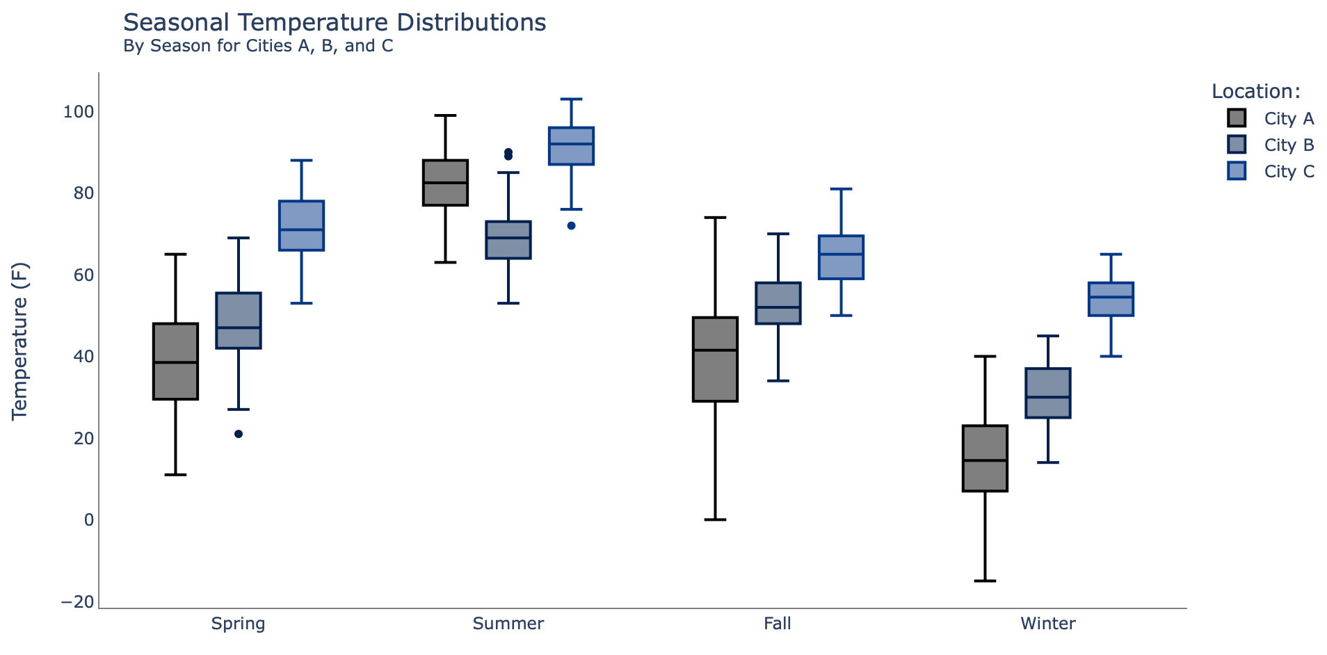
Note that like the previous examples, the same insights are readily available about the warmest city (City C), the strong annual shifts of City A, and the way City A tends to have more hotter days in summer than City B. But what the box plot also shows is outliers (represented by the dots) and some statistical information easily revealed via Plotly's interactivity, as shown below by the built-in hover text capability [5]:

Box plots may not be as easily understood by customers who aren't as technically inclined as a data scientist; choosing box plots over some of the other examples depends largely on the audience for the analysis and the message the data scientist intends to deliver.
5. Violin Plots
Violin plots are similar to box plots, but have a shape that arises from "a kernel density estimate of the underlying distribution" [5]. This results in the graphed objects sometimes resembling a violin. Like the box plot, the violin plot shows the range of the data and some statistical information.
The below code compares the cities across the four seasons in a Seaborn violin plot:
# Set plot size:
plt.figure(figsize=(14, 12))

# Generate violin plot:
sns.violinplot(data=df, x='Temp', y='Season', hue='Location',
               inner='quartile', palette='Set2')

# Set labels:
plt.title('Violin Plot of Observed Temperatures', fontsize=25, y=1.01)
plt.xlabel('Temperature (F)', fontsize=13)
plt.ylabel('');
This returns the following chart:

One key difference from box plots is no clear identification of outliers, but the shape of the violin plot more easily conveys where the bulk and skew of the data is for each subset. The dotted lines in the middle of the violin plots represent the quartiles and the median.
6. Strip and Swarm Plots
Strip plots closely resemble scatter plots but, due to a strip plot adding jittering, the points do not completely overlap along the axis containing the categorical variable. For our dataset, the strip plot will have a categorical y-column of seasons, while temperatures will be along the x-axis. The following Seaborn code generates a strip plot:
# Set plot size:
plt.figure(figsize=(14, 8))

# Generate strip plot:
sns.stripplot(data=df, x='Temp', y='Season', hue='Location', jitter=True,
              palette="magma", alpha=.75)

# Set labels:
plt.title('Strip Plot of Observed Temperatures', fontsize=25, y=1.01)
plt.xlabel('Temperature (F)', fontsize=13)
plt.ylabel('');
The result is this:

Unlike the box and violin plot, the strip plot does not include statistical markers for quartiles or median, but it does give a sense of the data's range, distribution, and changes and trends across categorical variables in the y-axis.
Let's make some minor changes to the code, specifically adding "dodge=True" and reducing the alpha some and see what happens:
# Set plot size:
plt.figure(figsize=(14, 12))

# Generate strip plot:
sns.stripplot(data=df, x='Temp', y='Season', hue='Location', jitter=True,
              palette="magma", dodge=True, alpha=.5)

# Set labels:
plt.title('Strip Plot of Observed Temperatures', fontsize=25, y=1.01)
plt.xlabel('Temperature (F)', fontsize=13)
plt.ylabel('');
This returns the following:

The dodge feature breaks the three locations apart while a lower alpha value changes the opacity of the dots, allowing the viewer to interpret data density based on the darkness of the dots. It's also a little easier to see how City A goes from generally having lower temps than City B until the two seem to switch positions in the summer. A downside to strip plots is characteristics such as skewness and central tendencies can be a little more difficult to interpret from this visualization.
Swarm plots are closely related to strip plots, but instead of adding jitter and overlapping some of the data points, the swarm plot simply stacks them with no overlap. The following code generates a swarm plot:
# Set plot size:
plt.figure(figsize=(14, 8))

# Generate swarm plot:
sns.swarmplot(data=df, x='Temp', y='Season', hue='Location',
              palette='magma')

# Set labels:
plt.title('Swarm Plot of Observed Temperatures', fontsize=25, y=1.01)
plt.xlabel('Temperature (F)', fontsize=13)
plt.ylabel('');
The plot looks like this:

In the swarm plot, distribution shape is more easily interpretable than the strip plot. And, similar to the strip plot above, adding "dodge=True" to the sns.swarmplot() function will separate the Locations. An example of this is in the full code book at the linked GitHub page.
7. ECDF Plot
ECDF stands for Empirical Cumulative Distribution Function, which "represents the proportion or count of observations falling below each unique value in a dataset" [7]. An ECDF is most easily explained by generating the graph and walking through it.
The below code creates an ECDF using the Seaborn displot() function and setting the kind to ‘ecdf':
# Generate plot:
sns.displot(df, x='Temp', hue='Location', kind='ecdf', height=6)

# Set labels:
plt.title('ECDF Plot of Temperatures', fontsize=25, y=1.03)
plt.xlabel('Temperature (F)', fontsize=13)
plt.ylabel('');
This returns the following plot:

What does it mean? Let's look at the temperature 40 degrees (F) and move up until hitting the orange line for City B. At this point, follow the line left to the y-axis to learn that about 25% of City B's temperature recordings are at or below 40 degrees (F).
Follow 40 degrees (F) again up to the blue line, then over to the y-axis, to see that roughly 50% of City A's temperature recordings fall at or below 40 degrees (F). Meanwhile, City C has only about 1% of its temperatures at 40 degrees (F).
There are some visual cues that can reveal information about the data's distribution; the blue and orange line are always to the left of the green line for City C, reconfirming that City C is generally warmer than the other two. City A and B's lines have a crossover point, showing City A is sometimes prone to higher temperature observations.
The steepness or slope at which the ECDF moves from 0 to 1.0 on the y-axis can reveal information about the range and density of data – a steeper slope, such as City C, shows a tighter range (about 40 to 105) versus City A, which has a less steep slope and a range of -18 to about 95.
However, unlike some previous examples such as the Joy Plot, the ECDF may not be as easily interpretable to casual observers and is generally more technical in nature.
The ECDF can be made into a facet plot as follows in the Seaborn displot() function:
# Create Displot:
g = sns.displot(df, x='Temp', col='Season', hue='Location',
                kind='ecdf', height=6, col_wrap=2,
                facet_kws=dict(margin_titles=True))

# Set labels:
g.fig.suptitle('Distributions of Temperature by Season',
               fontsize=25, x=0.47, y=1.03, ha='center')
g.set_axis_labels('Temperature (F)', 'Count');
The result is this:

Notice how the steepness changes by season and, in summer, the blue and orange lines switch spots.
Conclusion
There are numerous approaches to plotting data distributions in Python. Choosing and building a clean visualization can quickly deliver inferences on what is happening in a given dataset. The choice and depth of the visualizations chosen depends upon the intended audience for the analysis and the required message the data scientist must deliver after assessing a given dataset. Oftentimes, more than one view is necessary and typically such visualizations will generate sub-questions that inform and guide follow-on analyses and visualizations of the given data.
Thank you for reading, and feel free to use the code and data available here for your own learning and analysis!
References:
[1] Seaborn, seaborn.histplot (2024).
[2] Seaborn, seaborn.displot (2024).
[3] Seaborn, Visualizing distributions of data (2024).
[4] Leotac, joypy (2021).
[5] Plotly, Hover text and formatting in Python (2024).
[6] Seaborn, seaborn.violinplot (2024).
[7] Seaborn, seaborn.ecdfplot (2024).
