Radial Treemaps: Extending Treemaps to Circular Mappings

Background
The Treemap Concept
The "Treemap" was introduced by Ben Shneiderman at the University of Maryland in the early 1990s¹. Simply put, it's an efficient way of displaying hierarchical data as a set of nested rectangles. Although the concept is simple, the arrangement of the rectangles is subject to an aesthetic preference, and various arrangement algorithms have been developed to enhance the appearance of the final layout.
Treemap Mechanics
Given a hierarchy, a Treemap represents each branch in the hierarchy as a rectangle, which is then tiled with smaller rectangles representing sub-branches. The space in a Treemap is divided according to a specific attribute of the data (often size or value), and each rectangle's area corresponds to the attribute's magnitude, making it easy to compare different parts of the hierarchy.

To account for the arrangement of the rectangles, here are some of the common algorithms that govern a Treemap's construction and ultimate appearance:
- Squarified Treemaps² – creates rectangles as close to squares as possible by adjusting the aspect ratio of the rectangles
- Strip Treemaps³ – lays out the rectangles in strips, either horizontally or vertically, based on the data's hierarchy
- Slice-and-Dice⁴ – alternates between horizontal and vertical divisions which is straightforward but can create elongated rectangles
Treemap Features
- Proportions – the size of each rectangle is proportional to the data point it represents, allowing quick identification of larger and smaller items
- Lines and Colors – clever usage of borders, border size and color, and buffers can delineate hierarchy levels while container colors are often used to represent different dimensions of the data
- Spatial Efficiency – Treemaps are particularly useful for visualizing large data sets as they make efficient use of space, allowing for the display of thousands of items simultaneously with the tiling algorithm determining the ultimate layout
- Order – when gathering data independent of a known hierarchy, the order of dimensions in the grouping is important as it determines the parent-child relationships at each level of the hierarchy
Overall, the Treemap's strength lies in its ability to display complex hierarchical data in a space-efficient and visually appealing manner, making it a popular visualization tool in any field of study.
Polymorphism
Hierarchical data and it's representation as nested polygons and shapes already has various useful and visually appealing implementations. One of my favorites is Voronoi Treemaps⁵, and I particularly like the idea of 3D mappings with Voronoi shapes (like a 3D Voronoi Treemap Sphere).
There are likely many more Treemap representations waiting to be developed, and below I'll cover my own implementation that I call the Radial Treemap. While writing this article, I also came across a tool called Krona⁶ (which seems to have a similar output style) that I found by reverse image searching my own Radial Treemap plots.
Radial Treemap
Inspiration
When I created my first Radial Treemap, I wasn't thinking about implementing a type of Treemap, but rather a dataset about flying machines⁷. My goal was to take this dataset and make it look like a jet engine, as somewhat of an artistic visualization piece.

What I ended up with, I initially called a "Pie-Tree" chart, but I realized later that it's really just a form of Treemapping so now I call it a Radial Treemap!
What makes this type of Treemap special is the "radial" layout which opens up all kinds of useful and fun components that function well in a circular space. I find it particularly fun to integrate it with other types of radial charts for decomposing different aspects of hierarchical data.
In the next section, I'll discuss the components that are involved with constructing a Radial Treemap.
Math, Algorithm & Layout
Ingredients
The math behind the Radial Treemap leverages a few basic ingredients that determine the polygon container dimensions:
- inner radius – outlines the shorter curved edge of the container
- outer radius – outlines the longer curved edge of the container
- starting angle – outlines the straight edge of the container at the minimum angle
- ending angle – outlines the straight edge of the container at the maximum angle
These containers are essentially pie or donut wedges segmented between two radii, which seem irregular compared to the rectangular containers of the conventional Treemap, but maintain the same level of intuition with relative size comparisons.

Functions
Now that we've established the ingredients of the containers, let's move onto the math, beginning with the area of the outer parent container at the first level of the hierarchy. Assuming we want to have some flexibility with shape of the outer container, let's implement an area function (func_area) for a donut slice:
# area of the outer container:
#  > r1: inner radius
#  > r2: outer radius
#  > start_angle: degrees between 0-360
#  > end_angle: degress > start_angle

area = (pi*r2**2-pi*r1**2)*((end_angle-start_angle)/360)
This allows for void space in the middle of the donut (between the origin and inner radius) and a void section between the starting and ending angles. Having this flexibility encourages unique and creative ways to configure the layout to get the most out of the use case at hand. The possibilities!
Next we need to determine the corners of the containers depending on their prospective orientation (func_container):
# given 3 of the 4 child container paramters (r1, r2, a1, a2),
# gathered from the parent container, and the area of the child container:
#  > r1: inner radius
#  > r2: outer radius
#  > a1: starting angle
#  > a2: ending angle
#  > area: area of the child container

# split the current container between two angles at a constant radius
# find the radius:
r2 = sqrt(((area/(a2-a1))+pi*r1**2)/pi)

# split the current container at a specific angle between two radii
# find the angle:
a2 = a1 + (area)/(pi*r2**2-pi*r1**2)
For implementing a good default orientation method, let's calculate the arc and radius lengths for both orientation options to select the container orientation with the smallest maximum length (what I've called the "smart" method):
# "smart" container orientation method:
# calculate the max lengths between both
# orientation options using the following:
arc_length = (2*pi*r2)*((a2-a1)/360)
radius_length = r2-r1
max_lnegth = max(arc_length, radius_length)

# select the orientation with the smallest max_length
# to avoid skinny polygons
All that's left is converting Polar coordinates to Cartesian coordinates for plotting (func_convertion):
# assuming a starting position of 12 o'clock:
#  > ad: angle in degrees
#  > ar: angles in radians
#  > r: radius
ar = (ad-90)*pi/180
x, y = r*cos(ar), r*sin(ar)
Radial-Treemap Algorithm
Using the established functions, here's the general algorithm:
- Begin with a set of mutually exclusive groups, with 1 to many dimensions, and their associated counts or values that will govern the polygon areas, for example: ({a1,b1,c1}, 12.3), ({a1,b2,c1}, 4.5), ({a2,b1,c2}, 32.3), ({a1,b2,c2}, 2.1), ({a2,b1,c1}, 5.9), ({a3,b1,c1}, 3.5], ({a4,b2,c1}, 3.1)
- Set up configuration inputs: (positional: {starting angle, ending angle, inner radius, outer radius, rotation}), (sorting: {descending, ascending, manual}), (container orientation method: {alternating, outward, around, smart, legend}), (grouping: {on, off})
- Calculate the outer container's area (func_area)
- Recursively calculate child container positions, leveraging their relative area percentage to the outer container's area as an input into the container function (func_container), paired with the selected container orientation method
- Infill the polygon boundaries in the arc sections with points (more points for higher curve resolution) and convert the Polar coordinates into Cartesian coordinates for plotting
Container Orientation Methods
The original construction method I developed happened to alternate between radii partitions and concentric circle partitions (as seen above in my " Takeoff" info-graphic), similar to the early Treemaps which were drawn with the "slice and dice" algorithm that alternated between horizontal and vertical partitions.
Here are the container orientation methods I've created to date for my Radial Treemap:
- Alternate – the original! (alternates like the slice and dice approach)
- Outward – all partitions are drawn as radii
- Around – all partitions are drawn as concentric circles
- Smart – the arc and radius lengths are calculated for each option and the smallest is chosen as a mechanism to prevent skinny polygons
- Legend – the first level of the hierarchy is always drawn as radii to align with a corresponding legend donut
A choice can also be made whether or not group the items in the first place. Flattening the data (removing the hierarchical grouping) to sort by the natural order of the lowest level of elements can be toggled for another layer of insight (especially useful for legends).

Layouts
With the flexibility to include central and wedge void spaces, stack, and rotate Radial-Treemaps, the layout options are endless!
Outer perimeter layout parameters:
- Total Area (as a relative measure between 2 or more Radial Treemaps)
- Layout Constraints (donut slice determined by two angles and two radii)
- Rotation (rotation around the center)
- Relative positioning with other Radial Treemaps (stacking, etc.)

Legends:
- Complimentary Radial Treemap(s) around the inside, outside, or both sides (helpful for illustrating a different sorting of elements by level)

Visualization Extensions (inner / outer / linear connections):

3D Radial Treemap
The Radial Treemap construct can easily be extended to 3D mathematically, and it comes with an extra plane for slicing and dicing!
The available geometry for containerization is evident from the spherical coordinate system:
- radial distance: r ≥ 0,
- polar angle: 0° ≤ θ ≤ 180° (0 rad ≤ θ ≤ π rad)
- azimuth : 0° ≤ φ < 360° (0 rad ≤ φ < 2π rad)
In terms of 3D Radial Treemap inputs, here's a projection of each surface's useable space:

Conveniently, the general algorithm for 3D is the same as 2D, adjusting for the effect of area transition to volume and solving for the 3 possible orientations in terms of radius, polar angle, and azimuth. Here's a simple 3D Radial Treemap:

Next I'll show a python implementation for generating 2D Radial Treemap visualizations. A 3D version is on the roadmap!
Python Implementation
I've made an initial implementation of my Radial Treemap algorithm available in python via my vizmath package on PyPI. Here's an example of usage:
from vizmath import rad_treemap as rt # pip install vizmath==0.0.9
import pandas as pd

# using the example data from above:
data = [
    ['a1', 'b1', 'c1', 12.3],
    ['a1', 'b2', 'c1', 4.5],
    ['a2', 'b1', 'c2', 32.3],
    ['a1', 'b2', 'c2', 2.1],
    ['a2', 'b1', 'c1', 5.9],
    ['a3', 'b1', 'c1', 3.5],
    ['a4', 'b2', 'c1', 3.1]]
df = pd.DataFrame(data, columns = ['a', 'b', 'c', 'value'])

# create a rad_treemap object
#   > df: DataFrame with 1 or more categorical columns of data
#     and an optional 'value' column for the areas
#     (otherwise groups counts are used for areas)
#   > groupers: group-by columns
#   > value: optional value column
#   > r1, r2: inner and outer radius positions
#   > a1, a2: start and end angle positions
#   > rotate_deg: overall rotation around the center
#   > mode: container orientation method
#   > other options: 'points', 'default_sort', 'default_sort_override',
#     'default_sort_override_reversed', 'mode', 'no_groups', 'full'
rt_1 = rt(df=df, groupers=['a','b','c'], value='value', r1=0.5, r2=1,
  a1=0, a2=180, rotate_deg=-90, mode='alternate')

# plot the Radial Treemap
rt_1.plot_levels(level=3, fill='w')
Let's take a look at the output from the Radial Treemap algorithm:
- level – the level in the hierarchy: from 1 to N levels
- group – represents each node on the tree: for example, the group {a1,b1,c1} falls under the group {a1,b1}, which falls under {a1}
- count – the group's count: below you can see below that at level 1, the highest level, group {a2} contains 2 items
- value – the group's value (if specified): instead of using a count of items in a group, a supplied number can be used to represent the magnitude
- level rank – the item's rank within its group, in terms of its value (or count if value is not available) from highest to lowest: 1 to N
- overall rank – the item's overall rank among all groups in terms of its value (or count if value is not available) from highest to lowest: 1 to N
- x, y – Cartesian 2D coordinates for a point in the layout
- path – an ordered set of integers that describe the path which encloses a polygon, in conjunction with each (x, y) point in the Radial Treemap, for each group: 1 to N (specified by the ‘points' parameter)
# sample the Radial Treemap DataFrame
rt_1.to_df()[['level','group','count','value',
    'level_rank','overall_rank','x','y','path']].head()
Finally, let's see what a count based version looks like that ignores the group values.
# set 'value' to None or just leave it out since None is the default
# doing this sets the areas equal to the group counts
# in this case, each count will be one since there are no duplicates

rt_2 = rt(df=df, groupers=['a','b','c'], value=None, r1=0.5, r2=1,
  a1=0, a2=180, rotate_deg=-90, mode='alternate')

# plot the Radial Treemap
rt_2.plot_levels(level=3, fill='w')
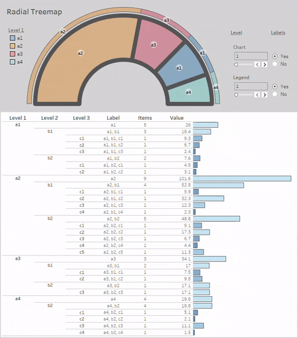
Tableau Public Implementation
In this section, I'll present a tutorial for implementing my Radial Treemap visualization in Tableau Public (v 2023.3.0) along with some fun interaction capabilities.
To get started, let's add a couple more groups and values to our prior example with python and output the data to a csv file to use with Tableau Public. First, create a DataFrame with 3 categorical columns and one numerical column:
import pandas as pd

data = [
    ['a1', 'b1', 'c1', 9.3],
    ['a1', 'b1', 'c2', 6.7],
    ['a1', 'b1', 'c3', 2.4],
    ['a1', 'b2', 'c1', 4.5],
    ['a1', 'b2', 'c2', 3.1],

    ['a2', 'b1', 'c1', 5.9],
    ['a2', 'b1', 'c2', 32.3],
    ['a2', 'b1', 'c3', 12.3],
    ['a2', 'b1', 'c4', 2.3],
    ['a2', 'b2', 'c1', 9.1],
    ['a2', 'b2', 'c2', 17.3],
    ['a2', 'b2', 'c3', 6.7],
    ['a2', 'b2', 'c4', 4.4],
    ['a2', 'b2', 'c5', 11.3],

    ['a3', 'b1', 'c1', 7.5],
    ['a3', 'b1', 'c2', 9.5],
    ['a3', 'b2', 'c3', 17.1],

    ['a4', 'b2', 'c1', 5.1],
    ['a4', 'b2', 'c2', 2.1],
    ['a4', 'b2', 'c3', 11.1],
    ['a4', 'b2', 'c4', 1.5]]

df = pd.DataFrame(data, columns = ['a', 'b', 'c', 'value'])
Next, we'll use vizmath to create a Radial Treemap chart and legend, combine both into one file, and output the drawing information to a csv:
from vizmath import rad_treemap as rt
import os

# Radial Treemap chart object
rt_obj = rt(df=df, groupers=['a','b','c'], value='value',
    r1=0.5, r2=1, a1=0, a2=180, rotate_deg=-90 ,mode='legend')
rt_df = rt_obj.to_df()
rt_df['type'] = 'chart'

# Radial Treemap legend object
rt_legend_obj = rt(df=df, groupers=['a','b','c'], value='value',
    r1=1.04, r2=1.09, a1=0, a2=180, rotate_deg=-90 ,mode='legend',
    no_groups=True)
rt_legend_df = rt_legend_obj.to_df()
rt_legend_df['type'] = 'legend'

# export the drawing data
df_out = pd.concat([rt_df, rt_legend_df], axis=0)
df_out.to_csv(os.path.dirname(__file__) + '/radial_treemap.csv',
  encoding='utf-8', index=False)
Import the file into Tableau using the Text file option, navigate to Sheet 1, and create these parameters and calculated columns that we'll use to draw the chart and legend:
Create parameters (select "Create Parameter…" from the hamburger dropdown menu under the Data tab on the left):
[Chart Level]: {Integer, Range, Minimum: 1, Maximum: 3, Step size: 3}
[Legend Level]: {Integer, Range, Minimum: 1, Maximum: 3, Step size: 3}
Create calculated columns (from the same menu under "Create Calculated Field…"):
_[rad_treemap]_: if [type] = ‘chart' and [Level] = [Chart Level] then MAKEPOINT([Y],[X]) else null end
_[rad_treemap_legend]_: if ([type] = ‘legend' and [Level] = [Legend Level]) then MAKEPOINT([Y],[X]) else null end
_[rad_treemap_lines]_: if [type] = ‘chart' and [Level] <= [Chart Level] then MAKEPOINT([Y],[X]) else null end
Start by dragging _[radial_treemap] to Detail under Marks to generate the first map layer and adjust these options by right clicking in the map area and selecting Background Layer_s:
- Unselect all Background Map Layers (Base, Land Cover, etc.)
- Now right click in the map area and select Map Options and unselect all of the options
Close out of Background Layers and continue with the following steps:
- Drag [Group] to Detail under Marks
- Under the Marks dropdown menu select Polygon (don't worry if it looks strange at this point)
- Drag [Path] to Path under Marks and right click on what's now SUM(Path) and select Dimension
- Drag [Value] to Color and repeat the process for converting it to Dimension
- Under Color select "Edit Colors…" and configure with the following options: {Reversed, Advanced: (Start: 0, End: 10)}
- Hit OK and adjust the opacity to 50% under Color
Now the structure of the Radial Treemap chart section should be in view. Let's add another layer to enhance the color using items from the first level of the hierarchy. Start by adding some new calculated columns:
[Label]: replace(replace(replace([Group],"'","),'(‘,"),')',")
[Level 1]: split([Label],',',1)
[Level 2]: split([Label],',',2)
[Level 3]: split([Label],',',3)
Now let's use [Level 1] for coloring:
- Drag _[radial_treemap] into the map area and a pop-up will appear: Add a Marks Layer_ – drop the pill into this to create a new map layer
- Repeat the steps from above except now use [Level 1] for the Color
- Under Color, select a black border and set the opacity to 50%
Let's wrap up the chart section by adding some lines with different thicknesses to indicate where the hierarchical boundaries are:
- Repeat the prior steps with _[rad_treemap_lines] as the map layer, Line as the chart type under the Marks dropdown menu, and Color_ set to medium black
- Drag [Level] to Size under Marks and convert to Dimension and Discrete
- On the right-hand side of the chart under the size section labeled Level, select the dropdown from the upper right corner which shows up upon hovering over the container and select "Edit Sizes…"
- Select the Reversed option, hit OK, and right-click on the nulls pill at the bottom right of the chart and select Hide Indicator to hide the nulls label
Now the chart section is in place and should look similar to the following:

Let's add a legend next to compliment the chart:
- Repeat all of the same steps as before to add two chart layers using _[rad_treemap_legend]_
To finalize the visualization, let's add some label layers. Start by adding these parameters and calculated columns to position the labels:
Create parameters:
[Show Labels Chart]: {Boolean, Aliases: (True: Yes, False: No)}
[Show Labels Legend]: {Boolean, Aliases: (True: Yes, False: No)}
Create calculated columns:
_[point_angle]_: atan2([X], [Y])*180/pi() – 90
_[group_angle]_: {fixed [Type], [Group]: avg([point_angle])}
_[point_radius]_: [X]/cos([point_angle]*pi()/180)
_[group_radius_min]_: {fixed [Type], [Group]: min([point_radius])}
_[group_radius_max]_: {fixed [Type], [Group]: max([point_radius])}
_[group_radius]_: ([group_radius_max]-[group_radius_min])/2+[group_radius_min]
_[chart_group_legend]_: if [Type] = ‘chart' and [Level] = [Chart Level] and [Show Labels Chart] then MAKEPOINT( -[group_radius]sin(([group_angle])pi()/180), [group_radius]cos(([group_angle])pi()/180) ) else null end
_[legend_group_legend]_: if [Type] = ‘legend' and [Level] = [Legend Level] and [Show Labels Legend] then MAKEPOINT( -[group_radius]sin(([group_angle])pi()/180), [group_radius]cos(([group_angle])pi()/180) ) else null end
Now we'll add a final two layers to complete the Radial Treemap:
- Add _[chart_group_legend] as a map layer and add [Group] to Detail under Marks_
- Change the chart type to Circle and drag [Label] to Label under Marks
- Adjust the Color to white with a opacity of 50% and no border or halo, and drag slider under Size to right of center
- Under Label, click on the […] menu next to Text, and in the dialog box select the text and change the size to {8 with a Bold font} and hit OK
- Back on the main Label menu, select Allow labels to overlap other marks and adjust the Alignment to {center, center}
- Toggle the parameter [Show Labels Chart] to False for now and repeat the above steps to add a label to the legend using _[legend_group_legend]_
To complete Sheet 1, add [ATTR(Label)] to the Tooltips by dragging [Label] to the Tooltip under Marks for the applicable layers and selecting Attribute by right-clicking on the pill. Add [ATTR(Items)] and [ATTR(Value)] as well, in the same way.
To assist with interactively exploring the data in the Radial Treemap, let's create a simple table bar graph:
- Create a new worksheet using the first plus sign on the bottom panel to create Sheet 2
- In the new sheet, drag [Level 1], [Level 2], [Level 3], and [Label] to Rows
- Now drag [Count] to Rows and change to Dimension and Discrete
- Do the same with [Value], change the chart type to Bar, and also drag [Value] to Color and Size under Marks
- Use the same color scheme for [Value] as we did with the prior Sheet and add a black border with 80% opacity
- Rename [Count] to [Items] by right-clicking on the column and selecting Rename
Finally, let's pull the two Sheets together in a dashboard. After creating the dashboard and adding the sheets, setup an action under Actions in the Dashboard top-menu. Click the Add Action dropdown and select Highlight. Under Targeted Highlighting select Selected Fields and select the [Label] and [ATTR(Label)] fields. Finally select the Hover option under the Run action on menu on the right and now the entire dashboard will highlight off of hovering over each level of the hierarchy in the table or chart!
After adding the parameters to the dashboard and orienting everything in an organized way, here's our new dashboard in Tableau Public:
Conclusion
In this article, I've covered a brief history of the Treemap and what I call the "Radial Treemap", a visual tool I developed for examining hierarchical relationships in a circular layout that offers flexibility in terms of donut slicing, stacking, legends, and synergy with other radial chart types. It can be used in a variety of ways to derive new insights from your data, and I hope you've found this visualization technique inspiring and full of potential!
If you're looking for inspiration with other radial chart types, check out my Multi-Chord Diagram:
Introducing the Multi-Chord Diagram: Visualizing Complex Set Relationships
Let me know if you come across any fun or professional use cases, and thanks for reading!
References
All images in this article were created by the author unless otherwise stated.
[1] Ben Shneiderman, "Tree visualization with tree-maps: 2-d space-filling approach" (1992), ACM Transactions on Graphics
[2] Mark Bruls, Kees Huizing, Jarke J. van Wijk, "Squarified Treemaps" (2000), Data Visualization 2000: Proceedings of the Joint EUROGRAPHICS and IEEE TCVG Symposium on Visualization in Amsterdam, The Netherlands, May 29–30, 2000
[3] Benjamin Bederson, Ben Shneiderman, Martin Wattenberg, "Ordered and Quantum Treemaps: Making Effective Use of 2D Space to Display Hierarchies" (2002), ACM Transactions on Graphics
[4] Ben Shneiderman, Martin Wattenberg, "Ordered Treemap Layouts" (2001), INFOVIS pages 73–78
[5] Michael Balzer, Oliver Deussen, "Voronoi Treemaps" (2005), IEEE Symposium on Information Visualization
[6] Brian Ondov, Nicholas Bergman, Adam Phillippy, "Interactive metagenomic visualization in a Web browser" (2011), BMC Bioinformatics
[7] Federal Aviation Administration, "Aircraft Registration Database" (2020), United States Department of Transportation
