Step-by-Step Guide for Building Interactive Calendars in Plotly

Plotly is one of the most comprehensive Python libraries for creating visualizations. This library offers many predefined visualizations useful for most data analyses. These visualizations are highly customizable, allowing us to be more creative in visualizing our insights and even to implement new visualizations.
In this article, we will explain step-by-step how to use Plotly to create a calendar where all the holidays in Barcelona for 2024 can be visualized. The calendar will be interactive, providing information about the different holidays in the city through hover-overs. As the article shows, although Plotly does not have a built-in visualization for creating calendars, starting from a heatmap and a bit of imagination, this type of visualization can be easily implemented.
Calendars in Plotly allow for more customization than those created with predefined tools. Additionally, one of the major advantages is that they can be integrated into Jupyter notebooks, for example, to conduct temporal analyses within these notebooks. Additionally, hover overs can be customized according to the needs of our analysis. Another great advantage compared to predefined tools is that Plotly is completely free, and no subscription is required.
Do you want to know how calendars are done? Let's get started!
Converting an ICS File into a DataFrame
The first step is to obtain a data frame with all the holidays of the city. Calendar-related information is generally stored in files with the ICS (iCalendar) format. This type of file is the most common for exchanging calendar and event information and has the .ics extension.
In our case, the file used in this article has been obtained from the open data page of the city of Barcelona and can be downloaded at the following link:
City of Barcelona's public holidays calendar – calendarifestius_en.ics – Open Data Barcelona
Once downloaded, the structure of the file can be viewed by opening it with a text editor. The properties BEGIN:VEVENT and END:VEVENTdelimit the events we want to extract from the file. Each event contains information about the start date (DTSTART), end date (DTEND), a summary (SUMMARY), and a description (DESCRIPTION). This information will be more than sufficient to create our calendar.

Regular expressions won't be necessary to extract all this information from the file. There is a library in Python called ics that allows for easily extracting information from this type of file.
To extract the content of the ICS file and store it in a data frame, the function convert_ics_to_dataframe has been defined.
The function reads the file's content and creates a Calendar object from the ics library. The events of the calendar can be accessed using the attribute events. Then, for each event, the start date (event.begin), the end date (event.end), the summary (event.name) and the description (event.description) are extracted and stored in a data frame.

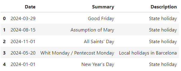
As can be seen, the DataFrame contains a column with the start date of the event and another with the end date. The goal is to create a DataFrame with only three columns: (1) the date, (2) the summary, and (3) the description. This way, if an event spans multiple days, each day will appear as a separate row in the dataset. To achieve this, the function expand_date_range is used, which is described below. Before applying the function, columns Start Dateand End Datehave been converted to the datetime type.
Creation of a Base DataFrame for the 2024 Calendar
The previous DataFrame contains information about all the holidays in the city of Barcelona. However, to visualize all this information in Plotly, a DataFrame with all the relevant data for the 2024 calendar needs to be created. The following function allows you to create a DataFrame with information related to the year specified as an input parameter, in this case, 2024. The dataset includes information for each day of the year 2024, including the day of the week, the ISO week number, and the month name.

This DataFrame will be used later to create the calendar in Plotly. The Date Typecolumn indicates the type of day: (1) for weekdays and (2) for weekends. Next, another type of day (3) will be added to indicate the presence of a holiday.
Integrating Holiday Information into the 2024 Base DataFrame
The next step involves incorporating all the holiday information into the base DataFrame with the 2024 calendar. As shown below, holidays are indicated with a Date Type equal to 3. The Summary column includes information about the holiday, while for the remaining days, it indicates whether the day is a weekday or a weekend.

The resulting DataFrame is what we will use to visualize our calendar.
2024 Barcelona Holiday Calendar Visualization
Finally, the functions to create the heatmap visualizing the 2024 calendar along with the holidays in the city of Barcelona will be defined. First, a function named create_heatmap_for_month will be created to generate a heatmap for a specific month. Then, this function will be used to create the heatmap for each month of the year in the create_all_month_heatmaps function.
The function returns a figure, which we can save as an HTML file, embed in a webpage, or even include in a Medium article.
We use the previously defined DataFrame to create the calendar using the create_all_month_heatmaps function.
And there you have it! We have our interactive calendar. As you can see, weekdays, weekends, and holidays are represented in different colors.

As shown in the following image, the calendar created is interactive, allowing us to see the name of the holiday by hovering the mouse over the day.

Now you can get creative – try different color palettes, various layouts, such as placing 3 months per row, or add annotations to indicate the day of the week. Be creative!
Next, I'll mention some websites that can be useful for getting ideas to design your visualizations.
Innovative Approaches to Calendar Design
When we create visualizations, one of the fundamental aspects is their correct design. Elements such as typography, the components to be displayed in the visualization, such as titles or subtitles, and the chosen colors play a crucial role. Often, we don't know how to design our visualization, and sources of inspiration are necessary.
Dribbble is one of my favorite websites for inspiration when I need to create visualizations or dashboards. This site contains thousands of design examples for visualizations on both mobile devices and websites.
Browse thousands of Calendars images for design inspiration | Dribbble
For choosing colors, the website I always consult is Adobe Color. This site allows you to search for color palettes related to a mood or a keyword.
I have consulted these two websites for inspiration on possible designs and color palettes for the calendar. As shown below, I have evaluated and experimented with different styles, depending on whether I want to give the visualization a more minimalist touch or, for example, a vintage feel. Plotly visualizations are highly customizable, which allows for experimentation with designs and creativity.

Although Plotly does not have a predefined visualization for creating calendars, this doesn't mean we can't use a workaround to create dynamic calendars with a custom design. The heatmap visualization allows us to create calendars and many other types of visualizations in Plotly; we just need to be a bit creative in using them. In this article, we've explained step by step how to create a calendar to visualize the holidays in the city of Barcelona. Additionally, by using all the customization options that Plotly offers, we've explored different designs depending on the style we want to give the calendar.
Thanks for reading, Amanda Iglesias
