Step-by-Step Guide to Time Series Visualization Using Plotnine

Visualization is a quick and effective way of getting insights from your data. This article provides a step-by-step guide for exploring a time series using graphics.
We'll use 6 different plots to uncover different aspects of a time series. We'll focus on Python's plotnine, a grammar-of-graphics type of library.
Introduction
Exploratory data analysis is an approach that aims to reveal the underlying structure of data sets. Almost always, this process involves using graphical techniques to visualize the data.
Using graphics for Time Series Analysis is a quick way of extracting insights from the data, such as:
- uncovering basic patterns, such as trends or seasonality
- detecting irregularities, including missing data or outliers
- detecting shifts in the distribution
In the rest of this article, you'll learn how to build 6 graphics to explore a time series.
Exploring a Time Series
Let's start by loading a time series. In this guide, we'll use a monthly time series that is available in the M3 dataset [2]. We get it from the datasetsforecast library:
from datasetsforecast.m3 import M3

dataset, *_ = M3.load('./data', 'Monthly')

series = dataset.query(f'unique_id=="M400"')
You'll learn how to create graphics using plotnine. This library is a sort of ggplot2 for Python. Let's start by setting the theme :
import plotnine as p9

MY_THEME = p9.theme_538(base_family='Palatino', base_size=12) +
           p9.theme(plot_margin=.025,
                    axis_text_y=p9.element_text(size=10),
                    panel_background=p9.element_rect(fill='white'),
                    plot_background=p9.element_rect(fill='white'),
                    strip_background=p9.element_rect(fill='white'),
                    legend_background=p9.element_rect(fill='white'),
                    axis_text_x=p9.element_text(size=10))
We'll use a theme based on 538 with a few extra modifications.
Time plot
Arguably, the first plot you want to do when analysing a time series is the time plot. A time plot is an instance of a line plot where you plot the values of the series against time:
time_plot = p9.ggplot(data=series) +
            p9.aes(x='ds', y='y') +
            MY_THEME +
            p9.geom_line(color='#58a63e', size=1) +
            p9.labs(x='Datetime', y='value')
This plot gives a quick glimpse into the basic patterns of a time series, such as trend or seasonality. With a time plot, changes in the distribution, either in the mean or variance, are often easy to detect as well.
The example time series exhibits a stochastic trend. The level of the series increases up to a point, at which the data starts to decrease in level. Also, the regular fluctuations suggest a seasonal structure.
You can also build a time plot with decomposed data. First, we decompose the time series using STL:
import pandas as pd
from statsmodels.tsa.seasonal import STL

ts_decomp = STL(series['y'], period=12).fit()

components = {
    'Trend': ts_decomp.trend,
    'Seasonal': ts_decomp.seasonal,
    'Residuals': ts_decomp.resid,
}

components_df = pd.DataFrame(components).reset_index()
melted_data = components_df.melt('index')
Then, we create a time plot for each part using a _facetgrid like so:
from numerize import numerize

# a nice trick to summarise large values in graphics
labs = lambda lst: [numerize.numerize(x) for x in lst]

decomposed_timeplot =
    p9.ggplot(melted_data) +
    p9.aes(x='index', y='value') +
    p9.facet_grid('variable ~.', scales='free') +
    MY_THEME +
    p9.geom_line(color='#58a63e', size=1) +
    p9.labs(x='Datetime index') +
    p9.scale_y_continuous(labels=labs)
This variant makes it easier to check each component. In this case, the trend and seasonal effects become clear.
We use numerize to make large numbers more legible. You can add this style to any other plot as well.
Lag plot
A lag plot is an instance of a scatter plot where you plot each value of a time series against a past (usually, the previous) value.
X = [series['y'].shift(i) for i in list(range(2, 0, -1))]
X = pd.concat(X, axis=1).dropna()
X.columns = ['t-1', 't']

lag_plot = p9.ggplot(X) +
           p9.aes(x='t-1', y='t') +
           MY_THEME +
           p9.geom_point(color='#58a63e') +
           p9.labs(x='Series at time t-1',
                   y='Series at time t') +
           p9.scale_y_continuous(labels=labs) +
           p9.scale_x_continuous(labels=labs)
A lag plot can give insights into the series structure. The points of a time series with autocorrelation will cluster along the diagonal. This clustering is as evident as the strength of the autocorrelation. If the data is random, then the data points will be all over the place on the graphic. This means that past values give no information about the future.

Lag plots are also useful to detect outliers. These points will be isolated from others.
The values of the example time series tend to cluster on the diagonal, but with a variance that increases for larger values. It appears that the series contains an auto-regressive structure.
Autocorrelation plot
Autocorrelation is a measure of how the time series is correlated with itself when observed in a past value (lag). Plotting autocorrelation also helps convey information about the structure of the series.
You can use statsmodels to compute autocorrelation:
import numpy as np
from statsmodels.tsa.stattools import acf

acf_x = acf(
    series['y'],
    nlags=24,
    alpha=0.05,
    bartlett_confint=True
)

acf_vals, acf_conf_int = acf_x[:2]

acf_df = pd.DataFrame({
    'ACF': acf_vals,
    'ACF_low': acf_conf_int[:, 0],
    'ACF_high': acf_conf_int[:, 1],
})

acf_df['Lag'] = ['t'] + [f't-{i}' for i in range(1, 25)]
acf_df['Lag'] = pd.Categorical(acf_df['Lag'], categories=acf_df['Lag'])
Then, we use plotnine to build a lollipop plot:
significance_thr = 2 / np.sqrt(len(series['y']))

acf_plot = p9.ggplot(acf_df, p9.aes(x='Lag', y='ACF')) +
           p9.geom_hline(yintercept=significance_thr,
                         linetype='dashed',
                         color='#58a63e',
                         size=.8) +
           p9.geom_hline(yintercept=-significance_thr,
                         linetype='dashed',
                         color='#58a63e',
                         size=.8) +
           p9.geom_hline(yintercept=0, linetype='solid', color='black', size=1) +
           p9.geom_segment(p9.aes(x='Lag',
                                  xend='Lag',
                                  y=0, yend='ACF'),
                           size=1.5,
                           color='#58a63e'
                           ) +
           p9.geom_point(size=4, color='darkgreen', ) +
           MY_THEME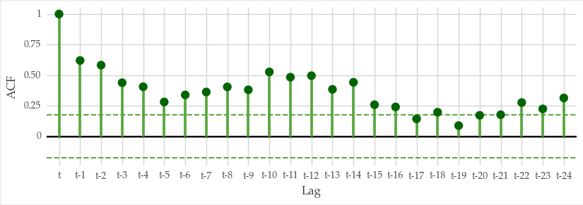
The way autocorrelation changes for increasing lag values gives information about the series structure. If autocorrelation is always close to zero, this means the series is white noise or random.
Slow decays for increasing lag values hint at the presence of a trend. Sometimes autocorrelation exhibits an oscillating pattern with peaks on seasonal lags. Such pattern is indicative of a strong seasonal component.
Seasonal subseries plot
Some graphics are tailored for exploring seasonal effects, such as the seasonal plot or the seasonal subseries plot.
The seasonal subseries plot works by grouping the series by seasonal period as follows:
grouped_df = series.groupby('Month')['y']
group_avg = grouped_df.mean()
group_avg = group_avg.reset_index()
series['Month'] = pd.Categorical(series['Month'],
                                 categories=series['Month'].unique())
group_avg['Month'] = pd.Categorical(group_avg['Month'],
                                    categories=series['Month'].unique())

seas_subseries_plot =
    p9.ggplot(series) +
    p9.aes(x='ds',
           y='y') +
    MY_THEME +
    p9.theme(axis_text_x=p9.element_text(size=8, angle=90),
             legend_title=p9.element_blank(),
             strip_background_x=p9.element_text(color='#58a63e'),
             strip_text_x=p9.element_text(size=11)) +
    p9.geom_line() +
    p9.facet_grid('. ~Month') +
    p9.geom_hline(data=group_avg,
                  mapping=p9.aes(yintercept='y'),
                  colour='darkgreen',
                  size=1) +
    p9.scale_y_continuous(labels=labs) +
    p9.scale_x_datetime(breaks=date_breaks('2 years'),
                        labels=date_format('%Y')) +
    p9.labs(y='value')

seas_subseries_plot + p9.theme(figure_size=(10,4))
This plot is useful for uncovering patterns within and across seasonal periods.
In the example time series, we can see that the average value is the lowest in March. In some months, such as May, the series shows a strong positive trend.
Grouped density plot
Time series are susceptible to changes or interventions.
Sometimes the thing represented by a time series changes due to some event. You can use graphical techniques to understand the impact of these events. For example, you can use a grouped density plot as follows:
# some event happens at index 23
change_index = 23

before, after = train_test_split(series, train_size=change_index, shuffle=False)

n_bf, n_af = before.shape[0], after.shape[0]

p1_df = pd.DataFrame({'Series': before['y'], 'Id': range(n_bf)})
p1_df['Part'] = 'Before change'
p2_df = pd.DataFrame({'Series': after['y'], 'Id': range(n_af)})
p2_df['Part'] = 'After change'

df = pd.concat([p1_df, p2_df])
df['Part'] = pd.Categorical(df['Part'], categories=['Before change', 'After change'])

group_avg = df.groupby('Part').mean()['Series']

density_plot =
    p9.ggplot(df) +
    p9.aes(x='Series', fill='Part') +
    MY_THEME +
    p9.theme(legend_position='top') +
    p9.geom_vline(xintercept=group_avg,
                  linetype='dashed',
                  color='steelblue',
                  size=1.1,
                  alpha=0.7) +
    p9.geom_density(alpha=.2)
In this particular example, some event occurs at the index 23. This particular time step was picked arbitrarily here. But, you can detect important time steps using change point detection methods.

We plotted the distribution before and after the critical point. There are noticeable changes in the distribution.
Key Takeaways
Exploratory data analysis is a key step in any time series analysis and forecasting project. This post walks you through the process of exploring a time series using 6 graphical techniques. These are:
- Time plot
- Decomposition time plot
- Lag plot
- Autocorrelation plot
- Seasonal subseries plot
- Grouped density plot
These enable you to quickly uncover insights from your data.
We used plotnine, a grammar of graphics type of visualization library implemented in Python. It is inspired by R's ggplot2 and provides lots of different graphics. You can check a few example in the following link: https://plotnine.org/tutorials/.
Thank you for reading and see you in the next story!
Code
References
[1] Hyndman, Rob J., and George Athanasopoulos. Forecasting: principles and practice. OTexts, 2018.
[2] M3 forecasting competition dataset, collected from datasetsforecast (MIT license)
