Unlocking Valuable Data and Model Insights with Python Packages Yellowbrick and PiML (with Code)

"We are what we repeatedly do. Excellence, then, is not an act, but a habit." — Will Durant-The Story of Philosophy (1926)
This article will explore how Yellowbrick and _PiML'_s Python packages can help data practitioners better understand their data and models, addressing various data and model quality issues. Even in the era of LLMs, which can perform many Data Science tasks, understanding and utilizing tools such as Yellowbrick and PiML is important for several reasons: (a) they offer powerful visual insights into your data and models, (b) they can be used as education tools, particularly in the area of analyzing model performance, (c ) they are efficient in terms of cost and resources and (c ) they offer data privacy. All training and visualizations can be in-house without transferring your data to a cloud-based server.
Topics we will discuss:
- Whether training data size is sufficient for a classification task
- Visualization of how the performance of classification is affected by the tuning of a specific parameter
- Visualization of clustering algorithm performance in terms of cluster overlap and cluster distance. Visualization of feature distribution among classes.
- Model Performance Comparison using five different measures.
- Global and Local Explainability
- Identification of a Model's Weak Slices
- Model Reliability Analysis
- Model Robustness Analysis
- Model Segmented-Diagnostic Analysis
A. Yellowbrick
A.1 Classification
To explore Yellowbrick‘s capabilities, we will use the well-known publicly available dataset wine. It consists of 178 rows and 13 columns. The features are different wine characteristics such as ‘color_intensity,' ‘alcohol,' and ‘malic acid' content. The target variable consists of 3 wine classes denoted with 0,1,2. We will first use the wine dataset to perform classification. We will employ the RandomForestClassifier, which gives us the following results.
As we can see, the classification accuracy is 0.97, which indicates a high level of accuracy.
A.1.1 Training-Data-Volume Sufficiency
We will plot the model's learning curve using Yellowbrick to address the issue of training-data-volume sufficiency. This curve is shown in Figure 1. A learning curve visualizes how a model's performance on training and validation datasets changes as we increase the amount of training data. The learning curve helps us understand the following:
- Whether adding more data might improve the generalization ability of our model.
- Whether there is overfitting/underfitting. This depends on how the training and validation scores converge.

The learning curve shows us the following:
- The training score remains high, close to 1.0, for all training instances. This suggests that the RandomForest model is very effective at learning from the training data.
- Looking at the cross-validation score line in Figure 1, we observe that the cross-validation score is not constant and starts lower than the training score. As the number of training instances increases, it shows some variability and then stabilizes at a level below the training score. There is a noticeable gap between the training and cross-validation, which is an indicator of overfitting. Some improvement, such as regularization, is needed to reduce the overfitting in order to improve generalization.
- Do we need more data? The answer is probably not. The cross-validation score seems to stabilize and does not show significant improvement beyond a certain number of training instances (around 70–80). This suggests that adding more data may not significantly improve the model's performance on new, unseen data.
A.1.2. How Classification Performance Is Affected By The Tuning Of a Specific Parameter
In the code snippet below, the maximum tree depth of the RandomForest classifier varies between values 1 and 11. Then, a validation curve visualizer is created that allows us to track the change in the model performance as ‘max_depth' (maximum tree depth) varies.

Figure 2 shows the validation curve. In general, a validation curve is used in Machine Learning to evaluate how a model performs over a range of hyperparameter values. The curve can help us find the optimal value of a hyperparameter, which is where the validation score is maximized, and the gap between the training and validation scores is reasonable. This implies that our model can generalize well.
The cross-validation score peaks at ‘max_depth'=7. This observation in Figure 2 suggests that a ‘max_depth' __ equal to 7 provides the best balance between the model's ability to capture sufficient complexity in the data and its ability to generalize to new data. In other words, this is the depth at which the model learns meaningful patterns without excessively fitting to noise. With this parameter setting, we avoid overfitting while still being able to capture enough detail to make accurate predictions. Increasing the parameter's value beyond 7 could lead to overfitting, as indicated by a plateau or slight decrease in the validation score.
A.2 Clustering
Next, we will apply the K-Means clustering method to the wine data and utilize Yellowbrick to get visual insights into the algorithm's performance. But before we do that, we will employ a useful Yellowbrick graph that is rarely seen. This is the distribution of wine's features over the 3 classes (Figure 3). As we can see, although most of the features overlap for the 3 classes, there are some notable break-aways, such as towards ‘alcohol' and ‘proline'. It will be interesting to see whether these two features are important in a Shapley analysis, too.

Indeed, as shown in Figure 4 below, ‘alcohol' and ‘proline' are in the first 3 most important features.

Below are the results of the clustering algorithm. As we can see in the gist below, the results are overall good, except for some misclassification of 4 samples that occurs for classes 1 and 2.
We will visualize the clusters in the PCA domain with Yellowbrick's help. You may ask why in the PCA domain. In the context of PCA, clusters are plotted as data points in the space defined by the first few principal components. PCA projects the data in orthogonal directions, so it can often separate features that overlap in the original space. Our clusters for the wine data are shown in Figure 5, and they appear well separated.

Finally, we will employ Multidimensional Scaling (MDS) in Yellowbrick to visualize the intercluster distance. MDS focuses on visualizing the similarities of individual data points in a dataset; it preserves the distances or dissimilarities and is, therefore, a suitable tool to visualize intercluster distance. In Figure 6, we see that there is a large distance between the three clusters, which agrees with the distinct class separation in the PCA domain. The dashed circles on the bottom left indicate the number of samples that belong to each class (34: class 0, 44: class 1, 41: class 2.)

B. PiML
B.1 Data and Preliminary Steps
While Yellowbrick pleases the user with its aesthetic visuals, PiML impresses with its wide array of functionalities, from EDA to model robustness and reliability analysis to identification of weak slices. But before we discuss the PiML functionalities, let us discuss the dataset we will use in our analysis. It is the Adult dataset, also known as the Census Income dataset, from the UCI Machine Learning Laboratory. It can be used to classify income and predict whether it exceeds 50K. It consists of 48842 instances and 14 features plus the target income variable. A view of its features is shown below.

Because many of the variables are categorical with numerous values, feature engineering was performed to merge some semantically similar values into one. We followed the feature engineering example described in [1]. An example of the feature ‘education' is shown below.
Piml requires very little programming from the user. All functionalities are available through the object ‘Experiment'.
The one-liner below shows how to do EDA (Exploratory Data Analysis) in PiML. And that's how all of PiML's functionalities are accessed: with one-liner commands.
As shown in Figure 7 below, PiML can do univariate and bivariate feature analysis and display heatmaps.

- Before we perform any analysis, we need to specify the target variable and the type of analysis we will perform (regression or classification). This is done by the _dataprepare() module:
Figure 8 shows the screen of the data preparation module.

- Here is the all-important model training step, where we can choose from various models. As shown below in Figure 9, we chose XGB1, XGB2, EBM (Explainable Boosting Machine), and ReLU-DNN.

B.2 MODEL ANALYSIS
B.2.1 Predictive Performance Evaluation Using Five Numeric Measures
Figure 10 shows the Leaderboard for the chosen models and displays five model performance measures for both the test and training datasets. These measures are (a) Accuracy, (b) AUC-ROC: The area under the ROC curve, (c ) F1 score: It is a combination of precision and recall, (d) Logloss: It penalizes false predictions and takes into account the uncertainty of predictions, (e) Brier score: It is used to measure the accuracy of a probability forecast. It is particularly useful when we need to assess the reliability of predictions. Regarding the range of values: For Accuracy, AUC-ROC, and the F1 score, a higher value indicates better model performance, while for Logloss and the Brier Score, a lower value indicates a better model performance.
So, the Leaderboard shows that the EBM algorithm, both in the test and training sets, outperforms all others in terms of all measures.

B.2.2 Global and Local Explainability
Regarding global explainability, PiML offers a variety of measures: (a) Permutation Feature Importance, (b) Univariate and Bivariate Partial Dependence Plots, and (c ) Accumulated Local Effects. Figure 11 shows the Permutation Feature Importance results. We see that ‘capital gain' is the most important measure, which makes intuitive sense, too, since we want to predict whether the subject makes more than 50K.

For local explainablity, PiML offers LIME and SHAP. Figure 12 shows the results for LIME. Here, we observe that ‘capital gain' has a significant positive weight and a corresponding positive effect. This means that an increase in capital gain is strongly associated with the model's output moving positively, i.e., predicting a higher income. ‘Age' also has a positive weight and effect, which means that higher ‘age' contributes positively to the model's outcome.

B.2.3 Identifying Underperforming Slices
This type of analysis is called ‘weakspot' analysis in PiML. Underperforming can be due to many different factors, either related to the data (biased or inadequate) or the model (not enough complexity, overfitting, etc.). To implement this analysis, we call the function _modeldiagnose. This is the function we will also use in the next sections to perform other types of analyses, such as robustness or reliability. __ The code snippet below shows its implementation for the ‘weakspot' type of analysis.
Let us discuss the different parameters. We call the function _modeldiagnose and pass the following parameters:
- ‘model': _T_he model we want to evaluate.
- ‘show': This __ indicates what we want to do.
- _'metric'._ The performance metric. This can be any of the five numeric metrics discussed above.
- _'_slicemethod‘:_ The method to slice through the data. It can be either histogram or tree.
- _'s_lice_features': These can be 1 or 2 features to slice through. We will use the ‘maritalstatus‘_ feature.
- ‘threshold': This is the performance metric ‘threshold ratio' we will use to differentiate between weak and good regions. We use the default value, 1.1, corresponding to a 10% performance drop from our model's accuracy metric.
- ‘min_samples': This specifies the minimum sample size for a region to be considered weak. We are using the default value of 20.
- ‘use_test': This parameter specifies whether we will use the training or testing data. We are using the default value False, which indicates that we will be using the training data.
The weakspot analysis is shown in Figure 13 below, and it consists of two plots.

The top plot represents the model's accuracy as a function of ‘marital-status', which is divided into buckets. The stepwise function indicates that the model's accuracy changes significantly across different ranges of the ‘marital-status' feature. The red dotted line indicates the desired threshold accuracy. The red ‘0' marker highlights a specific interval where the model's accuracy is significantly below the desired threshold.
The bottom plot shows the histogram of feature values in the dataset. The colors(blue for "Above threshold" and light blue for "Below threshold") indicate how many samples from each ‘marital-status' category fall above or below the performance threshold.
This kind of diagnostic plot is important for understanding model behavior in specific subgroups of data. Similarly, if we set the show parameter to overfit we can analyze overfit regions.
I would like to add a note here on how we can map the integer values shown on the histogram X-axis to data labels. Here is the code:
And the output is: {0: ‘Married', 1: ‘NotMarried', 2: ‘Separated', 3: ‘Widowed'}
B.2.4 Model Reliability Analysis
This type of analysis is based on the conformal prediction framework, which is used to quantify uncertainty [2]. It is important to note here how model reliability differs from model robustness, which will be discussed in the next section. Reliability focuses on the overall consistency of a model across different normal operational modes, while robustness is concerned with how well the model can handle abnormal, unexpected, or extreme changes in its inputs. Reliability analysis is important, especially in dynamic environments like the financial sector.
In the code snippet below, the parameter ‘show' now has the value ‘reliability_distance,' and we define a new parameter ‘distance_metric' with the value PSI. This code generates Figure 14.

The graph above uses the Population Stability Index (PSI) to show the distribution shifts of the model's features between "Unreliable vs. Remaining Regions." PSI is a measure used to quantify how much a variable's distribution has shifted temporally or between different datasets. A higher PSI value indicates a larger shift, which could be problematic for model stability.
In our case, we are dealing with one dataset, and a high PSI value suggests that there are significant differences in the distribution of that feature across different segments within the dataset. These segments could be stratified by geographical region, age groups, or other demographic factors. In Figure 14, features _'_relationship', ‘marital-status', __ and ‘occupation' show relatively high PSI values, indicating significant distribution shifts in data subsegments. On the other hand, ‘race', ‘education', and ‘capital-loss' exhibit lower _PS_I values, suggesting that their distributions are more stable across the different data segments.
B.2.5 Model Robustness Analysis
Model robustness is the ability of an ML model to maintain its performance across a variety of different scenarios, particularly when dealing with new data. Aspects of model robustness include (a) the ability to generalize well, i.e., perform well on unseen data (b) stability, i.e., the ability to provide stable predictions that do not vary greatly with small changes in the input (c ) noise tolerance; i.e., the ability not to be affected by some errors in the input data.
The graph in Figure 15 shows the impact of perturbations (i.e., intentional changes) on all features of the EBM model. Below is the code that generated the graph. The ‘perturb_size' denotes the step size of the perturbation. The ‘perturb_method' is set to ‘quantile'. There are two choices for this parameter: ‘raw' and ‘quantile'. The value ‘raw' indicates that Gaussian noise will be added to the features. Because many of our features are discrete, a better choice is the value ‘quantile', which means perturbations in the quantile range.
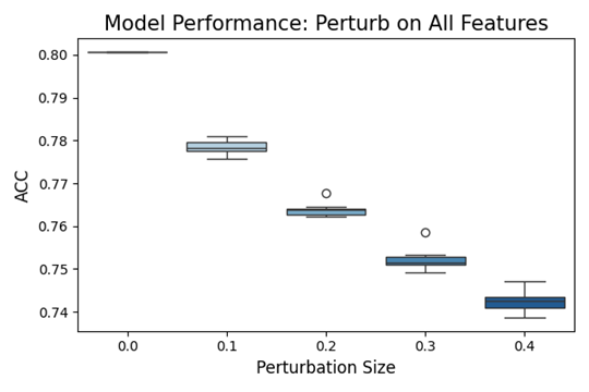
On the X-axis of the graph, we see the perturbation size, and on the Y-axis, we see the accuracy metric. The plot elements are box plots that represent the distribution of model accuracy across multiple trials at a specific level of perturbation. Outliers indicate points for which the model's accuracy was notably different from most of the data.
Zero Perturbation represents the baseline performance of the model with no alterations to the data. The model performs the best here, as indicated by the highest median accuracy and tight IQR. As the perturbation size increases, there is a noticeable trend of decreasing accuracy. This indicates that the model becomes less accurate as the input data is increasingly perturbed. As expected, the decrease in performance is more evident with larger perturbations.
This type of analysis is crucial for understanding how sensitive the model is to changes in its input data and can help in assessing how well the model might perform in real-world scenarios where input data could vary from the conditions seen during training.
B.2.6 Segmented Diagnostic Analysis
The last type of analysis we will discuss is particularly useful because it offers a deep view of individual features in order to find the weakest areas. An example is produced with the code snippet below. For model XGB1, the code will display how the different segments of ‘education' are doing in terms of the default performance measure which is accuracy. Note that ‘education' is a categorical feature and it will be segmented uniformly.
The results are shown below. Note that the segment IDs are assigned based on sorting the accuracies in ascending order. So, segment ID=0 is assigned to segment 2 because it has the lowest accuracy. The size parameter shows how many samples are contained in the segment. It is good news that the segment with the lowest accuracy also has the smallest number of samples in it.
We can further investigate these results, particularly segment 0, which displays the lowest accuracy. The code snippet below does this by assigning the value ‘accuracy_table' to the parameter ‘show'.
The results are shown in Table 3 below. The table displays valuable information about all five numeric performance measures and the gap in performance between the training and test data of segment 0. We also note that the number displayed in the accuracy table above was the lowest accuracy, which was that of the test data.
Conclusion
Yellowbrick and PiML offer valuable resources for data scientists and analysts who are interested in deepening their understanding of model behaviors. With the visualizations and insights these tools provide, users can address and resolve many issues related to data quality and model performance. This way, they can have models that are accurate, robust, and reliable for different scenarios and data segments. In this article, we only covered a part of the capabilities of these packages. In particular, PiML offers many more functionalities, such as assessing data quality, model resilience, etc.
In addition, given today's increasing privacy concerns, running things locally can be a compelling aspect of a cybersecurity plan. Another issue is the increasing complexity of today's data; images, audio, and text are being merged in multimodal applications, like robotics and contextual object detection with multimodal LLMs. The objects of interest in all these modalities need to be modeled as accurately as possible; therefore, it is essential to know how to evaluate different aspects of models, as discussed in this article.
The code for all discussed examples can be found in my Github repository: https://github.com/theomitsa/Yellowbrik-PIML
Thank you for reading!
References
- Kaggle notebook, Income Classification Model, https://www.kaggle.com/code/jieyima/income-classification-model
- Manokhin, V., Practical Guide to Applied Conformal Prediction in Python: Learn and Apply The Best Uncertainty Frameworks to Your Industry Applications, Packt Publishing, December 2023.
Datasets Used
- Wine dataset: UCI Machine Learning Repository, https://archive.ics.uci.edu/dataset/109/wine, License: This dataset is licensed under a Creative Commons Attribution 4.0 International (CC BY 4.0) license.
- Adult (Census Income) dataset: UCI Machine Learning Repository, https://archive.ics.uci.edu/dataset/2/adult License: This dataset is licensed under a Creative Commons Attribution 4.0 International (CC BY 4.0) license.
Note: "All images, unless otherwise noted, are by the author"
