Using Plotly 3D Surface Plots to Visualise Geological Surfaces
Within Geoscience, it is essential to have a full understanding of the geological surfaces present within the subsurface. By knowing the exact location of the formation and its geometry, it becomes easier to identify potential new targets for oil and gas exploration as well as potential carbon capture and storage locations. There are a variety of methods we can use to refine these surfaces ranging from seismic data to well log derived formation tops. Most often, these techniques are used in combination with each other to refine the final surface.
This article continues from my previous articles, which focused on the process of extrapolating well log measurements across a region to understand and visualise geospatial variations. In this article, we will look at how we can create 3D surfaces using interactive Plotly charts.
As modelling geological surfaces is a complex process and often involves multiple iterations and refinement, this article demonstrates a very simple example of how we can visualise this data with Python.
To see how we can use Plotly to visualise our geological formation top across an area we will be using two sets of data.
The first data set is derived from 28 intersections with the formation derived from wellbore picks, which are used as input for kriging to produce a low-resolution surface. In contrast, the second set of data is derived from interpreted seismic data, providing a much higher resolution surface.
Both sets of data are from the Equinor Volve dataset. Details of which are at the bottom of this article.
You can also check out the following articles within this mini-series at the links below:
- Plotly and Python: Creating Interactive Heatmaps for Petrophysical & Geological Data
- Utilising pykrige and matplotlib for Spatial Visualisation of Geological Variations
- Visualising Well Paths on 3D Line Plots with Plotly Express
Importing Libraries & Data
Before attempting to do any work with the data, we first need to import the libraries we will need. These are:
- pandas – to read our data, which is in
csvformat - matplotlib to create our visualisation
- pykrige to carry out the kriging
- numpy for some numerical calculations
- plotly.graph_objects to visualise surface in 3D
Python">import pandas as pd
import matplotlib.pyplot as plt
import plotly.graph_objects as go

from pykrige import OrdinaryKriging
import numpy as np
Next, we can load the data using pd.read_csv().
As this data contains information about geological surfaces from all of the wells within the Volve field, we can use query() to extract the data for the formation we need. In this case, we will be looking at the Hugin Formation.
df = pd.read_csv('Data/Volve/Well_picks_Volve_v1 copy.csv')
df_hugin = df.query('SURFACE == "Hugin Fm. VOLVE Top"')
df_hugin
When we run the above code, we get back the following table. You may notice that some wells have encountered the Hugin Formation multiple times. This is likely due to the wells penetrating the formation multiple times either due to wellbore or formation geometry.

Extrapolating TVDSS to Generate Geological Surface
In my previous articles, I have focused on how we can use a process known as kriging to "fill in the gaps" between the measurement points. We won't be covering the details of this process in this article; however, you can check this article for more information.
Once our data has been loaded, we can run the kriging process by calling upon pykrige's OrdinaryKriging method.
Within this call, we pass in our x and y data which represents the Easting and Northing position of where the wellbore encountered the formation within the subsurface.
As we want to generate a surface of the Hugin Formation, we need to use the TVDSS – True Vertical Depth Subsea – measurement. This gives a true reflection of how deep down the surface is below the selected datum.
OK = OrdinaryKriging(x=df_hugin['Easting'],
                      y=df_hugin['Northing'],
                      z=df_hugin['TVDSS'],
                      variogram_model='linear',
                      verbose=True, enable_plotting=True)
Once the model has been generated, we can apply it to two arrays that cover the entire range of the well/penetration points.
This allows us to generate a grid of values which are then passed into the OrdinaryKriging object we generated above.
gridx = np.arange(433986, 438607, 50, dtype='float64')
gridy = np.arange(6477539, 6479393, 50,dtype='float64')

zstar, ss = OK.execute('grid', gridx, gridy)
To finish things off, we can generate a simple 2D map view of our surface using matplotlib's imshow method.
fig, ax = plt.subplots(figsize=(15,5))

# Create a 2D image plot of the data in 'zstar'
# The 'extent' parameter sets the bounds of the image in data coordinates
# 'origin' parameter sets the part of the image that corresponds to the origin of the axes
image = ax.imshow(zstar, extent=(433986, 438607, 6477539, 6479393),
                  origin='lower')

# Set the labels for the x-axis and y-axis
ax.set_xlabel('X Location (m)', fontsize=14, fontweight='bold')
ax.set_ylabel('Y Location (m)', fontsize=14, fontweight='bold')

# Add contours
contours = ax.contour(gridx, gridy, zstar, colors='black')

colorbar = fig.colorbar(image)

colorbar.set_label('DTC (us/ft)', fontsize=14, fontweight='bold')

# Display the plot
plt.show()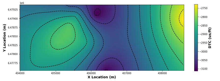
Creating a Simple 3D Surface Plot with Plotly
To convert our 2D surface to 3D, we need to use Plotly. We could use matplotlib to do this; however, from my experience, it is easier, smoother and more interactive to generate the 3D visualisations with Plotly.
In the code below, we first create our grid of coordinates. To do this, we use numpy's linspace function. This function will create a set of evenly spaced numbers over a specified range. For our dataset and example, the range extends from the minimum to the maximum of xgrid_extent and ygrid_extent.
The total number of values used within this range will be equivalent to the number of x and y elements present in the zstar grid we created above.
Once our grid is formed, we then call upon the Plotly.
First, we create our figure object and then use fig.add_trace to add our 3D surface plot to the figure.
Once this has been added, we need to tweak the layout of our plot so that we have axis labels, a defined width and height, and some padding.
xgrid_extent = [433986, 438607]
ygrid_extent = [6477539, 6479393]

x = np.linspace(xgrid_extent[0], xgrid_extent[1], zstar.shape[1])
y = np.linspace(ygrid_extent[0], ygrid_extent[1], zstar.shape[0])

fig = go.Figure()

fig.add_trace(go.Surface(z=zstar, x=x, y=y))

fig.update_layout(scene = dict(
                    xaxis_title='X Location',
                    yaxis_title='Y Location',
                    zaxis_title='Depth'),
                  width=1000,
                  height=800,
                  margin=dict(r=20, l=10, b=10, t=10))

fig.show()
When we run the code above, we get back the following interactive plot showing the geological surface of the Hugin formation based on the multiple encounters from the drilled wellbores.

Viewing a Fully Intepreted Surface with Plotly
The Volve dataset has a number of fully interpreted surfaces that have been generated from geological interpretations, including seismic data.
This data contains the x and y locations of data points across the field, as well as our TVDSS data (z).
The data supplied on the Volve data portal is in the form of a .dat file, however, with a bit of manipulation within a text editor, it can easily be converted to a CSV file and loaded using pandas.
hugin_formation_surface = pd.read_csv('Data/Volve/Hugin_Fm_Top+ST10010ZC11_Near_190314_adj2_2760_EasyDC+STAT+DEPTH.csv')
Once we have the data loaded, we can make things easier for ourselves by extracting the x, y and z data to variables.
x = hugin_formation_surface['x']
y = hugin_formation_surface['y']
z = hugin_formation_surface['z']
We then need to create a regularly spaced grid between our min and max positions within the x and y data locations. This can be done using numpy's meshgrid.
xi = np.linspace(x.min(), x.max(), 100)
yi = np.linspace(y.min(), y.max(), 100)
xi, yi = np.meshgrid(xi, yi)
There are several ways to interpolate between a series of data points. The method chosen will depend on the form your data is in (regularly sampled data points vs irregularly sampled), data size and computing power.
If we have a large dataset like the one here, it will be much more computationally expensive with some of the methods such as the Radial Basis Function.
For this example, we will use the LinearNDInterpolator method within scipy to build our model, and then apply it to our z (TVDSS) variable.
In order for us to interpolate between points, we need to reshape xi, yi to 1D arrays for interpolation, as LinearNDInterpolator expects 1D array.
xir = xi.ravel()
yir = yi.ravel()

interp = LinearNDInterpolator((x, y), z)
zi = interp(xir, yir)
Once that has been computed, we can move on to creating our 3D Surface with Plotly Graph Objects.
fig = go.Figure()

fig.add_trace(go.Surface(z=zi, x=xi, y=yi, colorscale='Viridis'))

fig.update_layout(scene = dict(
                    xaxis_title='Easting (m)',
                    yaxis_title='Northing (m)',
                    zaxis_title='Depth',
                    zaxis=dict(autorange='reversed')),
                  width=1000,
                  height=800,
                  margin=dict(r=20, l=10, b=10, t=10))

fig.update_traces(contours_z=dict(show=True,
                                  usecolormap=True,
                                  project_z=True,
                                  highlightcolor="white"))

fig.show()
When we run the above code, we get back the following 3D surface plot of the Hugin Formation.

When we compare this plot to the one generated from wellbore measurements, we can definitely see similarities in the overall shape with the valley in the middle. However, the seismic-derived surface provides much greater detail than the well-derived formation tops one.


Summary
Within this short tutorial, we have seen how we can use Plotly's 3D Surface plot to generate an interactive 3D visualisation of a geological surface. With well log derived formation tops, we can generate a very basic-looking 3D surface. This is due to the measurements being restricted to where the wellbores that have intersected the Hugin Formation, which means we end up with a low-resolution surface.
In contrast, we can generate a much more realistic impression of the formation if we have more detailed measurement points, such as from seismic-derived horizons.
Both methods are equally valid, however, you do have to bear in mind that when extrapolating from formation tops that have been derived from well log measurements alone, we may not have been able to generate a full picture of that formation across the area.
Dataset Used
The data used within this tutorial is a subset of the Volve Dataset that Equinor released in 2018. Full details of the dataset, including the licence, can be found at the link below
The Volve data license is based on CC BY 4.0 license. Full details of the license agreement can be found here:
Thanks for reading. Before you go, you should definitely subscribe to my content and get my articles in your inbox. You can do that here!
Secondly, you can get the full Medium experience and support thousands of other writers and me by signing up for a membership. It only costs you $5 a month, and you have full access to all of the fantastic Medium articles, as well as the chance to make money with your writing.
If you sign up using my link, you will support me directly with a portion of your fee, and it won't cost you more. If you do so, thank you so much for your support.
