Where Do EU Horizon H2020 Fundings Go?
All images created by the author.
The Horizon 2020 was the EU's research and innovation funding program from 2014–2020 with a budget of nearly €80 billion, funding research projects across the continent at various scales, covering topics from Anthropology to Particle Physics. As these grants usually funded international research, many of them were awarded to joint efforts of collaborative parties.
In this piece, I aim to explore some basic cross-sections of the rather rich data sets published about H2020 to have a brief overview on how these chunks of EU fundings were distributed across thousands of actors and hundreds of research topics. For that, I will use data shared by CORDIS. These data sets, owned by the EU, are authorized under the Creative Commons Attribution 4.0 International (CC BY 4.0) licence, providing a great playground for anyone interested in explorative Data Science or EU funding (or both).
In this article, I first conduct explorative analytical steps to capture the major trends of the data set, such as most funded topics and institutions. Then, I show a quick way to use Python to create an interactive map visualization highlighting the spatial and funding distributions of the funded organizations. While this map shows each organization as an independent entity, the EU funding schemes are highly built on collaborations. Hence, in the last part of this article, I build and visualize the collaboration network of funded entities.
Additionally, this analysis aims to highlight the potential of using various branches of data science to analyze the results of large-scale policies and propose the incorporation of data-driven measures for designing better future policies and monitoring mechanisms.
1. Downloading and parsing the data
While the CORDIS website lists more than 20 different data files, I will only focus on the parts here.
That contain general H2020 project information, such as including participating organizations, and project themes based on the classification of the European Science Vocabulary (EuroSciVoc).
First, let's parse the table containing all the project information stored in the organization.csv file:
import pandas as pd
root = 'csv'
df_org = pd.read_csv(root + '/' + 'organization.csv', sep = ';', on_bad_lines='skip')
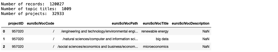
print('Number of records: ', len(df_org))
print('Number of organisations: ', len(set(df_org.organisationID)))
print('Number of projects: ', len(set(df_org.projectID)))
print(df_org.keys())
df_org = df_org[['projectID', 'projectAcronym', 'organisationID', 'name', 'city', 'country', 'geolocation', 'totalCost']]
df_org.head(3)The output of this code block:

This table tells us that there are about 42k organizations that run more than 35k projects. The total number of 178k records implies that many projects were run by multiple parties, hinting at the potential unfolding of an underlying network.
Besides, to ease the following analytical steps, I decided to filter the feature columns of this table and only kept the project ID and its acronym, the ID and name of the organizations, the city and country they are located in, their geolocation expressed as a pair of longitude-latitude coordinates, and the total cost of that given organization in the total project.
Now let's have a look at the table containing unified scientific categorization on each project's topic – euroSciVoc.csv
df_theme = pd.read_csv(root + '/' + 'euroSciVoc.csv', sep = ';', on_bad_lines='skip')
print('Number of records: ', len(df_theme))
print('Number of topic titles: ', len(set(df_theme.euroSciVocTitle)))
print('Number of projects: ', len(set(df_theme.projectID)))
df_theme.head(3)
The output of this code block:
The output of this code block clearly tells us that the 100k+ projects are tagged by altogether 1009 different scientific field categories (euroSciVocTitle).
2. Simple statistics
Top organizations
Now let's look at a few basic Statistics and create various top lists of this data set. First, see the most funded institutions and the number of unique projects they were involved in:
from collections import Counter

Counter(df_org[['projectID', 'name']].drop_duplicates().name).most_common(10)
The output of this code block, showing the name and frequency of institutions:

Budgets
Let's check the total amount of funding distributed – warning, we need to clean the totalCost column a bit.
def clean_cost(x):
    if type(x) is str:
        return float(x.replace(',', '.'))
    else:
        return x

df_org['totalCostClean'] = df_org['totalCost'].apply(lambda x: clean_cost(x))
df_org.head(3)
The total totalCost seems to align well with the official 80B+ statement:
df_org['totalCostClean'].sum() / 10**9Which yields the result of 85.7, measured in billions of euros.
Now compute the total amount of funding each organization received:
df_sum = df_org[['projectID', 'name', 'totalCostClean']].groupby(by = 'name').sum().sort_values(by = 'projectID', ascending = False)
df_sum.head(30)
From this table, we can also compute CENTRE NATIONAL DE LA RECHERCHE SCIENTIFIQUE CNRS is the only institution that received more than 1B Euros, while UNIVERSITA CA' FOSCARI VENEZIA ranked 30th is the first one receiving less than 10M amongst the highest funded institutions.
To have an understanding of how distorted the distribution of the funding amounts is, let's count a few further statistics:
print('Number of unique project fundings: ', len(df_sum))
print('Number of projects above EUR 1B:   ', len(df_sum[df_sum.totalCostClean>10**9]))
print('Number of projects above EUR 100M: ', len(df_sum[df_sum.totalCostClean>10**8]))
print('Number of projects above EUR 10M:  ', len(df_sum[df_sum.totalCostClean>10**7]))
print('Number of projects above EUR 1M:   ', len(df_sum[df_sum.totalCostClean>10**6]))
print('Number of projects between EUR 100k-1M:   ', len(df_sum[(df_sum.totalCostClean>10**5) | (df_sum.totalCostClean<10**6)]))
print('Number of projects below EUR 100k:   ', len(df_sum[df_sum.totalCostClean<10**5]))
The output of this code block:

This summary statistics tells us that there are very few extremely highly funded institutions, while the main body falls between 100k-1M, with a significant amount of nearly 13k institutions staying below 100k for total funding. Let's also see how the Pareto principle acts here:
print(df_sum[df_sum.totalCostClean>10**7].totalCostClean.sum()/10**9)
print(df_sum[df_sum.totalCostClean>10**6].totalCostClean.sum()/10**9)
The output of this code block:

These two figures tell us that 55% of the total funding amount went to those organizations that scored above 10M, and 77% of the whole 80B+ went to those scoring more than 1M.
Trending topics
Now let's see which topics were the most frequent and also the ones bringing on the most funding. The most frequent topics, are associated with the following number of projects:
Counter(df_theme.euroSciVocTitle).most_common(10)
df_project_funding = df_org[['projectID', 'totalCostClean']].groupby(by = 'projectID').sum()
df_theme.merge(df_project_funding, left_on = 'projectID',
               right_index = True)[['euroSciVocTitle', 'totalCostClean']].groupby(
                by = 'euroSciVocTitle').sum().sort_values(by = 'totalCostClean', ascending = False).head(10)
The output:

In conclusion, this table shows that the largest amount of money went into various sensory resources, and in general, renewable energy and sustainability seem to be a major focus. Interestingly, probably in order to be able to manage so many difficult projects, management activities seem to be at the top as well.
Topics and organizations
In the last part of the explorative section I create the topic profile of each organization:
df_org_theme = df_org[['projectID', 'name']].merge(df_theme[['projectID', 'euroSciVocTitle']], left_on = 'projectID', right_on = 'projectID')
df_org_theme = df_org_theme.drop_duplicates()
org_theme_profile = df_org_theme.groupby(by = 'name').agg(list).to_dict()['euroSciVocTitle']
Now attach the most frequent theme tag to each organization – if there is an equal number of the most frequent tag then its picked randomly:
org_theme = {o : Counter(profile).most_common() for o, profile in org_theme_profile.items() }
org_theme
The output:

While I was hoping for clean topic profiles, these counters rather show a pretty random distribution of topics per organization, so for now, I will leave it as it is.
3. The spatial dimension
Static map view
After a few summary statistics, I would like to show an interactive map that visualizes all funded institutions. Additionally, to focus on key funded players and decrease noise, I will, from now on, focus on organizations that received at least EUR 1M in funding total.
import geopandas as gpd
from shapely.geometry import Point

# let's get dictionaries containing the total funding and the geolocation of each organization
org_cost = df_org[['projectID', 'name', 'totalCostClean']].groupby(by = 'name').sum().sort_values(by = 'projectID', ascending = False).to_dict()['totalCostClean']
org_loc = df_org.set_index('name').to_dict()['geolocation']

# now transform the df_org table into a geodataframe and add the total funding for each entity
df_org_filt = df_org[df_org.totalCostClean>10**6]
gdf = df_org_filt[['name', 'geolocation']].drop_duplicates()
gdf[['latitude', 'longitude']] = gdf['geolocation'].str.split(',', expand=True)

gdf['latitude'] = pd.to_numeric(gdf['latitude'])
gdf['longitude'] = pd.to_numeric(gdf['longitude'])
geometry = [Point(xy) for xy in zip(gdf['longitude'], gdf['latitude'])]

gdf = gpd.GeoDataFrame(gdf, geometry=geometry)
gdf['totalCostClean'] = gdf.name.map(org_cost)

gdf.crs = 'EPSG:4326'
gdf = gdf[['name', 'totalCostClean', 'geometry']]
gdf = gdf[gdf.totalCostClean>10**6]

print(len(gdf))
gdf.head(3)
The output of this cell:

First do a simple plot using Matplotlib:
f, ax = plt.subplots(1,1,figsize=(15,15))
gdf.plot( ax=ax, alpha = 0.1, markersize = 6)
ax.set_xlim([-40,50])
ax.set_ylim([22,70])
It seems that some entities' locations fall outside of continental Europe, so I set the x and y limits manually to have a better view. Now, still using Matplotlib, I color the points based on the total funding they gut, using a log scale.
from matplotlib.colors import LogNorm

f, ax = plt.subplots(1,1,figsize=(15,8))
gdf.plot(column = 'totalCostClean', ax=ax, alpha = 0.7, markersize = 10, cmap = 'RdYlGn_r', norm=LogNorm())
ax.set_xlim([-30,45])
cbar = plt.colorbar(ax.collections[0], ax=ax, orientation='vertical')
cbar.set_label('Value')
ax.set_ylim([28,71])
ax.axis('off')
The output of this cell:

Interactive map view
This was nice, but we still can't really see the details. Let's build an interactive version using Folium, where each marker corresponds to a funded entity and is labeled by the name and the total amount of funding received, measured in EUR millions.
import folium
import branca.colormap as cm
import math

# Create a Stamen Toner Background map centered at the world's approximate center
m = folium.Map(location=[47.450, 6.268], zoom_start=5, tiles='Cartodbdark_matter', zoomControl=False)

# Create a colormap based on the years with 'inferno' colormap
min_val = gdf['totalCostClean'].min()
max_val = gdf['totalCostClean'].max()

# Define a custom colormap using 'inferno' from Matplotlib
cmap = plt.get_cmap('inferno')

# Calculate color for each year within the range
def get_color(val):
    normed_val = (val - min_val) / (max_val - max_val)
    return plt.cm.colors.rgb2hex(cmap(normed_val))

# Iterate through the GeoDataFrame and add circle markers with radius based on mass
for index, row in gdf.iterrows():

    try:

        lat, lon = row['geometry'].y, row['geometry'].x
        val = row['totalCostClean']
        radius = 2 + math.sqrt(val / 10**6 )
        val2 = val/10**6
        val2 = str(round(val2, 2)) + 'M'
        name = row['name']
        name = ' '.join([n.title() for n in name.split(' ')])

        # Get the color based on the year using the custom colormap
        color = get_color(val)

        folium.CircleMarker(
            location=[lat, lon],
            radius=radius,
            color='none',  # Transparent line boundary
            fill=True,
            fill_color=color,
            fill_opacity=0.4,  # Lower fill opacity
            tooltip=f'Total funding: {val2} nn name: {name}'
        ).add_to(m)

    except:
        pass

m.save("map.html")
m
While this code block outputs the interactive map into the file map.html, here is a static view as an illustration showing funded entities across Europe:

4. Mapping the network of organizations
Collaboration statistics
irst, filter the data to those 5000+ organizations that received more than 1M total funding. Then, I attach the list of projects (by project IDs) to each organization to capture the full profile of their project involvement.
Then, I defined the network of organizations as follows. Each organization is represented by a node, while two nodes are linked if they are part of the same project. Consequently, the more projects they shared, the stronger their connection, with its weight being measured as the total number of shared projects.
First, create a listing of collaborations:
df_org_filt = df_org[df_org.totalCostClean>10**6]
df_org_g = df_org_filt.groupby(by = 'projectID').agg(list)[['name']]
collaborations = df_org_g.name.to_list()
collaborations[0:10]
The result:

The variable collaborations contains the list of participants in each project. Let's have a quick look at the project size distribution, measured as the number of participating organizations:
collaboration_sizes = [len(c) for c in collaborations]
f, ax = plt.subplots(1,1,figsize=(6,4))
ax.hist(collaboration_sizes)
ax.set_yscale('log')
ax.set_xlabel('Size of collaboration')
ax.set_xlabel('Number of projects')
print(np.mean(collaboration_sizes))
print(np.median(collaboration_sizes))
print(np.max(collaboration_sizes))
print(len([c for c in collaboration_sizes if c == 1]) / len(collaboration_sizes))
The output statistics and histogram:

Building the graph
Based on this quick histogram and the underlying data, we can see that 84% of the projects only contain one partner. Note – these are the partners that received at least 1M of funding, meaning that there are 16% of projects that had multiple partners, either 2 or more than 50, who received at least one million euros as funding. That sounds quite impressive, so let's see how many connections these account for:
edges = {}

for collaborators in collaborations:
    if len(collaborators)>1:
        for idx, c1 in enumerate(collaborators):
            for c2 in collaborators[idx+1:]:
                if c1 != c2:
                    edge = 't'.join(sorted([c1, c2]))
                    if edge not in edges:
                        edges[edge] = 1
                    else:
                        edges[edge] += 1

len(edges)
Running this code block should result in 25216 edges. Now turn these 25k+ edges into a NetworkX graph object:
import networkx as nx
G = nx.Graph()
for edge, weight in edges.items():
e1, e2 = edge.split('t')
G.add_edge(e1, e2, weight = weight)
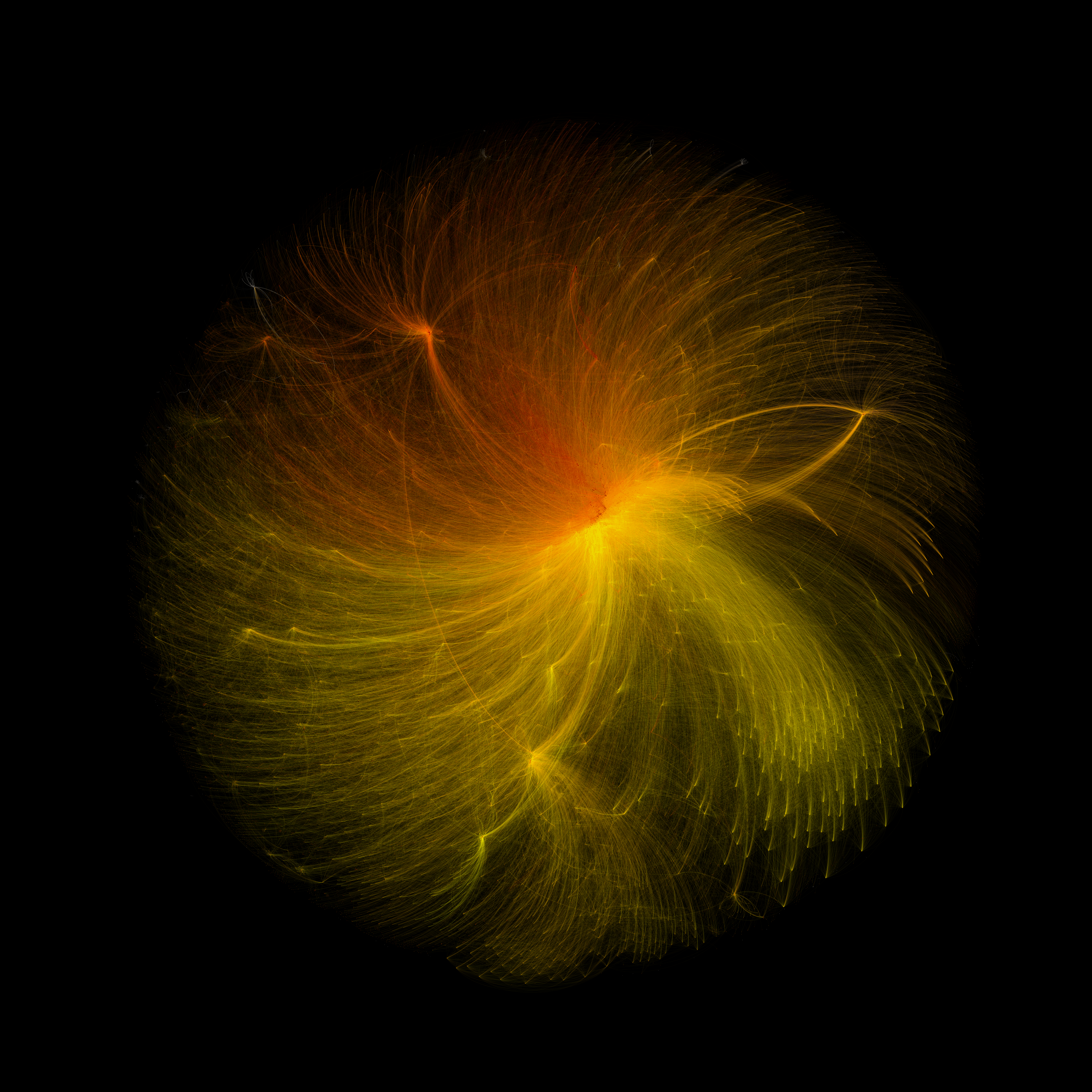
G.number_of_edges(), G.number_of_nodes()Here we arrived at a network of H2020 funded entities with 3290 nodes and 25217 links connecting them. Using the next two lines, I tried to take a look at the network using Matploblib; however, it took forever to run and looked terrible, so I decided to export the graph into a Gephi format and use that tool to create the final visual.
f, ax = plt.subplots(1,1,figsize=(15,15))
nx.draw(G)
Save the graph:
nx.write_gexf(G, 'h2020.gexf')Once visualized in Gephi using force layout, first I colored each node based on the organization's countries. This, as shown below, resulted in a pretty much random coloring pattern, despite the clearly visible clusters of nodes across the graph.

So, I decided to run a modularity finding algorithm, which groups nodes together into communities – each community is defined based on the higher number of links between member nodes (within the community) as opposed to the number of links pointing outside of the community. Hence, each community represents tightly knit clusters of nodes.

While the current analysis aimed to explore the basics of this H2020 data set, further research may aim to shed some light on the reason and characteristics that group certain nodes together into communities and what policy and funding implications this may have.
