Creating Dynamic Choropleth Visualizations Using Plotly

Visualizing data is a step that gets overlooked by data scientists. It helps us tell stories by analyzing and curating data into a form easy to understand. By removing all the technical detail and noise and highlighting key information, data scientists can explain the importance of their work to non-technical managers and executives.
There are many tools to help visualize data. For years, Microsoft Excel dominated the static visualization market. Over time, we gravitated to dynamic visualizations and flexibility to showcase more data in a cleaner manner. Two types of tools helped create dynamic visuals.
- Business Intelligence and Analytics Software: Tableau, PowerBI
- Open-sourced programming libraries: D3.js, Plotly Dash
Third party software tools like Tableau and PowerBI are excellent for non-technical folks. Drag and drop interfaces and abstractions allow analysts to create dynamic dashboards easily. The drawbacks are
- software tools are expensive
- a bit of a learning curve to learn these tools
- limits to visualization design; software may not allow some components
Open-sourced programming libraries are excellent for technical folks. Those comfortable with software engineering can follow the documentation to create flexible dynamic visualizations with ease. Furthermore, these packages are free to use (with Plotly offering a paid version for its enterprise Dash components).
The difference between D3.js and Plotly are the following
- D3.js is designed in JavaScript, Plotly is designed in Python
- D3.js has been around longer than Plotly, and thus has better community support and a more mature ecosystem(extensive examples and tutorials).
- D3.js requires engineers to understand the low-level details of web development (HTML, CSS, JavaScript) in order to use it effectively. Plotly abstracts such details in simple-to-use Python classes.
- D3.js has a steep learning curve due to its JavaScript nature (asynchronous, Domain Object Model, functions), but can build a variety of complex dynamic visualizations. Plotly has a small learning curve due to its Python nature, but is limited to the kind of visualizations users can build.
If this was in 2019, I would recommend D3.js. At that time, Plotly was severely constrained on the kinds of visualizations I would have liked to build.
However, I took a look at Plotly again and was impressed with its improvements. The clean interface makes it easy to rival some D3.js's custom visualizations. Furthermore, I don't have to learn the intricacies of JavaScript to utilize the package effectively.
In fact, I was able to create a complex visualization in just 147 lines of code. Below is the video of the visualization.
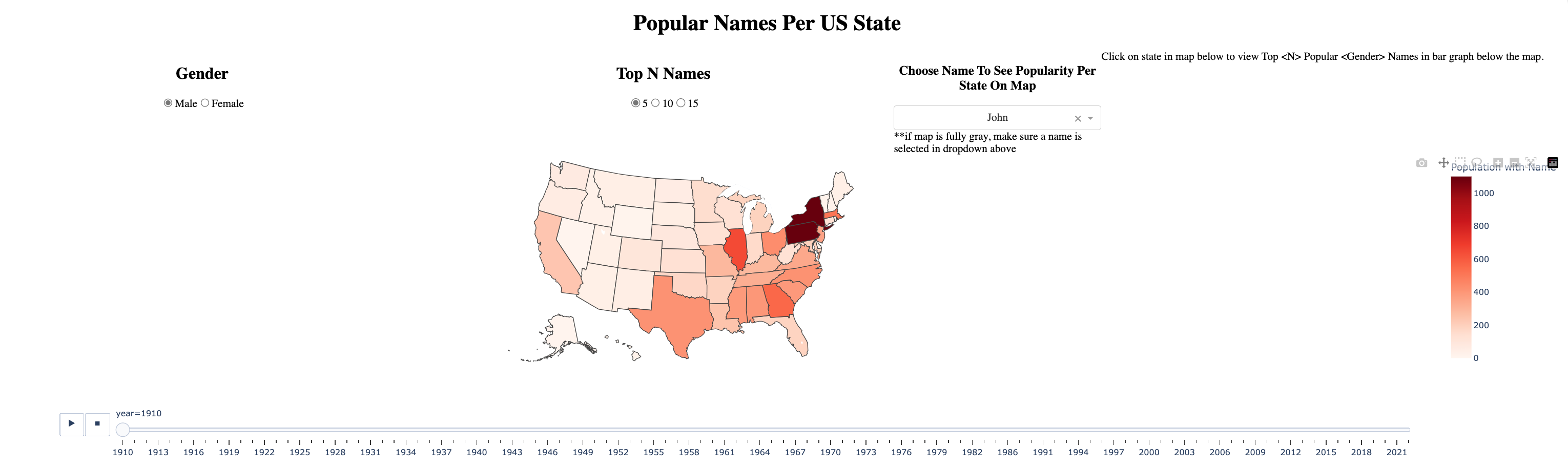
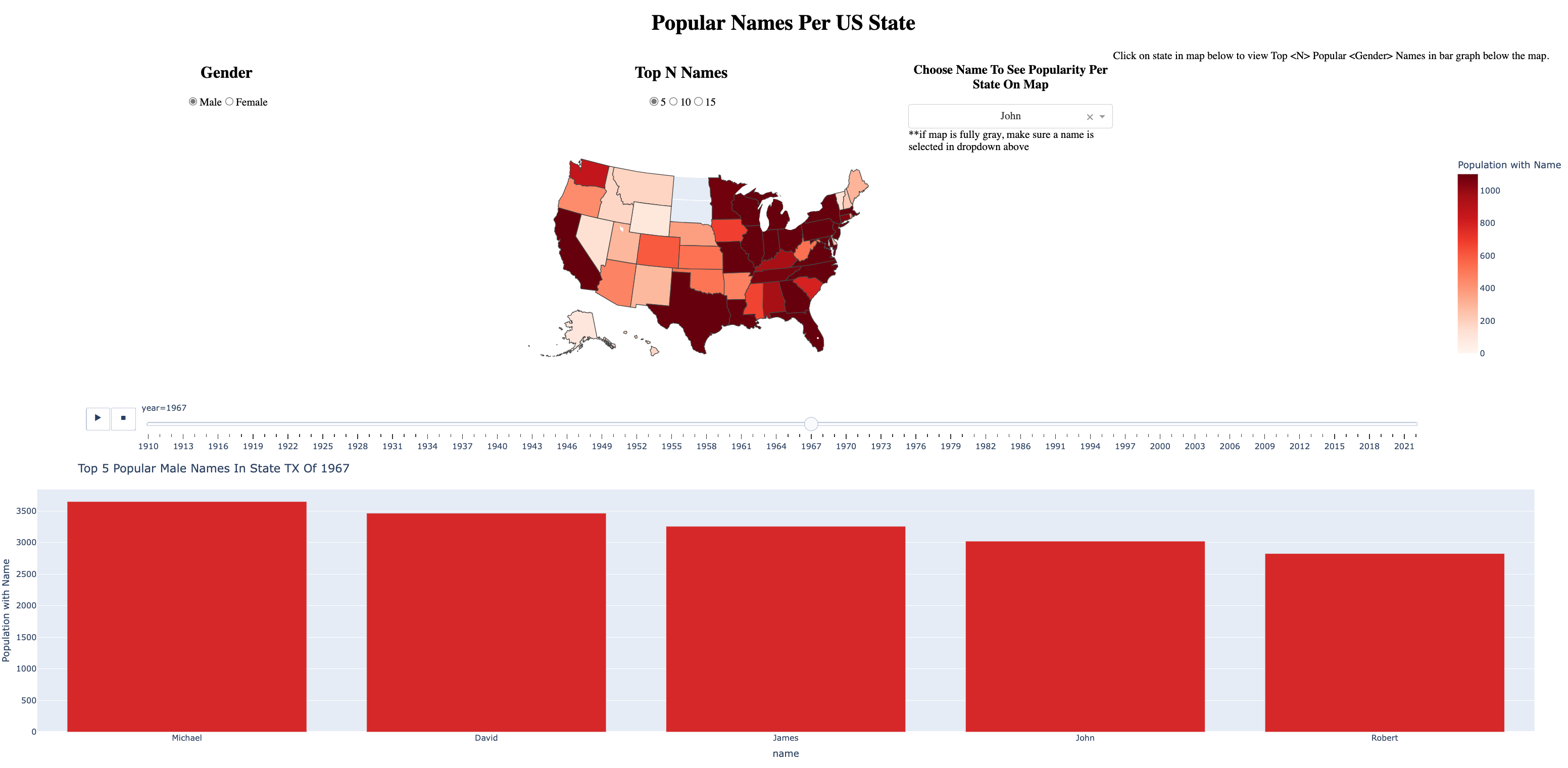
So what does the visualization do?
- It has a map that shows how many people have a particular first name. The particular first name is based on the far-right dropdown Choose Name To See Popularity Per State On Map
- The names recommended by the Choose Name To See Popularity Per State On Map dropdown are the most popular N names in the USA. These N names are filtered by the middle dropdown Top N Names, where N can be 5, 10, or 15.
- These names are also filtered by Gender. The Gender filter is on the far left, where users can choose Male or Female.
- Once the visualization is drilled down by Gender, Top N Names, and Choose Name To See Popularity Per State On Map, the map then displays the popularity of a selected name by state AND by year. There is a year filter that a user can drag through to show the popularity of the selected name over time instantaneously.
- If a user clicks on a state, the bar graph below is updated. The bar graph takes the state and year of the map upon the click and displays the Top N Popular Names in that given state and year. The Top N Names are based on the filter Top N Names.
- It has a loading spinner to suggest when data is currently being loaded in, thus improving the user experience.
The amazing part? This complex visualization was completed in just 148 lines of Python code. Some of the complex pieces were added in 1–3 lines of code! Check out the repository below.
Data-Science-Projects/Name-Dashboard/name_dashboard.py at master · hd2zm/Data-Science-Projects
I was amazed at how intuitive the package is. The creators put a lot of thought into making this easy for people who have limited programming experience.
While the documentation is straightforward, I'll go over how I built each component.
Plotly Components
Load in data
There are two datasets we're loading
- names_by_state_cleaned.csv – a custom dataset that lists all the first names of a person, the number of people with such name, the year, and the state. This dataset was downloaded and cleaned by the Social Security administration website. The datasets are publicly available for commercial use. Datasets were downloaded as folders containing many .txt files, and were merged into one CSV file using a custom script. This CSV file is 150 MB, and pretty big to upload to Github. For convenience sake, I'm attacking a sample screenshot of the dataset.

- us-states.json – a dataset of geographical coordinates of all states in the USA. This is used to create the choropleth map. This is 88KB, and can be easily loaded in memory. I've uploaded the json to the git repo containing the visualization code.
After creating the app, I load the two datasets in memory. Disclaimer: I explain later why loading in the csv file in memory isn't a good idea from a production standpoint. For now, I'll keep it as is.
app = Dash(__name__)

df = pd.read_csv('names_by_state_cleaned.csv')
f = open("us-states.json")
us_states = json.load(f)
HTML Layout
Here's the HTML design for the application
app.layout = html.Div(className = 'dashboard', children = [
    html.H1(children='Popular Names Per US State', style={'textAlign':'center'}),
    html.Div(className='filters', children=[
        html.Div(children=[
            html.H2(['Gender'], style={'font-weight': 'bold', "text-align": "center","offset":1}),
            dcc.RadioItems(
                id='sex-radio-selection',
                options=[{'label': k, 'value': k} for k in ["Male", "Female"]],
                value=initial_sex,
                inline=True,
                style={"text-align": "center"}
            )], style=dict(width='33.33%')),
        html.Div(children=[
            html.H2(['Top N Names'], style={'font-weight': 'bold', "text-align": "center","offset":1}),
            dcc.RadioItems(
                id='rank-dropdown-selection',
                options=[5, 10, 15],
                value=initial_rank,
                inline=True,
                style={"text-align": "center"}
            )], style=dict(width='33.33%')),
        html.Div(children=[
            html.H3(['Choose Name To See Popularity Per State On Map'], style={'font-weight': 'bold', "text-align": "center","offset":6}),
            dcc.Dropdown(
                options=[{'label': k, 'value': k} for k in names_in_initial_rank],
                id='top-rank-name-dropdown-selection',
                value=names_in_initial_rank[0],
                style={"text-align": "center"}
            ),
            html.Label(['**if map is fully gray, make sure a name is selected in dropdown above'], style={"text-align": "center","offset":6}),
            ], style=dict(width='15%')),
            html.Div(children=[
                html.Label(['Click on state in map below to view Top  Popular  Names in bar graph below the map.'], style={"text-align": "right"}),
            ],  style=dict(width='33.33%')),
        ], style=dict(display='flex')),
     dcc.Loading(
        id="loading-2",
        children=[
            dcc.Graph(
                id='map'
            ),
            dcc.Graph(id='bar_top_n')
        ],
        type="circle"
     )
])
Below is a screenshot of the layout that generates.

For those who are new to web development, Plotly abstracts all the complexities of HTML and CSS. Here are all the main components from the application.
- Header 1, which is the title of the visualization.

- HTML Div with class name
filters. This contains the Gender Header (html.Div), Gender options in radio button format (dcc.RadioItems), Top N Names Header (html.Div), Top N Names options in radio button format (dcc.RadioItems), Choose Name Header (html.Div), and Choose Name dropdown (dcc.Dropdown)

- A loading spinner (
dcc.Loading) that encompasses two graphs (dcc.Graph): one with id ofmap(see map from Figure 2) and one with id ofbar_top_n(see bar chart from Figure 2)

I was impressed that creating a loading spinner took 4 lines of code. This complexity requires a combination of CSS, HTML, and/or JavaScript in a website. Plotly abstracted those details so non-technical users can easily create a user friendly experience.
Furthermore, I enjoyed how Plotly kept the HTML DOM Structure while naming elements. As a former web developer, I quickly picked up on learning Plotly because of that HTML familiarity. Furthermore, I liked their utilization of the children parameter so the elements can be rearranged in an organized fashion. As a software developer, it's better to write code that is maintainable than to write code that is efficient, yet confusing to read.
You may notice some values like initial_rank or initial_sex in the dcc elements. Those are my custom variables I created before the app HTML layout. Here are these variables below.
year_values = df["year"].unique()
rank_values = df["rank"].unique()

initial_rank = 5
initial_sex = "Male"
initial_year = 1910
initial_state = "AK"

ranks = []
for i in range(0, initial_rank):
    ranks.append(i+1)

names_in_initial_rank = df[(df["rank"].isin(ranks)) & (df["sex"] == initial_sex[0]) & (df["year"] == initial_year) & (df["state"] == initial_state)]["name"].unique()
This is why you see the bar graph in Figure 2 set to the default title upon loading: Top 5 Popular Male Names In AK of 1910

The goal is to have default options populated when the user first loads the dashboard. The user can then navigate through clicks.
Now that we have the HTML layout, it's time to add actions. What happens when we click on the dropdowns, radio buttons, or map? We utilize JavaScript callback functions.
Callback functions
A JavaScript callback is a function which is to be executed after another function has finished execution. JavaScript is asynchronous, which allows it to run functions in the background while your application is running. Callbacks are used to execute logic after certain events, such as mouse-clicks or typing.
Plotly's template for callback functions is as follows
@callback {
   Output[],
   Inputs[]
}
def callback_function(Inputs[]) {
  return Outputs[]
}
Inputs and outputs take in two parameters:
- id of div
- type of input received from div
From HTML Layout, here are the following div ids we have
- sex-radio-selection
- rank-dropdown-selection
- top-rank-name-dropdown-selection
- loading-2
- map
- bar_top_n
The type of input can be parameters in dcc elements (dcc.Dropdown , dcc.RadioButton ) , clickData , hoverData , etc. Below is the callback function for the visualization.
@callback(
    [
        Output('map', 'figure'),
        Output('bar_top_n', 'figure'),
        Output("top-rank-name-dropdown-selection", "options")
    ],
    [
        Input('sex-radio-selection', 'value'),
        Input('rank-dropdown-selection', 'value'),
        Input('top-rank-name-dropdown-selection', 'value'),
        Input('map', 'clickData')
    ]
)
def update_graphs(sex_value, rank_value, name_for_map_value, click_data):

    df_filter = df[df["sex"] == sex_value[0]]
    ranks = []
    for i in range(0, rank_value):
        ranks.append(i+1)

    state = initial_state
    year = initial_year
    if click_data:
        state = click_data['points'][0]['location']
        year = click_data['points'][0]['customdata'][0]

    top_rank_name_dropdown_options = df[(df["rank"].isin(ranks)) & (df["sex"] == sex_value[0]) & (df["state"] == state)]["name"].unique()

    if not name_for_map_value:
        name_for_map_value = top_rank_name_dropdown_options[0]

    RENAMED_COUNT_COLUMN = "Population with Name"
    df_filter = df_filter.rename(columns={"count": RENAMED_COUNT_COLUMN})

    df_filter = df_filter.sort_values(by=["year"])

    df_map_filter = df_filter[(df_filter["rank"].isin(ranks)) & (df_filter["name"] == name_for_map_value)]

    df_bar_filter = df_filter[(df_filter["state"] == state) & (df_filter["rank"].isin(ranks)) & (df_filter["year"] == year)]
    df_bar_filter = df_bar_filter.sort_values(by=["rank"])

    fig_map = px.choropleth(df_map_filter, geojson=us_states,
                            locations='state',
                            color=RENAMED_COUNT_COLUMN,
                            animation_frame='year',
                            animation_group='state',
                            hover_name="state",
                            custom_data='year',
                            color_continuous_scale="Reds",
                            range_color=(0, 1100),
                            scope="usa"
                          )

    fig_map.update_layout(margin={"r":0,"t":0,"l":0,"b":0})

    bar_chart_title = "Top %i Popular %s Names In State %s Of %i"%(rank_value, sex_value, state, year)

    fig_bar = px.bar(df_bar_filter,
                     x="name",
                     y=RENAMED_COUNT_COLUMN,
                     title=bar_chart_title)
    fig_bar.update_traces(marker_color='#D62728')
    fig_bar.update_layout(margin={"r":50,"t":50,"l":0,"b":0})

    return [fig_map, fig_bar, top_rank_name_dropdown_options]
The choropleth map and bar chart are created using plotly express figures, and returned as part of the output. The order of output returned in the function matters, as it should correlate to the Output order specified in the callback template. The same holds true for Inputs.
The choropleth has an animation frame parameter, which takes in ‘year'. This creates the animation slider by year, shown in in Figure 6 and Figure 7.

The state and year variables are set to inital_state and initial_year , which were specified above. However, we would want to change those if a user clicked on a given state and a given year. Hence the if statement check if click_data is true, indicating if the clickData event is fired.
If click_data is true, we set state=click_data[points][0]['location'] and year=clic_data['points'][0]['customdata'] . Furthermore, we defined the input click_data as Input("map", "clickData") . This means that we're acknowledging a click if it happened on the map and updating the state and year based on the location and customdata properties of the map. Those are parameters defined when creating the choropleth map ( locations='state' and custom_data='year' ).


Other inputs from dropdowns are used in filtering the data frame of names that was initially loaded in. Below are how the filters operate after they are modified by the callback function.
Gender Filter


Top Rank Filter


Popular Name Filter


Putting it all together
Tips to Improve Visualization
Use SQL Databases and Queries for Optimization
You may have noticed in the video that the loading spinner takes 4+ seconds to load in the data from any filter changes EXCEPT for year. This is because the Plotly Dash app reads all 150MB of data from a CSV file in memory, and queries select data while the application is running. Hence, why it takes a while to process the data frame.
It is much faster to read from a database and select data using SQL queries. Now, you're not loading in all data into memory. Just some parts. Furthermore, SQL databases are more compact and take up less memory than CSV files.
Making the Bar Graph More Dynamic
The visualization's core component is the map of a single name's popularity over location and time. The bar graph of the top N names in a single year or time may be redundant, as it contains the same information as the top_rank_name_dropdown filter.
The top_rank_name_dropdown filter could be removed, and the bar graph can highlight the current name that the map is showing. If a user clicks on another bar with a different name, the map updates. If a user clicks on a state in a map, the bar graph will update with the top N names, state user selected, and year the slider was last on.
Have The Bar Graph Update on The Year Slider On The Map
It seems confusing that the map can be filtered by the year slider, but the bar cannot. The bar can be updated by state and year if the user clicks on a state on the map. This might be a confusing experience if a bar graph is from a different year than what the map year is on the slider.
There might be a way to have the same year filter for both the map and the bar graph, but I have yet to come across that solution.
My best guess is to see if there's an event fired off when moving the year slider. Then in the callback, update the bar graph to reflect the current year. However, this current approach doesn't do that because we're loading in 150MB of data in memory, and filtering it in memory. So there would be a tremendous lag time when moving the slider.
Revise Top N Filter
There are some states and years that only have 8 popular names in the dataset (Arkansas in 1910). This doesn't reflect well on the Top N Filter, which shows 8 bar graphs even when clicking on radio buttons 10 or 15. Perhaps such buttons need to be hidden and replaced with a Top 8 radio button in this special circumstance.
Conclusions
This tutorial showed how to create a complex, dynamic visualization using Plotly. While there are ways to improve the visualization, this nevertheless shows how easy it is to use this open-source package. With more technical engineers and data/business analysts switching to Data Science, we need better tools to help them convey the data to the executives in clean manners. Based on the free costs and little learning curve, Plotly puts itself as one of the best packages an aspiring data scientist should keep in his/her arsenal.
Thanks for reading! If you want to read more of my work, view my Table of Contents.
If you're not a Medium paid member, but are interested in subscribing just to read tutorials and articles like this, click here to enroll in a membership. Enrolling in this link means I get paid for referring you to Medium.
