Data Visualization with KNIME
The 2007 Nobel Peace Prize was awarded to Al Gore and the Intergovernmental Panel on Climate Change (IPCC) for raising awareness about climate change's dangers. The documentary "An Inconvenient Truth", directed by Davis Guggenheim, played a significant role in bringing the issue of climate change to the forefront of public consciousness. The film featured a slide show that Gore presented many times to worldwide audiences¹.
What's particularly worth noting is Al Gore's use of graphs and charts in that presentation. Despite some criticisms, these visualizations were pivotal in communicating the urgency of the climate crisis to a broad audience. Gore skillfully uses engaging visuals, effectively raising awareness, and underscoring the need for action against climate change. These visualizations convert abstract concepts into clear, accessible messages, proving valuable in discussing complex issues².
I recommend watching this film to anyone interested in data visualization and, perhaps more importantly, climate change.
So, what is this post about?
Surprise, surprise, it's about visualization. To be more precise, it's about crafting visualizations, reports, and dashboards with KNIME, a tool that caught my attention recently. If you've read some of my previous posts, you'll know I've immersed myself in the world of alternative visualizations, using various free and practical tools to create them.
One of these tools, KNIME, deserves a separate article. At least in my humble view. So, here it is.
For many of you, KNIME will be a familiar name. While preparing for this post, I encountered numerous articles describing the capabilities and functions of this tool. Yet, I got the impression that most writings on KNIME & visualization dealt with fragmented functions (such as preparing a single chart) and lacked a comprehensive view. I hope to bridge that gap.
When I began working with KNIME, I had zero knowledge of this tool. Yet, thanks to its ease of use, learning it proved no particular challenge. And it's certainly worthwhile to make this journey, as I will hopefully demonstrate.
This post is for those familiar with Data Visualization but new to KNIME. I hope this will be a perfect starting point for anyone looking to dive into the capabilities of KNIME in visualization quickly.
What is KNIME?
Knime is an open-source data analytics and visualization platform. It is particularly well-suited for data manipulation, making it easy to sort, merge, and analyze data without the need for coding. It also offers a wide range of statistical tools.
Knime boasts a 4.6 rating on Gartner Peer Insights, with new reviews still coming. According to 6sense, KNIME, with its 2038 customers has c.a. of 1% of analytics' platforms market share (#12 in the market). So it is a recognizable name but not a major player. What benefits can it offer?
Ease of use
KNIME's workflow-based approach makes it easy to use, even for people with limited data skills. This approach simplifies complex data processes by breaking them down into manageable steps. It is a more accessible alternative to other methods such as plain Python coding.
Machine learning and predictive modeling
KNIME is a powerful tool for machine learning and predictive modeling. It can efficiently handle tasks such as anomaly detection and regression. It can also connect to various data sources and automate workflows, streamlining data engineering tasks.
Visualization
KNIME's Visualization capabilities, powered by JavaScript libraries, offer a flexible toolbox for data presentation. This allows users to create clear and insightful visualizations of their data. I hope to display it in a second.
Reusability
A major benefit of KNIME workflows is their reusability. This means that workflows can be easily scheduled and run repeatedly, with new data sets being uploaded as needed. These workflows can also be integrated into reports and dashboards.
Visualization with KNIME: step-by-step
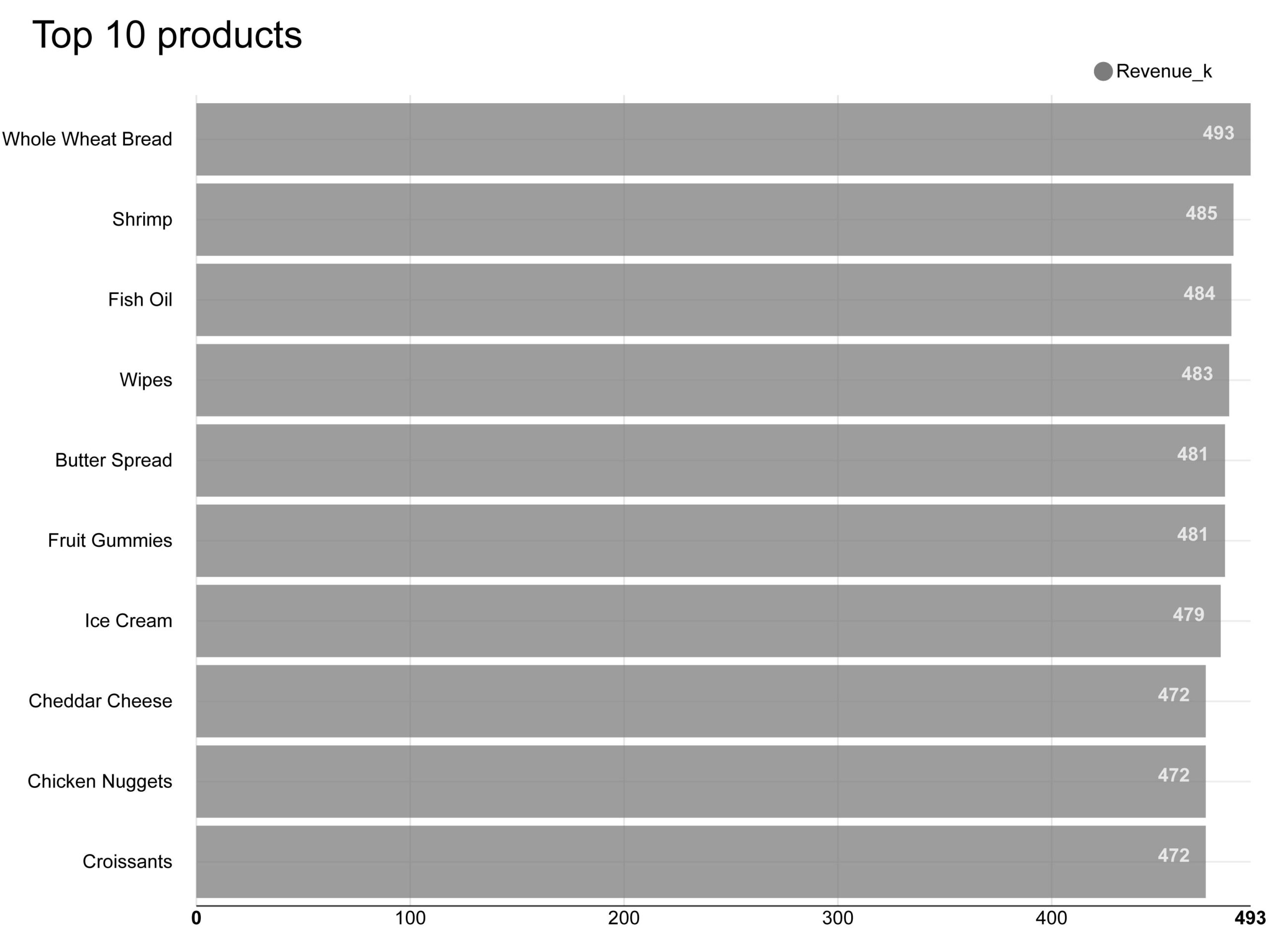
To start with something, I will show you how to craft the visual below. It's a bar chart showing the top 10 products in terms of revenue. Even though the final product may not seem very spectacular, one must follow a few steps to achieve this result.
By the way, most of the charts Al Gore used are fairly straightforward, many of them being line or area charts.
Step 1. KNIME installation
The first step is to download and launch KNIME. You can download the necessary set of files from their website at https://www.knime.com/download. Sometimes, difficulties arise when downloading them, e.g., on a Windows 11 system. If you face problems, I suggest checking the information at https://www.knime.com/installation-problems-on-windows. KNIME doesn't require traditional installation. You extract the files to your chosen directory and run the program.
Step 2. Data preparation
I have prepared a dataset for this exercise that can be downloaded from here. It's synthetic data containing the revenues and costs of an FMCG company over five years, from 2018 to 2022.
Once we have the data, we can input and process it in KNIME.
First, we need to create a new workspace. Select ‘File,' then ‘New…,' and finally, ‘New KNIME Workflow.'
We start by uploading data. Left-click on the dataset file in the folder you saved it and drag-and-drop it onto the workflow area in KNIME. An ‘Excel Reader' node will be automatically created.
We need the following nodes in the workflow:
- ‘Column Filter': Here, we will select the columns necessary for the first visualization.
- ‘Date & Time-based Row Filter': In this step, we will select the appropriate time range (I selected 2022).
- ‘Math Formula': We will use this to recalculate the revenue measure to show it in thousands, rounded to a single decimal place.
After adding all these nodes, we must connect them. Select two nodes with the left-click of your mouse and pick ‘Connect selected nodes.' You can also assign characteristic names to the nodes. Double-click on the default name and type in your own.

In the ‘Excel Reader' node, we configure the file import into our workflow. I haven't done anything else in this node at that point.
In the ‘Column Filters' node, I deselected ‘Product id', ‘Category', ‘COGS', ‘Marketing Spend', ‘Other Expenses', and ‘.'
In the ‘Date & Time-based Row Filter', I selected an inclusive date range from January 1st, 2022, to December 31st, 2022.
Finally, in the ‘Math Formula' node, I added the following equation: round($Revenue$/1000,1). I wanted to write it to a new column, so I selected the ‘Append Column' option and named the new column "Revenue_k." However, you can also overwrite an existing column if you want.
Step 3. Designing a visual
Sidenote: If you are uncertain about which visual to choose, you can seek assistance from ChatGPT (or any other LLM). Simply describe the data and your goal in the prompt, and you will receive helpful suggestions.


In our case, we already know what visual we want to craft. As a reminder, we'll create a chart displaying the top 10 revenue-generating products.

For this, we would need to add three additional nodes to our workflow:
- ‘GroupBy': We will group revenue according to product names.
- ‘Top K Selector': This allows us to select the top ‘x' items from a given dataset.
- ‘Bar Chart': To draw the actual chart.
Let's focus for a moment on the ‘GroupBy' node. To apply grouping, we first need to indicate the grouping column. In our case, it will be the product.

Next, we add aggregations. In our case, the selected aggregation method is ‘Sum.'

To set up the bar chart, follow these simple steps:
- Navigate to the ‘Options' tab. Select ‘Generate image' and designate ‘Product name' as the ‘Category column.' For the ‘Aggregation Method,' choose ‘Sum.'
- In the ‘General Options' tab, input a title for your chart. I recommend opting for ‘Plot horizontal bar chart.'

Take the opportunity to delve into other configuration settings. Experimenting with these options can help you discover a range of potential outcomes and possibilities.
Step 4. Publishing results
To complete the process, configure the export settings. One effective way is to use the ‘Image Writer (Port)' node. This step finalizes your work and prepares it for presentation or further use.

I configured the ‘Image Writer' to save the file as a .svg. The other option, .png, did not work on my computer. I understand from KNIME-related forums that this issue is quite common.

Finally, we can run our workflow by clicking ‘Execute all executable nodes' in the top menu.

If all goes well, we should see green lights beneath the nodes. If you are unhappy with the result initially produced by KNIME, you can always explore the KNIME Hub for additional options. One alternative to consider is KNIME JFreeChart, as exemplified below.

Alternatively, you can delve into the community options, such as this one. An added benefit of this last option is its increased control over the y-axis versus the basic chart I showcased above.

Wrapping up this section, we've created a simple visual using KNIME. Of course, there's potential to make it far more advanced, but be aware that the process can become complicated, raising the entry barrier quickly.
Visualization with KNIME: alternative visualizations
Sunburst chart
This first visual in KNIME we have just created was not spectacular. Now, let's explore whether we can create something more advanced.
In my recent post, I delved into the world of alternative visualizations, focusing on visuals beyond the standard bar, line, and pie charts. Let's investigate whether KNIME can also offer intriguing options in this area.
For this, we will again use our previous file as a starting point. This time, we will create a sunburst chart.

A sunburst chart is a visualization for displaying hierarchical data in concentric rings. Each ring in this chart represents a level in the hierarchy, segmented to demonstrate the proportion of each constituent part. This layout facilitates an intuitive understanding of the part-to-whole relationships within the data³.
To create the sunburst chart, I developed the below workflow. I chose the ‘Category' and ‘Product Name' columns in the ‘Column Filter' node.

At this step, checking if the column order aligns with what we intend to display in the chart is essential. Specifically, if the ‘Category' column is to be presented in the inner ring of the sunburst, then it must appear above ‘Product Name' in the column list. We can easily adjust this in the ‘Excel Reader' node, as shown in the image below.

Interactive table
The following visualization I will showcase is an interactive table. The animated picture below displays the final product.

Here is the workflow for creating the above table. The ‘Extract Date & Time Fields' node is a new element in this process.

We need this new node to extract the year number from the ‘Date' column. Then, using the ‘GroupBy' node, we can group use that number to group the values. Without this step, data for every single day would be displayed in the table, which would make it useless.

Line plot
Okay, this isn't an alternative visualization. However, I wanted to evaluate how well KNIME performs in trend analysis. Unfortunately, I must say it's disappointing. Look at the chart displayed below. My biggest complaint is the difficulty in controlling the chart axes, specifically in deciding the lowest and highest points. When crafting this chart, I hadn't figured out a simple way to do that. But I'll keep looking!


In the chart, I am displaying the monthly average price. To calculate it, I created a ‘Math Formula' node, where I input the following equation: Price = Revenue / Units Sold.
To generate multiple lines in the chart, I first extracted year and month values from the ‘Date' column and then applied pivoting. In the pivoting process, I placed ‘Month (number)' in the rows (refer to the 1st screenshot under the ‘Groups' tab) and ‘Year' in the columns (refer to the 2nd screenshot under the ‘Pivots' tab).


The last step was to create an aggregation rule for the ‘Price.' I selected ‘Mean' as the aggregation method.

If you want the plot to start scaling from zero on the y-axis, remember to check the ‘Always Show Origin' option in the configuration settings of the ‘Line Plot' node.

An alternative approach could be to use small multiple charts. In this example, I have displayed the average prices of separate products for 2022. The node used to create this was downloaded from the KNIME Hub.

Visualization with KNIME: using Report Designer⁴

Step 1. Installation of the Report Designer
At this point, I will show you how to design a report using the visualizations we created earlier. We must add the ‘Reporting Extension' if we haven't done so already. First, select ‘Install KNIME Extensions…' from the file menu. Then, type "report" in the search box and select ‘KNIME Report Designer.'

Step 2. Add Reporting nodes to your visualizations
We need to add reporting nodes to obtain the outcomes from separate workflows.

One crucial aspect to pay attention to at this stage is to use the custom image scaling option in the reporting node. Without this, your visualizations may not display correctly – they could be tiny and low-resolution. I selected Height & Width set at 400 and chose *.png as export format.
Step 3. Design the report
You can find the example report I generated here. To view it, first open the report editor. To do that, click on the icon in the top menu.

My first step in creating the report was to set the view to ‘Landscape' in the ‘Master Page' layout to allow more space for my visualizations vertically.

Then, I added and formatted a label for the title and arranged a grid to position my visualizations.
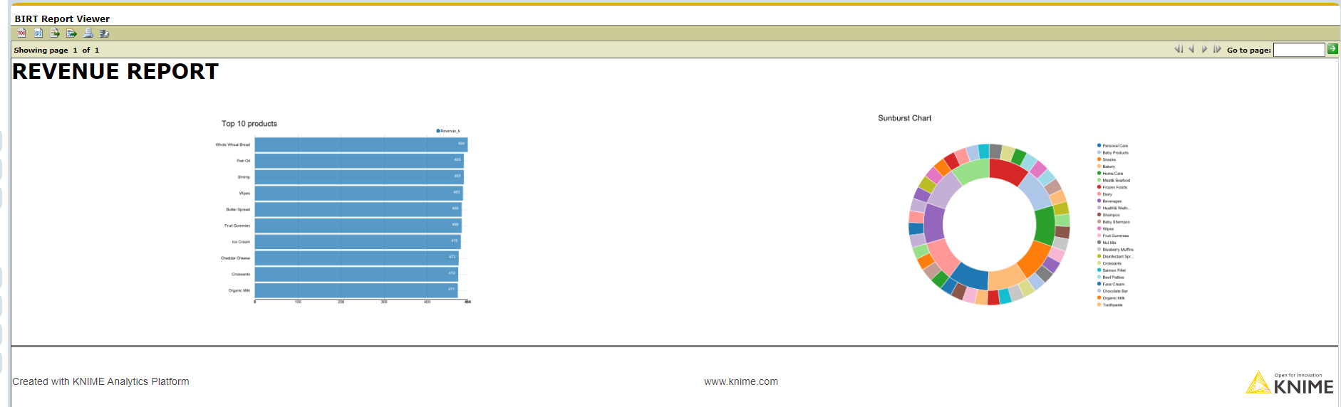
Let's add our first visualization – the bar chart. To do that, drag and drop the ‘Image' icon, choose the ‘BAR CHART TO REPORT' data source, and select ‘Image.'

You can control the alignment of the chart by adjusting the grid properties.

Then, I added the Sunburst chart similarly and clicked the ‘View Report' button in the top menu. I showcase the result in the image below.
Next, I wanted to add the table we created in one of the workflows (‘TABLE TO REPORT' node). I decided to do that in the ‘Cross Tab.' For such a table to work, we must first build a cube. It's an easy process. First, drag-and-drop ‘Cross Tab' to the grid. Then, drag any dimension or measure from the data source. This will initiate the ‘Cross Tab Cube Builder'. You must indicate the Groups (Dimensions) and Summary Fields (Measures) in the builder. You can assign new names to them to find them easily later.

You can view the cube in the ‘Data Explorer.' From there, you drag the fields into the table. You can display the measure (‘Revenue') as a chart.

Step 4. Publish the report
Publishing the report is as easy as pie. Choose one of the options from the ‘View Report' menu.

Visualization with KNIME: building interactive dashboards

I started with a slightly modified workflow from the visualization tutorial, where I've removed the reporting nodes and the table workflow. I left only one visualization per node. I recommend making a copy of our previously generated workspace if you wish to retain it. The first step to developing a dashboard was to select all the nodes and then click ‘Create component'⁵.

Open the component first to modify your workflows and/or design the dashboard layout.


My evaluation of KNIME
What do I like?
After working with KNIME for a few days, I must say that I see many advantages to this application. First, it is relatively easy to use. As you have witnessed, creating visualizations or even interactive dashboards is simple. I appreciate that you can work with KNIME locally and use it as an automation tool, such as having a regularly updated dashboard. The ease of installation, open-source foundation, and community support are definite pluses.
What don't I like?
However, there are also drawbacks. Some basic functions are unavailable or complicated, even with community assistance. For example, modifying chart axes, expanding color options for charts, or implementing an interactive slicer⁶ can be challenging. Furthermore, the visualizations could be more visually appealing. While most of these issues are solvable, the time and learning curve can quickly become steep.
Summary
In this post, I've explored the process of crafting visualizations in KNIME. I described steps necessary to create effective visuals, make detailed reports, and build interactive dashboards. KNIME's user-friendly interface, characterized by its drag-and-drop functionality and broad configuration options, makes it a versatile and powerful tool for data visualization. Moreover, its open-source nature and active community enable continuous improvement and guidance should we get stuck with a given problem.
Despite its strengths, KNIME occasionally exhibits limitations in certain functionalities. There is undoubtedly room for further enhancement.
Overall, KNIME proves to be a valuable tool for data visualization, offering a straightforward and intuitive approach to crafting meaningful insights from data. I intend to continue exploring KNIME's analytical capabilities and share my discoveries in future posts.
Did you like this post?
Consider a subscription to get notified about my new stories, follow me, or leave a
