Enhance Your Network Analysis with the Power of a Graph DB

Contents
- Introduction (you can skip this if you like)
- Setup & Installation
- Migrating from
networkxto Memgraph DB - Size Each Node By Feature Value
- Color Edges By Feature Value
- Next Steps
Introduction
So far I have presented to you the most convenient methods to create fully interactive network visualizations in Python with as little code as possible.
Now it is time to go one step further – and incorporate a graph database into our network visualizations.
In this article, I introduce to you a python compatible graph database that you can set up in 5 minutes.
It will allow you to gain ALL the benefits of having a graph DB, whilst also:
- Allow you to create a fully interactive visualization, where you can click on nodes and edges and view its attributes, plus drag and drop them.
- Convenient to implement – doesn't require too much code (like Dash), but powerful and flexible enough for most use cases.
- Compatible with commonly used network packages in Python such as
networkx. - Is free to use and open source.
As usual, the Python code accompanying this article can be found here:
bl3e967/medium-articles: The accompanying code to my medium articles. (github.com)
Any other code will be available in this article, and fully replicable.
Let's get started.
If you would also like a quick and convenient Python package to generate interactive visualizations, even without a graph DB, see the articles below:
The Two Best Tools for Plotting Interactive Network Graphs
The New Best Python Package for Visualising Network Graphs
An Interactive Visualisation for your Graph Neural Network Explanations
All images used in this article are created by the author, unless stated otherwise.
Setup & Installation
The package that we will discuss is called Memgraph, an open source graph database that comes with the visualization capabilities we need.
There are many ways to install Memgraph, and we will install it using docker, which is the default and easiest option.
For Linux and Mac users:
curl https://install.memgraph.com | shFor Windows users, you can use
iwr https://windows.memgraph.com | iexBUT!
Windows users, I recommend that you use WSL (Windows Subsystem for Linux) to emulate Linux on your computer and then to use the Linux installation commands instead.
I suggest this because some other dependencies which we need to install are much easier to install on Linux compared to Windows (believe me, I have tried both).
Steps for setting up WSL can be found at the end of this article, and the instructions from Microsoft is here: Install WSL | Microsoft Learn
Finally, some other dependencies we require:
pip install --user pymgclient
pip install gqlalchemy
pip install networkx
gqlalchemy is the package that bridges the gap between the Memgraph DB and Python, whilst pymgclient is a dependency for this and also the package that is troublesome to install on Windows.
Migrating from Networkx To Memgraph DB
Firstly we will look into migrating networkx graph data into Memgraph usinggqlalchemy. Other formats are supported, such as torch_geometric objects which we will cover in a later article. The full list of supported formats can be found here:
Dummy Data
Firstly, we simulate a dummy graphs using networkx:
def get_new_test_digraph(num_nodes:int=50):
    test_graph = nx.scale_free_graph(n=num_nodes, seed=0, alpha=0.5, beta=0.2, gamma=0.3)

    # append node properties
    nx.set_node_attributes(
        test_graph, dict(test_graph.degree()), name='degree'
    )
    nx.set_node_attributes(
        test_graph,
        nx.betweenness_centrality(test_graph),
        name='betweenness_centrality'
    )

    for node, data in test_graph.nodes(data=True):
        data['node_identifier'] = str(uuid.uuid4())
        data['feature1'] = np.random.random()
        data['feature2'] = np.random.randint(0, high=100)
        data['feature3'] = 1 if np.random.random() > 0.5 else 0

    # append edge properties
    for _, _, data in test_graph.edges(data=True):
        data['feature1'] = np.random.random()
        data['feature2'] = np.random.randint(0, high=100)

    return test_graph
And we will end up with a simulated directed graph of a scale free network.
Instantiating our test graph gives us the below static, simple plot:
import networkx as nx

test_graph = get_new_test_digraph() # default 50 nodes
nx.draw(test_graph)
We add the following attributes to each node:
node_identifier: Auuidto uniquely identify each nodefeature1: a simulated feature, uniformly distributed between 0 and 1.feature2: a simulated feature of integer values between 0 and 100.feature3: a Boolean feature that is either 0 or 1.betweenness_centrality: the number of shortest paths going through a node (normalized using min-max scaling).degree: the number of edges
And similarly, we add edge properties feature1 and feature2 of the same definition as for nodes.
Now, let's move on to creating an interactive visualization using a graph DB.
Export data into Memgraph
We define the following function that will export a given networkx graph object into our Memgraph database.
from gqlalchemy import Memgraph
from gqlalchemy.transformations.translators.nx_translator import NxTranslator

def export_nx_to_memgraph(g:nx.Graph, db:Memgraph):
    translator = NxTranslator()
    for query in list(translator.to_cypher_queries(g)):
        db.execute(query)
We can then run the below code to export our test_graph instance. Make sure Memgraph is running in docker.
memgraph = Memgraph() # get memgraph connection
memgraph.drop_database() # start from clean slate, empty the db.Why Use a Graph Database?

export_nx_to_memgraph(test_graph, memgraph)
We go to localhost:3030 on our browser to find our instance of Memgraph Lab.
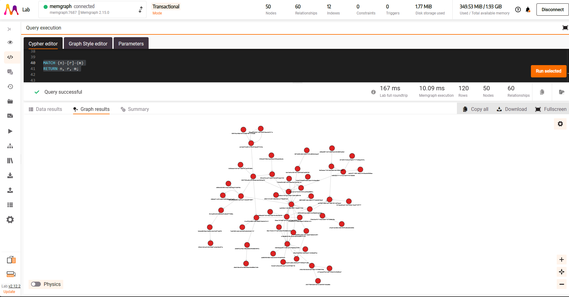
We can run Cypher queries in the ‘Cypher Editor' tab; running the below
MATCH (n) - [r] -> (m)
RETURN n, r, m
will return all nodes and edges for our graph.

This gives us a fully interactive network visualization where you can:
- Click on a node or edge to bring up the properties display on the right hand side (highlighted blue)
- Click on the
Physicsbutton on the bottom left to activate the force directed graph physics engine for the display (highlighted red) - Change the physics engine parameters by clicking on the cog symbol on the right hand side (highlighted green)
But we can't stop here.
We want to make our visualizations more informative by coloring and sizing each node and edge differently depending on their importance for our Data Science projects.
Let's see what we can do for some hypothetical use cases.
Size Each Node By Feature Value
Let's say our task is to identify potential fraudulent social network accounts that generate a lot of spam content, and our hypothesis is that they will act as hubs in our network (i.e. they will be motivated to connect to as many accounts as possible to send out spam).
One may consider using betweenness centrality to pluck out such accounts – the higher the value the more important they are.
For our visualization we would like to size our nodes by this metric such that a node acting as a hub will be larger than others.
We do this through the Graph Style Editor tab in our Memgraph session:

Here, we can create custom visualization styles that fit our needs using Memgraph's Graph Style Script language (memgraph.com) that I found to be quite easy and intuitive to learn.
What we need to do is tell the graph visualization that ‘if a node has the property betweenness_centrality, scale the size according to its value'.
@NodeStyle HasProperty(node, "betweenness_centrality") {

  // The minimum size of a node
  Define(minSize, 2)

  // The maximum size of a node
  Define(maxSize, 100)

  // By how much to scale the node size
  Define(scalingFactor, Sub(maxSize, minSize))

  // Compute nodeSize = minSize + betweenness_centrality * (maxSize - minSize)
  Define(
    nodeSize,
    Add(
      Mul(Property(node, "betweenness_centrality"), scalingFactor),
      minSize
    )
  )

  // Set the node size according to our computation
  size: nodeSize

}
And this code gives us the following:

You can now save this styling to use again for other queries using Save Style. You can also make this your default style when saving. This is convenient when you want different styling options for different pieces of analyses/feature engineering/EDA you do.
You will need to use the Apply button to apply any changes you make to your styling.

Color Edges By Feature Value
Now, let us assume our hypothetical feature feature1 on our edges is a probability score generated by an upstream anomaly detection model.
Any edge with a value close to 1 is an unexpected connection and you want to inspect which nodes this applies to and whom they are connected to.
Our rationale is that Spam accounts generally connect to randomly selected accounts and have no real reason to be connected in the first place.
We can start off by inspecting all edges that have a score greater than 0.9.
- To make it visually easier to identify such edges, we shall color them red.
- Furthermore, similar to what we did with edges, we want a thicker edge for those exceeding 0.9 so they visually stand out from the rest.
@EdgeStyle HasProperty(edge, "feature1") {

  // declare our threshold variable
  Define(maxThreshold, 0.9)

  // Flag any edges that have values exceeding threshold as red, else black.
  Define(edgeColor,
      If(
        Greater(Property(edge, "feature1"), maxThreshold),
        red,
        black
      )
    )

  // Thicken any edges that have values exceeding threshold.
  Define(edgeWidth,
    If(
        Greater(Property(edge, "feature1"), maxThreshold),
        2,
        0.5
      )
  )

  color: edgeColor
  color-hover: Lighter(edgeColor)
  color-selected: Darker(edgeColor)
  width: edgeWidth

}
We can write this simple edge style to generate the below plot:
Immediately we see that a lot of unexpected connections are concentrated around the immediate neighborhood of the large node on the right side of our plot.
This immediately gives us some interesting insights to work off of for our Spam account detection project.
Note, these are all just hypothetical scenarios and the underlying data is all randomly generated.
Next Steps
Now that you are setup with with Memgraph and have the basic visualization styling set up, it's time for you to unleash the true potential of this tool for yourself.
You have seen a taster for how useful a fully interactive visualization with a graph database backend can be for a data scientist. Why not try exploring Memgraph further and try the following:
- Try running Cypher queries from Python and visualize complex sub-networks that wasn't previously possible with Python alone, e.g. Temporal Graphs or large Heterogeneous networks.
- Create custom Styling using the Graph Style Editor for your different EDA use cases, feature engineering or sub-networks.
- Explore the different styling options that we did not cover in this article here: Data visualization in Memgraph Lab, or look out for my next articles that will cover common use cases for Data Scientists.
If you have any particular use cases that you want to see, please leave your suggestions in the comments section.
If you liked this article, please help us writers out by giving us as many claps as you like (up to 50!).
Appendix
Setting up WSL
Simply open cmd or powershell and install WSL using
wsl --installYou can then activate this through cmd or powershell by entering the command wsl.
The Docker installation on Windows should already be compatible with WSL, but if not go to Settings > General > Use WSL2 Based Engine. This will allow you to use docker on your WSL environment and enable you to use the Linux installation commands.
