From Dull to Stunning: How Matplotx Can Improve Your Matplotlib Charts
Matplotib is one of the most popular data visualisation libraries available within the Python world. However, over the years, it has gained a reputation for creating boring figures and being awkward to use.
As seen in my latest articles, converting the basic matplotlib Charts to something visually appealing does require several lines of code. Don't get me wrong; I enjoy using matplotlib due to it being highly customisable, but there are times when I just want a stylish plot without too much hassle.
This is where the matplox library comes in. Using two lines of code – an import statement and a with statement – we can instantly transform our basic matplotlib figure into something much more visually appealing.
The matplotx library provides an easy way to instantly stylise your Matplotlib figures. The library has been around for a while. It has been downloaded nearly 60,000 times and averages 3,000 downloads per month (at the time of writing this).
In this article, we will see how we can use this library to spice up our matplotlib figures.
Installing Matplotx
Matplotx can be installed into your Python environment by opening up a terminal/command prompt and running the following command.
pip install matplotxImporting Libraries and Setting up Data
For this article, we will start off by importing two common python libraries: pandas and matplotlib. Then we will import matplotx.
import pandas as pd
import matplotlib.pyplot as plt
import matplotx
Once the libraries have been imported, we can read in our dataset from a CSV file.
For this example, I am using a well from the Volve dataset. Details of this dataset can be found at the bottom of the article. This dataset contains a series of well log and petrophysical measurements from a well in the Volve Field, located on the Norwegian Continental Shelf.
In addition to specifying the file location, we need to convert the missing data value of -999 to a NaN value. This is done using the na_values parameter.
df = pd.read_csv('/well_log_data_volve.csv', na_values=-999)
df.head()
Once the data has been loaded, we can view the header of the dataframe using df.head()

Enhancing Matplotlib Scatter Plots With Matplotx
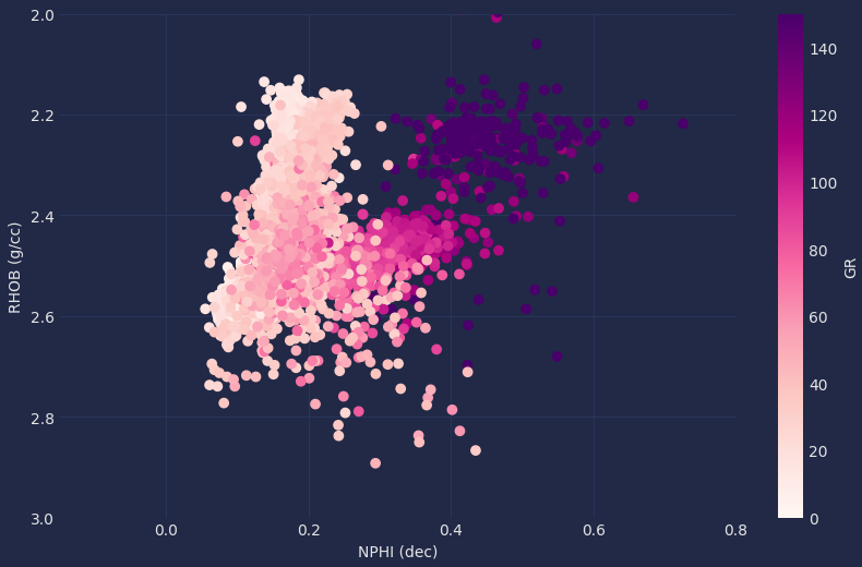
Now that the data has been loaded, the first plot we are going to create is a scatter plot. This is easily created using the following code.
plt.scatter(df['NPHI'], df['RHOB'], c=df['GR'])
plt.ylim(3,2)
plt.xlim(-0.15, 0.8)
plt.clim(0, 150)
plt.colorbar(label='GR')
plt.xlabel('NPHI (dec)')
plt.ylabel('RHOB (g/cc)')
plt.show()
When we run the above code, we get the following plot.

Even though we have a useable scatter plot, it doesn't stand out from the crowd of other matplotlib scatter plots out there.
Creating a Dracula Styles Matplotlib Scatter Plot with Matplotx
To apply the styles from matplotx, we need to add a single line of code before our matplotlib scatter plot code.
Using a with statement, we call upon plt.style.context and pass in matplotx.styles from here, we can choose one of the many available themes.
For this example, I have selected the Dracula theme – a very popular theme that seems to be in nearly every app.
with plt.style.context(matplotx.styles.dracula):
  plt.scatter(df['NPHI'], df['RHOB'], c=df['GR'])
  plt.ylim(3,2)
  plt.xlim(-0.15, 0.8)
  plt.clim(0, 150)
  plt.colorbar(label='GR')
  plt.xlabel('NPHI (dec)')
  plt.ylabel('RHOB (g/cc)')
  plt.show()
Without changing any other parts of the matplotlib code we had earlier, we can run it and get the following plot.

Removing Chart Junk with Matplotx and the duftify Function
When creating plots for our readers, it is often necessary to remove chart junk, such as gridlines, borders etc. This allows the reader to focus on the data rather than get distracted by other elements.
To see the impact of removing chart junk, the following animation was created by Darkhorse Analytics.
To help us remove chart junk like the animation above, Matplotx provides a nice function to help with this.
To use it, we need to call upon matplotx.styles.duftify and then pass in the matplotx style we want to use.
with plt.style.context(matplotx.styles.duftify(matplotx.styles.dracula)):
  plt.scatter(df['NPHI'], df['RHOB'], c=df['GR'])
  plt.ylim(3,2)
  plt.xlim(-0.15, 0.8)
  plt.clim(0, 150)
  plt.colorbar(label='GR')
  plt.xlabel('NPHI (dec)')
  plt.ylabel('RHOB (g/cc)')
  plt.show()
After running the above code, we get back the following plot.

We can see that the borders have been removed around the plot and on the colourbar. The labels for the axes have also been dimmed down, and immediately your eyes focus on the data rather than the extra stuff.
Other Styles with Matplotx
There are many other styles available from matplotx, and they can be viewed on the project's GitHub repository.
Here is just a sample of what is available:

One thing to bear in mind when using some of these styles is if the name in the graphic above has additional text in brackets after it, then you need to make sure to add that to your call to matplotx.styles.
For example, if we want to use Tokyo Night, we will have three styles to choose from: day, night and storm.

From the above, if we selected Tokyo Night (day), then we would need to add that in square brackets at the end of our call: matplotx.styles.tokyo_night['day']
with plt.style.context(matplotx.styles.tokyo_night['day']):
  plt.scatter(df['NPHI'], df['RHOB'], c=df['GR'])
  plt.ylim(3,2)
  plt.xlim(-0.15, 0.8)
  plt.clim(0, 150)
  plt.colorbar(label='GR')
  plt.xlabel('NPHI (dec)')
  plt.ylabel('RHOB (g/cc)')
  plt.show()
Running the above will generate the following plot in the desired style.

Applying Matplotx to Other Matplotlib Charts
We can also apply the matplotx styling to other plots, for example on a histogram. All we have to do is change the matplotlib plotting code so that we get the histogram.
with plt.style.context(matplotx.styles.pitaya_smoothie['dark']):
  plt.hist(df['RHOB'], bins=50, alpha=0.8)
  plt.xlim(2, 3)
  plt.xlabel('RHOB (g/cc)')
  plt.show()
When we run the above, we return the following histogram, which is significantly better looking than the basic blue bars we often see.

Summary
Even though Matplotlib is a powerful data visualisation library, it can be awkward to use, especially if you want to create stunning figures. With matplotx, we can add two lines of code and instantly transform our charts into something that is miles better. It is definitely a library that you should consider when creating your next figure and want to quickly add some style.
Thanks for reading. Before you go, you should definitely subscribe to my content and get my articles in your inbox. You can do that here! Alternatively, you can sign up for my newsletter to get additional content straight into your inbox for free.
Secondly, you can get the full Medium experience and support me and thousands of other writers by signing up for a membership. It only costs you $5 a month, and you have full access to all of the fantastic Medium articles and the chance to make money with your writing. If you sign up using my link, you will support me directly with a portion of your fee, and it won't cost you more. If you do so, thank you so much for your support!
Data Used Within This Tutorial
The data used within this tutorial is a subset of the Volve Dataset that Equinor released in 2018. Full details of the dataset, including the licence, can be found at the link below.
The Volve data license is based on CC BY 4.0 license. Full details of the license agreement can be found here:
