How to Create a Network Chart in Tableau

In a world increasingly driven by interconnected Data, understanding the relationships between various entities is more important than ever. Network charts, also known as network graphs or relationship maps, offer a compelling way to visualize these connections, providing clarity and insight into complex datasets. Whether you're analyzing social networks, organizational structures, communication flows, or any system of interrelated elements, network charts can help you see the bigger picture.
In this blog, I want to take you on a journey through the creation of a network chart using Tableau, focusing specifically on the structure of manager-employee relationships within an organization. Understanding how employees connect to their managers is crucial for visualizing organizational hierarchies, enhancing team dynamics, and identifying potential communication gaps.
Key Components of a Network Chart
Before diving into the creation of a network chart, it's essential to understand the architecture of network visualizations. Let's imagine an organizational chart of a small company in the form of a network chart.
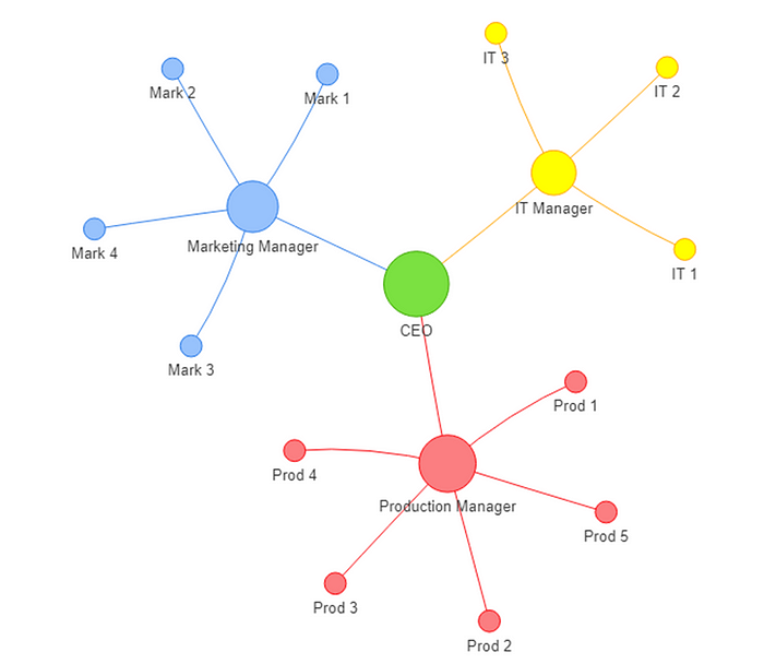
In this diagram, we can clearly see what a network chart consists of. Here, we have several "bubbles", each representing a role in a company. The largest bubble in the center is the CEO, who connects to three smaller bubbles, representing the team leads of the Production, Marketing, and IT departments. The lines illustrate manager-subordinate relationships. By using a network chart, we can quickly identify individuals at the highest level in the company.
In network chart terminology, these bubbles are called nodes. Nodes typically represent individual entities or objects within the network, such as people, products, accounts, or topics. Nodes are often connected to other nodes by lines, which represent the relationships or interactions between entities (e.g., friendships, transactions, or co-authorships), and these connections are known as edges.
Another essential feature of network charts is node attributes. In our example, node color is used to assign workers to their respective teams. Similarly, node size can indicate the importance of each entity in the network. Various metrics can determine node size, allowing you to set your own measure of importance. Here, we've based it on job level: higher-level roles result in larger nodes.
Example Metrics for Defining Node Importance
Before I show you step by step how to create the network chart in Tableau, I would like to provide some example metrics that can be used to define the size or importance of a node in a network. The code I provide for transforming the data into the network structure will also output the four centrality metrics. For your use case, you can simply choose the one that is most relevant to you. If you're not interested in the explanations of the metrics, feel free to skip this part.
One basic metric for identifying key nodes in your network is Degree Centrality. This metric simply counts the number of direct edges a node has. For example, in the context of followers and followings on Medium, a person with many followers would have a higher degree centrality, making them more important to the network.
However, direct connectivity doesn't always capture a node's importance accurately. Sometimes, there are nodes that serve as bridges between two others. Imagine several cities on either side of a river, with only one city located at a bridge. This city may not have a high degree centrality due to a lack of direct connections to other cities. Nevertheless, it remains crucial because all traffic between the two sides must pass through it. To measure this kind of importance, you can use Betweenness Centrality.
The third metric is Closeness Centrality, which measures how far, on average, all nodes in the network are from a particular node. Nodes with high closeness centrality can quickly reach others, making them effective at spreading information.
Eigenvector Centrality considers both the quantity and quality of a node's connections. Nodes that are connected to other high-scoring nodes receive a higher eigenvector score, indicating their influence within the network, much like celebrities or influential figures in a social circle.
There are many other statistics you can use to define the importance of a node in a social network. You can even create your own metric, such as considering a person's level within a company. Ultimately, it's important to understand what you want from the network chart and choose the metric that best fits your use case.
Create the Network Chart in Tableau
In this section, we will apply our understanding of what a network consists of – namely, nodes and edges – to create our network chart in Tableau.
We now know that the construction of the network itself relies solely on nodes and edges. To illustrate this, we will use mock data representing the company structure we previously discussed. If you would like to follow along with the code, you can download the data from my GitHub profile.
Let's assume we have the following data available, and we aim to create a network chart from it:

- Step – Data Preparation
For the first step, you need to structure the data appropriately. If you are using Python for your data preparation, I can provide you with the code to assist with this process.
import pandas as pd
import networkx as nx

def get_network_structure(data, manager_column, employee_column):
    # Create ID for unique relationships
    data['id'] = data.index + 1

    # Sort names to ignore order of relation
    data['sorted_pair'] = data.apply(lambda row: tuple(sorted([row[manager_column], row[employee_column]])), axis=1)

    # Group pairs and count occurences
    relationship_counts = data.groupby('sorted_pair').size().reset_index(name='count')

    # Create Manager and Employee column again
    relationship_counts[[manager_column, employee_column]] = pd.DataFrame(
        relationship_counts['sorted_pair'].tolist(), index=relationship_counts.index
    )

    # Create an undirected graph
    G = nx.Graph()

    # Add Edges
    for _, row in relationship_counts.iterrows():
        G.add_edge(row[manager_column], row[employee_column], weight=row['count'])

    # Calculate positions of nodes
    positions = nx.spring_layout(G, weight='weight')

    # Calculate centricity measures
    degree_centrality = nx.degree_centrality(G)
    betweenness_centrality = nx.betweenness_centrality(G, weight='weight')
    closeness_centrality = nx.closeness_centrality(G)
    eigenvector_centrality = nx.eigenvector_centrality(G, weight='weight', max_iter=10000)

    # Create lists for node data
    nodes = []
    x_coords = []
    y_coords = []
    degrees = []
    betweennesses = []
    closenesses = []
    eigenvectors = []

    # Append values to the list
    for node in G.nodes():
        nodes.append(node)
        x_coords.append(positions[node][0])
        y_coords.append(positions[node][1])
        degrees.append(degree_centrality[node])
        betweennesses.append(betweenness_centrality[node])
        closenesses.append(closeness_centrality[node])
        eigenvectors.append(eigenvector_centrality[node])

    # Create DF for centricity meaures
    employees_df = pd.DataFrame({
        'Node': nodes,
        'X': x_coords,
        'Y': y_coords,
        'Degree Centrality': degrees,
        'Betweenness Centrality': betweennesses,
        'Closeness Centrality': closenesses,
        'Eigenvector Centrality': eigenvectors
    })

    # Create Dataframe for relationships
    Lines = relationship_counts[[manager_column, employee_column]]
    Lines['Lines'] = range(1, len(Lines) + 1)
    Lines = pd.melt(Lines, id_vars=['Lines'], value_vars=[manager_column, employee_column],
                    var_name='Role', value_name='Node')
    Lines = pd.merge(Lines, employees_df, how='left', on='Node')
    Lines = Lines[['Lines', 'Node', 'X', 'Y', 'Degree Centrality', 'Betweenness Centrality', 'Closeness Centrality', 'Eigenvector Centrality']]

    return Lines
This function not only calculates the x and y positions of each node but also computes the centrality measures. We can then easily apply this function to our data.
result_df = get_network_structure(data, 'Manager', 'Employee')This will produce an output that looks like this:

2. Step -Load Data in Tableau and Create a Scatter Plot
After loading the data into Tableau, we simply need to drag the X values to the Columns shelf and the Y values to the Rows shelf.

3. Step – Create a Line Chart
To create the line chart, we need to drag a second X value to the Columns shelf and select "Lines" from the Marks card for the second visualization. By default, Tableau will connect all the dots in the order of the values on the column axis. However, to specify that we only want certain points connected, we can drag our "Lines" field to the Detail section in the Marks card.

4. Step – Create a Dual Axis
After that, we right-click on the second X in our Columns shelf and select "Dual Axis." Next, we right-click on one of the axes and choose "Synchronize Axis." Once synchronized, we can remove the axis lines and format our visualization to enhance its appearance.

Of course, it may not look very appealing at this stage, and there isn't much information conveyed by the graph. However, the true power of the network chart emerges once you add the node attributes to the visualization. By joining your resulting table from the first step with the categories per node and the data used for size, you can enrich your visualization with additional insights.

Conclusion
Throughout this blog, we explored the architecture of network visualizations and walked through the process of creating a network chart in Tableau. By incorporating node attributes and selecting appropriate metrics, you can tailor your network analysis to suit your specific needs and goals.
As you apply these concepts to your own data, remember that the key to effective network analysis lies in choosing the right metrics and understanding the context of your network. With the tools and techniques discussed here, you are well-equipped to explore the intricate web of relationships that define your data, leading to more informed decisions and valuable insights.
And there you have it! You've successfully navigated the intricate world of network charts and centrality metrics. If you've enjoyed this journey through nodes, edges, and the occasional data pun, give yourself a round of applause!
