How to Style Plots with Matplotlib
Quick Success Data Science

Decades ago, my mother gave me a maroon velour tracksuit as a Christmas present. It was a God-awful thing, and I replied that it wasn't really in style. She snorted derisively and said, "You set the style! Be a trendsetter!"
Needless to say, I did NOT set the style, but my wife still teases me with the "You set the style!" quote. I do set the style, however, when using Matplotlib, and unlike a velour tracksuit, that's a good thing.
For convenience, Python's Matplotlib library lets you override its default plotting options. You can use this powerful feature to not only customize plots but to apply consistent, automatic, and reusable styles for reports, publications, and presentations.
In this Quick Success Data Science project, we'll take a quick look at how to style plots with Matplotlib.
Styling Options in Matplotlib
If you've used Matplotlib much, you've probably changed the default settings for a plot, such as for the color of a line, by passing new values to methods that made the plot. But what if you want to set these values for multiple plots at the same time, so that all the curves are the same color, or to cycle through a pre-defined order of colors?
Well, you can do this by using either:
- Runtime Configuration Parameters
- Style Files
- Style Sheets
Let's look at each of these in turn.
Changing Runtime Configuration Parameters
One way to style plots is to set the parameters at runtime, using an instance of the RcParams class. The name of this class stands for runtime configuration parameters, and you run it from a notebook, script, or console using either the pyplot approach or the object-oriented style. (If you're not familiar with these two methods, see my article, Demystifying Matplotlib).
The plotting parameters are stored in the matplotlib.rcParams variable, which is a dictionary-like object. There's a very long list of configurable parameters, which you can view in the Matplotlib docs.
Now, let's look at a pyplot example in which we standardize the size of figures, use red for all plotted lines, and cycle through two different line styles. This means that the first line plotted will always have a certain consistent style and that the second line plotted will have another consistent style.
import numpy as np
import matplotlib.pyplot as plt
import matplotlib as mpl
from cycler import cycler
Notice here that we also import Matplotlib as mpl. Importing Matplotlib in this manner gives us access to more features than in the pyplot module alone. We also import cycler. The Cycler class will let us specify which colors and other style properties we want to cycle through when making multi-data plots. You can read more about it here.
To access a property in rcParams, you treat it like a dictionary key. You can find the valid parameter names by entering mpl.rcParams.keys().
In the next three lines, we set the figure size, line color, and line styles:
mpl.rcParams['figure.figsize'] = (5, 4)
mpl.rcParams['lines.color'] = 'firebrick'
mpl.rcParams['axes.prop_cycle'] = cycler('linestyle', ['-', ':'])
NOTE: You can also set parameters through
pyplot, using syntax likeplt.rcParams['lines.color'] = 'black'.
To cycle through the line styles, we used the axes.prop_cycle key and then passed the cycler factory function the parameter ('linestyle') and a list of the styles (solid and dotted). These defaults have now been reset for all plots that you will make in the current session.
To test it, let's generate some data and plot it:
# Prepare the data:
x = np.arange(0, 15, 0.1)
y = np.sin(x)

# Plot the data:
plt.plot(x, y)
plt.plot(x + 1, y - 2);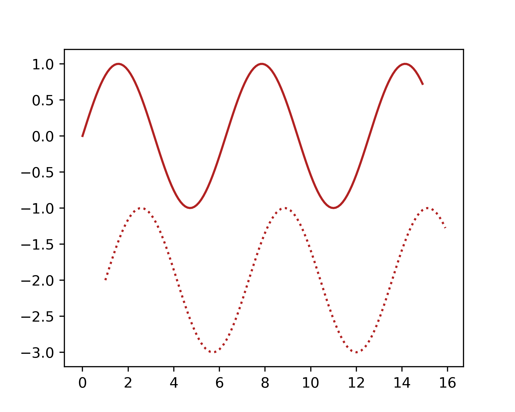
Normally, this code would produce a plot with two solid lines, one blue and one orange. We overrode the defaults, however, so that we got two red lines distinguished by different line styles.
Note that if you were to plot three lines in the previous plot, the third line would cycle back to using the solid line style, and you'd have one dotted and two solid lines. If you want three different styles, you'll need to add the extra style to the cycler.
For convenience, Matplotlib comes with functions for simultaneously modifying multiple settings in a single group using keyword arguments. Here's an example where we first restore the default settings and then change the line width:
plt.rcdefaults()  # Restore plot defaults.

mpl.rc('lines', lw=5)
plt.plot(x, y)
plt.plot(x + 1, y - 2);
In this plot, the default blue-orange color scheme is restored but the line width is customized to 5.
Note that you can also reset the defaults using:
mpl.rcParams.update(mpl.rcParamsDefault)Creating and Using a Style File
You can save changes you make to the Matplotlib defaults in a file. This lets you standardize plots for a report or presentation and share the customization within a project team. It also reduces code redundancy and complexity by letting you preset certain plot parameters and encapsulate them in an external file.
Let's create a simple style file that sets some standards for plots, such as the figure size and resolution, the use of a background grid, and the typeface and size for titles, labels, and ticks. In a text editor, enter the following:
# scientific_styles.mplstyle

figure.figsize:    4, 3  # inches
figure.dpi:        200
axes.grid:         True
font.family:       Times New Roman
axes.titlesize:    24
axes.labelsize:    16
xtick.labelsize:   12
ytick.labelsize:   12
For Matplotlib to easily find this file, you need to save it in a specific location. First, find the location of the matplotlibrc file (where Matplotlib stores its defaults) by entering the following in the console:
import matplotlib as mpl
print(mpl.matplotlib_fname())
Here's the output for my computer (yours will be different):
C:Usershannaanaconda3libsite-packagesmatplotlibmpl-datamatplotlibrcThis shows you the path to the mpl-data folder, which contains the matplotlibrc file and a folder named stylelib, among others. Save your style file into the stylelib folder as _scientificstyles.mplstyle (replacing the .txt extension).
NOTE: If Matplotlib has trouble finding this file later, you might need to restart the kernel.
Now, let's use this file to create a standardized plot. After importing pyplot, use its style.use() method to load the style file without its file extension:
import matplotlib.pyplot as plt
plt.style.use('scientific_styles')
Next, generate an empty figure using the object-oriented style:
fig, ax = plt.subplots()
ax.set_title('Standardized Title')
ax.set_xlabel('Standardized X-label')
ax.set_ylabel('Standardized Y-label');
When you saved your style file, you might have noticed that the stylelib folder was full of preexisting mplstyle files. These files create many different plot formats, and you can look through them for clues on how to write your own style files. In the next section, we'll use one of these files to override some of Matplotlib's default values.
Applying Style Sheets
Besides letting you customize your own plots, Matplotlib provides pre-defined style sheets that you can import by using style.use(). These are the same format as the style file you created in the previous section.
Style sheets look the same as the matplotlibrc file, but within one, you can set only rcParams that are related to the actual style of the plot. This makes style sheets portable between different machines because there‘s no need to worry about uninstalled dependencies. But don't worry, only a few rcParams can't be reset, and you can view a list of these here.
To see examples of the available style sheets, visit Matplotlib's Style Sheet Reference page. These examples take the form of a strip of thumbnails, as shown below. Some of the style sheets emulate popular plotting libraries like Seaborn and ggplot.

An important style sheet to be aware of is the seaborn-colorblind sheet. This style sheet uses "colorblind-safe" colors designed for the 5 to 10 percent of the population that suffers from color blindness.
Let's try out a scatterplot using the grayscale style sheet that ships with Matplotlib. First, import NumPy and Matplotlib and select the grayscale style sheet.
import numpy as np
import matplotlib.pyplot as plt

plt.style.use('grayscale')
Next, generate some dummy data for making two different point clouds:
x = np.arange(0, 20, 0.1)
noise = np.random.uniform(0, 10, len(x))
y = x + (noise * x**2)
y2 = x + (noise * x**3)
Finish by setting up and executing the plot using the pyplot approach. Use log scales for both axes:
plt.title('Grayscale Style Scatterplot')
plt.xlabel('Log X')
plt.ylabel('Log Y')
plt.loglog()
plt.scatter(x, y2, alpha=0.4, label='X Cubed')
plt.scatter(x, y, marker='+', label='X Squared')
plt.legend(loc=(1.01, 0.7));
The point locations you see might differ from this figure due to the use of randomly generated data.
If you open the grayscale.mplstyle file, you'll see that it looks a lot like the _scientificstyles.mplstyle file that we made in the "Creating and Using a Style File" section. So, if an existing style sheet is not quite right for your purposes, you can always copy the file, edit it, and save it as a new style sheet!
Limiting Styling to Code Blocks
If you want to use a style for only a specific block of code, rather than your entire script or notebook, the style package provides a context manager for limiting your changes to a specific scope. For more on this, see "Temporary styling" in the docs.
Summary
Matplotlib provides three main methods for styling plots. You can change the runtime configuration parameters within your script, make your own style file and save it in the stylelib folder, or use a pre-defined style sheet from the stylelib folder. You can apply these style changes to your entire code or to specified code blocks.
Storing your style parameters in a file gives you the ability to share them with team members so that everyone's plots have a consistent, unified look. Besides aiding the customization of plots, these techniques let you write cleaner code through the process of abstraction.
Thanks!
Thanks for reading and please follow me for more Quick Success Data Science projects in the future. For more Matplotlib tips and tricks, check out Chapter 19 of my book, Python Tools for Scientists.
Python Tools for Scientists: An Introduction to Using Anaconda, JupyterLab, and Python's Scientific…
