Sketch: A Promising AI Library to Help With Pandas Dataframes Directly in Jupyter

The interest in using the power of AI and large language models to create interactive chatbots like ChatGPT has exploded in recent months. It was only a matter of time before we could use the powers of these models directly from a Python library within a Jupyter Notebook.
A recently launched Python library called Sketch brings an AI coding assistant directly to Python and is easily used within Jupyter notebooks and IDEs. The library is aimed at making it easier for users to understand and explore data stored within a pandas dataframe without the need for additional plugins.
The sketch library can quickly summarise data that is stored within the dataframe. It does so by creating data summaries using approximation algorithms (known as data sketches) and then passing the generated summaries into a large language model.
Through natural language input and the available functions, we can explore our dataset. This can be helpful in a number of ways, for example:
- Creating an app for non-coder end users to explore the data
- For quickly getting code to create plots and managing data
You can find more on the library at PyPi:
Within this article, we are going to explore two of the available functions within sketch. The .ask and the .howto functions. These allow us to ask questions about our dataframe and how to do things with it. This is done using natural language rather than using in-built pandas functions.
At the time of writing this article, the Sketch library is only a few months old and at version 0.3.5. It is still actively being developed.
Importing Libraries and Data
The first step is to import sketch and pandas into our notebook like so.
import sketch
import pandas as pd
Next, we will load in our data from a CSV file using the pandas read_csv function. Within this function, we will pass in the file location and name.
df = pd.read_csv('Data/Xeek_Well_15-9-15.csv')When the data has been loaded, we can check the contents of it by calling upon df.

Now that we have the data loaded, we can begin using sketch in our notebook.
After sketch has been imported, three new functions attached to the dataframe object will become available to us. These are df.ask() , df.howto(), and df.apply(). For this article, we will focus on the ask and howto methods.
Asking Sketch Questions with .sketch.ask
The .ask() method allows us to ask questions about the dataframe using simple language. We can use this method to help us understand and explore the data.
To give this a try, we will ask how many unique values are there within the GROUP column of our dataframe. This column should contain 7 different geological groups.
df.sketch.ask('How many unique values are in the GROUP column?')Sketch will return the following:
7We can expand the query and ask Sketch to give us the unique values present within the GROUP column in addition to how many there are:
df.sketch.ask("""How many unique values are in the
GROUP column and what are the values?""")
Sketch returned the following. You will see this is written in a more sentence-like way as opposed to having just a number and list returned. This is handy if we want to copy the output directly to a report.
The GROUP column has 7 unique values: 'NORDLAND GP.', 'VESTLAND GP.',
'TROMS GP.', 'FINNMARK GP.', 'SVALBARD GP.', 'BARENTS SEA GP.', and
'NORTH SEA GP.'.
Although, the AI assistant became confused when the same question was asked of the FORMATION column:
df.sketch.ask("""How many unique values are in the
FORMATION column and what are the values?""")
Which returned a list of lithologies instead of a list containing geological formations.
The FORMATION column has 15093 unique values.
The values are: ['nan', 'SHALE', 'SANDSTONE', 'LIMESTONE',
'DOLOMITE', 'CHALK', 'ANHYDRITE', 'GYPSUM'].
We can check what is actually present within the FORMATION column by calling upon df.FORMATION.unique() . When we do this, we get back an array of formation names, which is as expected.
array([nan, 'Utsira Fm.', 'Frigg Fm.', 'Balder Fm.', 'Sele Fm.',
       'Lista Fm.', 'Tor Fm.', 'Hod Fm.', 'Blodoeks Fm.', 'Draupne Fm.',
       'Heather Fm.', 'Skagerrak Fm.'], dtype=object)
We can also ask Sketch to give us some statistics about the data. In this example, we will get the minimum, maximum and the mean values for the GR (gamma ray) column.
df.sketch.ask('What is the min, max and mean values for the GR column')Sketch returned the following:
The min value for the GR column is 6.0244188309,
the max value is 804.2989502 and the mean value is 57.9078450037.
At first glance, this looks reasonable. However, when we call upon df.describe() and view the pandas summary statistics, we can see that the mean value of 59.1542 differs from what Sketch returned: 57.9078.

Could this potentially be the result of a bug in the code? Possibly.
Asking Sketch How to Do Things Using sketch.howto
Sketch allows us to ask it how to do things with our dataframe and will return a code-block. This is handy if you want to quickly plot the data without remembering all of the matplotlib calls.
For this example, we will ask it how to create a simple density vs neutron porosity scatterplot, which is commonly used within petrophysics.
df.sketch.howto("""How to make a scatterplot with NPHI on the x axis,
caled from 0 to 0.8, and RHOB on the y axis reversed scaled from 1 to 3""")
This returns back some simple matplotlib code, which can be copied and pasted into the next cell:
import matplotlib.pyplot as plt

# Create the scatterplot
plt.scatter(df['NPHI'], df['RHOB'])

# Set the x-axis limits
plt.xlim(0, 0.8)

# Reverse the y-axis limits
plt.ylim(3, 1)

# Show the plot
plt.show()
Which, when run, generates the following plot:

We can see that the above plot is very simple, so let's add some colour to the plot by using a third variable.
df.sketch.howto("""How to make a scatterplot with NPHI on the x axis,
scaled from 0 to 0.8 and RHOB on the y axis reversed scaled from 1 to 3.
Colour the points by GR and add a colorbar.
Limit the colorbar values to between 0 and 200.""")
Which returns the following code
import matplotlib.pyplot as plt

# Create the scatterplot
_['NPHI'].plot.scatter(x='NPHI', y='RHOB', c='GR', cmap='viridis',
                        vmin=0, vmax=200, s=20, figsize=(10,8))

# Reverse the y axis
plt.gca().invert_yaxis()

# Scale the x axis
plt.xlim(0, 0.8)

# Add a colorbar
plt.colorbar()
The code it returns is almost correct. However, it has added some oddities to the code.
Instead of expanding the code above, it has switched over to using the pandas .plot method and applied it to _['NPHI']. It has also ignored my scale range for the y-axis, but it has correctly inverted it.
Finally, it has also added a call to plt.colorbar, which is not really required and throws an error if it is included.
With some fixing of the code, we can get it working like so:
import matplotlib.pyplot as plt

# Create the scatterplot
df.plot.scatter(x='NPHI', y='RHOB', c='GR', cmap='viridis',
                        vmin=0, vmax=200, s=20, figsize=(10,8))

# Reverse the y axis
plt.gca().invert_yaxis()

# Scale the x axis
plt.xlim(0, 0.8)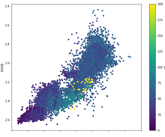
We now have a good plot to work with and build upon.
Summary
The sketch library looks very promising for integrating the power of AI within Jupyter Notebooks or an IDE. Even though a few issues cropped up whilst writing this article, we have to bear in mind it is still a newish library that is still actively being developed. It will be interesting to see where this library will go over the coming months.
As with any AI-based tools in this current time, caution is always needed, especially when relying on the answers it generates. However, even with that caution, these systems can have numerous benefits, including helping jog your memory if you forget a function call or creating quick plots without writing code.
Interestingly, if this were to be integrated with a dashboard or application like Streamlit, this could provide a powerful tool to non-coders.
The dataset used in this article is a subset of a training dataset used as part of a Machine Learning competition run by Xeek and FORCE 2020 (Bormann et al., 2020). It is released under a NOLD 2.0 licence from the Norwegian Government, details of which can be found here: Norwegian Licence for Open Government Data (NLOD) 2.0. The full dataset can be accessed here.
The full reference for the dataset is:
Bormann, Peter, Aursand, Peder, Dilib, Fahad, Manral, Surrender, & Dischington, Peter. (2020). FORCE 2020 Well well log and lithofacies dataset for machine learning competition [Data set]. Zenodo. http://doi.org/10.5281/zenodo.4351156
Thanks for reading. Before you go, you should definitely subscribe to my content and get my articles in your inbox. You can do that here! Alternatively, you can sign up for my newsletter to get additional content straight into your inbox for free.
Secondly, you can get the full Medium experience and support me and thousands of other writers by signing up for a membership. It only costs you $5 a month, and you have full access to all of the amazing Medium articles, as well as the chance to make money with your writing. If you sign up using my link, you will support me directly with a portion of your fee, and it won't cost you more. If you do so, thank you so much for your support!
