Studying the Gender Wage Gap in the US Using Distributional Random Forests

In two previous articles, I explained Distributional Random Forests (DRFs), a Random Forest that is able to estimate conditional distributions, as well as an extension of the method that allows for uncertainty quantification, like Confidence Intervals, etc. Here I present an example of a real-world application to wage data from the 2018 American Community Survey by the US Census Bureau. In the first DRF paper, we obtained data on approximately 1 million full-time employees from the 2018 American Community Survey by the US Census Bureau from which we extracted the salary information and all covariates that might be relevant for salaries. This wealth of data is ideal to experiment with a method like DRF (in fact we will only use a tiny subset for this analysis).
When one studies the raw data on hourly wages, there is a consistent gap between the two genders, in that men tend to earn more. An interesting question is whether the observed gap in hourly wages (W) of men (G=1) and women (G=0) is due to gender alone or whether it can be explained by some other confounding variables X, which are influenced by gender and in turn influence wage. That is, we want to study the effect size corresponding to the bold arrow in the following causal graph:
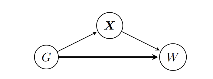
For example, let's assume that X only includes occupation and that women have a tendency to choose occupations that do not entail a high monetary reward, such as doctors, nurses, or teachers, while men tend to have professional gambling jobs with obscene hourly wages. If this alone were to drive the difference in hourly wages between genders, we would still see a Wage Gap when looking directly at the hourly wage data. However if we then fix the occupation (X) only to doctors and compare the two wage distributions there, any statistically significant difference can only come from gender alone.
We focus on a two-stage analysis:
- We fix X to a particular value and compare the distribution of wages in the two groups for the covariates fixed to X=x. This is interesting from two points of view: First, if X really includes all other factors that influence wages and are related to gender, then fixing X=x and looking at wages for both genders means we really observe the effect of Gender on wages. Second, it allows for the prediction of the whole wage distribution for an individual with given characteristics x.
- We use the assumed causal graph above and the rules of causality to estimate a counterfactual distribution with DRF: The distribution of women's wages had they been treated as men for setting the wage. If X contains all the relevant covariates and there is no gender pay gap, this distribution should be the same as the wage distribution for men (neglecting statistical randomness).
This article is the culmination of the work of several people: The code and the dataset were obtained from the original DRF repository and then combined with the methods developed in our new paper on arXiv, written together with Corinne Emenegger.
Before going on, I want to point out that this is only an example to illustrate the use of DRF. I do not want to make any serious (causal) claims here, simply because the analysis is surely flawed in some regard and the causal graph we assume below is surely wrong. Moreover, we only use a tiny subset of the available data.

Also, note that the code is quite slow to run. This is because, while DRF itself is coded in C, the repeated fitting needed for Confidence Intervals is implemented in R so far.
That said, let's dive in. In the following, all images, unless otherwise noted, are by the author.
Data
The PUMS (Public Use Microdata Area) data from the 2018 1-Year American Community Survey is obtained from the US Census Bureau API. The survey is sent to ≈ 3.5 million people annually and aims to give more up-to-date data than the official census that is carried out every decade. The 2018 data set has about 3 million anonymized data points for the 51 states and the District of Columbia. For the DRF paper linked above, we retrieved only the subset of variables that might be relevant for the salaries, such as a person's gender, age, race, person's marital status, education level, and level of English knowledge.
The preprocessed data can be found here. We first do some further cleaning:
##Further data cleaning ##

which = rep(TRUE, nrow(wage))
which = which & (wage$age >= 17)
which = which & (wage$weeks_worked > 48)
which = which & (wage$hours_worked > 16)
which = which & (wage$employment_status == 'employed')
which = which & (wage$employer != 'self-employed')
which[is.na(which)] = FALSE

data = wage[which, ]
sum(is.na(data))
colSums(is.na(data))
rownames(data) = 1:nrow(data)
#data = na.omit(data)

data$log_wage = log(data$salary / (data$weeks_worked * data$hours_worked))

## Prepare data and fit drf
## Define X and Y
X = data[,c(
  'age',
  'race',
  'hispanic_origin',
  'citizenship',
  'nativity',
  'marital',
  'family_size',
  'children',
  'education_level',
  'english_level',
  'economic_region'
)]
X$occupation = unlist(lapply(as.character(data$occupation), function(s){return(substr(s, 1, 2))}))
X$occupation = as.factor(X$occupation)
X$industry = unlist(lapply(as.character(data$industry), function(s){return(substr(s, 1, 2))}))
X$industry[X$industry %in% c('32', '33', '3M')] = '31'
X$industry[X$industry %in% c('42')] = '41'
X$industry[X$industry %in% c('45', '4M')] = '44'
X$industry[X$industry %in% c('49')] = '48'
X$industry[X$industry %in% c('92')] = '91'
X$industry = as.factor(X$industry)
X=dummy_cols(X, remove_selected_columns = TRUE)
X = as.matrix(X)

Y = data[,c('sex', 'log_wage')]
Y$sex = (Y$sex == 'male')
Y = as.matrix(Y)
These are actually way more observations than we need, and we instead subsample 4'000 training data points at random for the analysis here.
train_idx = sample(1:nrow(data), 4000, replace = FALSE)

## Focus on training data
Ytrain=Y[train_idx,]
Xtrain=X[train_idx,]
Again, this is because it is just an illustration— in reality, you would want to take as many data points as you can get. The estimated wage densities of the two sexes for these 4'000 data points are plotted in Figure 1, with this code:
## Plot the test data without adjustment
plotdfunadj = data[train_idx, ]
plotdfunadj$weight=1
plotdfunadj$plotweight[plotdfunadj$sex=='female'] = plotdfunadj$weight[plotdfunadj$sex=='female']/sum(plotdfunadj$weight[plotdfunadj$sex=='female'])
plotdfunadj$plotweight[plotdfunadj$sex=='male'] = plotdfunadj$weight[plotdfunadj$sex=='male']/sum(plotdfunadj$weight[plotdfunadj$sex=='male'])

#pooled data
ggplot(plotdfunadj, aes(log_wage)) +
  geom_density(adjust=2.5, alpha = 0.3, show.legend = TRUE,  aes(fill=sex, weight=plotweight)) +
  theme_light()+
  scale_fill_discrete(name = "gender", labels = c('female', "male"))+
  theme(legend.position = c(0.83, 0.66),
        legend.text=element_text(size=18),
        legend.title=element_text(size=20),
        legend.background = element_rect(fill=alpha('white', 0.5)),
        axis.text.x = element_text(size=14),
        axis.text.y = element_text(size=14),
        axis.title.x = element_text(size=19),
        axis.title.y = element_text(size=19))+
  labs(x='log(hourly_wage)')
Calculating the percentage median difference between the two wages, that is
(median wage men- median wage women)/(median wage women) *100,
we obtain around 18 percent. That is, the median salary of men is 18 percent higher than that of women in the unadjusted data (!)
## Median Difference before adjustment!
quantile_maleunadj = wtd.quantile(x=plotdfunadj$log_wage, weights=plotdfunadj$plotweight*(plotdfunadj$sex=='male'), normwt=TRUE, probs=0.5)
quantile_femaleunadj = wtd.quantile(x=plotdfunadj$log_wage, weights=plotdfunadj$plotweight*(plotdfunadj$sex=='female'), normwt=TRUE, probs=0.5)
(1-exp(quantile_femaleunadj)/exp(quantile_maleunadj))
Analysis
The question now becomes whether this is truly "unfair". That is, we assume the causal graph above, where Gender (G) influences both Wage (W), as well as covariates X that in turn influence W. What we would like to know is whether Gender directly influences Wage (the bold arrow). That is, if a woman and a man with the exact same characteristics X=x get the same wage, or whether she gets less, simply because of her gender.
We will study this in two settings. The first one is to truly hold X=x fixed and to use the machinery explained in the earlier article. Intuitively, if we fix all other covariates that could influence wage besides gender, and now compare the two wage distributions, then any observed difference must be by wage alone.
The second one tries to quantify this difference over all possible values of X This is done by calculating the counterfactual distribution of
W(male, X(female)).
This quantity is the counterfactual wage a man gets if he has exactly the characteristics of a woman. That is, we ask for the wage a woman gets if treated like a man.
Note that this assumes that the causal graph above is correct. In particular, it assumes that X captures all relevant factors besides gender, that would determine the wage. It could very well be that this is not the case, thus the disclaimer at the beginning of this article.
Studying the conditional distributional differences
In the following, we fix x to an arbitrary point:
i<-47

# Important: Test point needs to be a matrix
test_point<-X[i,, drop=F]
The following picture shows some of the values contained in this test point x – we are looking at childcare workers with high school diplomas that are married and have 1 child. With DRF we can estimate and plot the densities for the two groups conditional on X=x:
# Load all relevant functions (the CIdrf.R file can be found at the end of this
# article
source('CIdrf.R')

## Fit the new DRF framework (I forgot to include this in an earlier
## version of the article, apologies)
drf_fit <- drfCI(X=Xtrain, Y=Ytrain, min.node.size = 20, splitting.rule='FourierMMD', num.features=10, B=100)

# predict with the new framework
DRF = predictdrf(drf_fit, x=x)
weights <- DRF$weights

## Conditional Density Plotting
plotdfx = data[train_idx, ]

propensity = sum(weights[plotdfx$sex=='female'])
plotdfx$plotweight = 0
plotdfx$plotweight[plotdfx$sex=='female'] = weights[plotdfx$sex=='female']/propensity
plotdfx$plotweight[plotdfx$sex=='male'] = weights[plotdfx$sex=='male']/(1-propensity)

gg = ggplot(plotdfx, aes(log_wage)) +
  geom_density(adjust=5, alpha = 0.3, show.legend=TRUE,  aes(fill=sex, weight=plotweight)) +
  labs(x='log(hourly wage)')+
  theme_light()+
  scale_fill_discrete(name = "gender", labels = c(sprintf("F: %g%%", round(100*propensity, 1)), sprintf("M: %g%%", round(100*(1-propensity), 1))))+
  theme(legend.position = c(0.9, 0.65),
        legend.text=element_text(size=18),
        legend.title=element_text(size=20),
        legend.background = element_rect(fill=alpha('white', 0)),
        axis.text.x = element_text(size=14),
        axis.text.y = element_text(size=14),
        axis.title.x = element_text(size=19),
        axis.title.y = element_text(size=19))+
  annotate("text", x=-1, y=Inf, hjust=0, vjust=1, size=5, label = point_description(data[i,]))
plot(gg)
In this plot, there appears to be a clear difference in wages, even in the case of this fixed x (remember, all the assumed confounders are fixed in this case, so we really just compare wages directly). With DRF we now estimate and test the median difference
## Getting the respective weights
weightsmale<-weights*(Ytrain[, "sex"]==1)/sum(weights*(Ytrain[, "sex"]==1))
weightsfemale<-weights*(Ytrain[, "sex"]==0)/sum(weights*(Ytrain[, "sex"]==0))

## Choosing alpha:
alpha<-0.05

# Step 1: Doing Median comparison for fixed x

quantile_male = wtd.quantile(x=data$log_wage[train_idx], weights=matrix(weightsmale), normwt=TRUE, probs=0.5)
quantile_female = wtd.quantile(x=data$log_wage[train_idx], weights=matrix(weightsfemale), normwt=TRUE, probs=0.5)

(medianx<-unname(1-exp(quantile_female)/exp(quantile_male)))

mediandist <- sapply(DRF$weightsb, function(wb) {

  wbmale<-wb*(Ytrain[, "sex"]==1)/sum(wb*(Ytrain[, "sex"]==1))
  wbfemale<-wb*(Ytrain[, "sex"]==0)/sum(wb*(Ytrain[, "sex"]==0))

  quantile_maleb = wtd.quantile(x=data$log_wage[train_idx], weights=matrix(wbmale), normwt=TRUE, probs=0.5)
  quantile_femaleb = wtd.quantile(x=data$log_wage[train_idx], weights=matrix(wbfemale), normwt=TRUE, probs=0.5)

  return( unname(1-exp(quantile_femaleb)/exp(quantile_maleb)) )
})

varx<-var(mediandist)

## Use Gaussian CI:
(upper<-medianx + qnorm(1-alpha/2)*sqrt(varx))
(lower<-medianx - qnorm(1-alpha/2)*sqrt(varx))
This gives a confidence interval of the median difference of
(0.06, 0.40) or (6%, 40%)
This interval very clearly does not contain zero and thus the median difference is indeed significant.
Using the Witobj function, we can make this difference better visible
Witobj<-Witdrf(drf_fit, x=test_point, groupingvar="sex", alpha=0.05)

hatmun<-function(y,Witobj){

  c<-Witobj$c
  k_Y<-Witobj$k_Y
  Y<-Witobj$Y
  weightsall1<-Witobj$weightsall1
  weightsall0<-Witobj$weightsall0
  Ky=t(kernelMatrix(k_Y, Y , y = y))

  out<-list()
  out$val <- tcrossprod(Ky, weightsall1  ) - tcrossprod(Ky, weightsall0  )
  out$upper<-  out$val+sqrt(c)
  out$lower<-  out$val-sqrt(c)

  return( out )

}

all<-hatmun(sort(Witobj$Y),Witobj)

plot(sort(Witobj$Y),all$val , type="l", col="darkblue", lwd=2, ylim=c(min(all$lower), max(all$upper)),
     xlab="log(wage)", ylab="witness function")
lines(sort(Witobj$Y),all$upper , type="l", col="darkgreen", lwd=2 )
lines(sort(Witobj$Y),all$lower , type="l", col="darkgreen", lwd=2 )
abline(h=0)
which leads to the Figure:

We refer to the companion article for a more detailed explanation of this concept. Essentially it can be thought of as
conditional density of log(wage) of men given x – conditional density of log(wage) of women given x
That is, the conditional witness function shows where the density of one group is larger than the other, without having to actually estimate the density. In this example, negative values mean the density of women's wages is higher than that of men conditional on x, and positive values mean the density of women's wages is lower. Since we already estimated the conditional densities above, the conditional witness function alone does not add much more. But it's good for illustration purposes. Indeed, we see that it is negative at the start, for values where the conditional density of women's wages is higher than the conditional density of men's wages. Vice-versa it turns positive for larger values, for which the conditional density of men's wages is higher than for women. Thus the relevant information about the two densities is summarized in the witness function plot: We see that the density for women's wages is higher for lower values of wages and lower for higher values, indicating that the density is shifted to the left and women earn less! Moreover, we can also provide 95% confidence bands in green that include the true function with 95%, uniformly over all y. (Though one really needs a lot of data to make this valid) Since this uniform confidence band does not contain the zero line between around 2 and 2.5, we see again that the difference between the two distributions is statistically significant.
Conditioning on a particular x, allows us to study individual effects in great detail and with a notion of uncertainty. However, it can also be interesting to study the overall effect. We do this by estimating the counterfactual distribution, in the next section.
Estimating the counterfactual distribution
Using the calculation laws of causality on our assumed causal graph, it can be derived that:
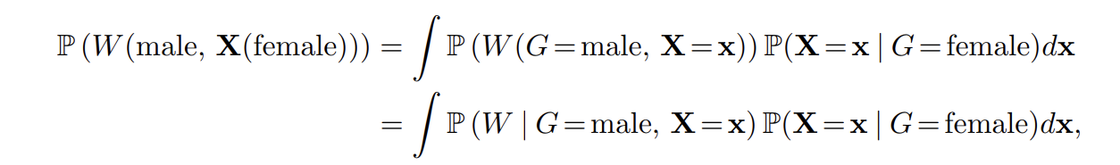
I.e. the distribution of the counterfactual we are looking for is obtained by averaging the conditional distribution of W | G=male, X=x, over the x of the gender female.
As the distributions are given as simple weights, this is easily done with DRF as follows:
## Add code

## Male is 1, Female is 0

# obtain all X from the female test population
Xtestf<-Xtest[Ytest[,"sex"]==0,]

# Obtain the conditional distribution of W | G=male, X=x, for x in the female
# population.

# These weights correspond to P(W, G=male | X=x  )
weightsf<-predictdrf(drf_fit, x=Xtestf)$weights*(Ytrain[, "sex"]==1)
weightsf<-weightsf/rowSums(weightsf)

# The counterfactual distribution is the average over those weights/distributions
counterfactualw<-colMeans(weightsf)
which leads to the following counterfactual density estimate:
plotdfc<-rbind(plotdfc, plotdfunadj[plotdfunadj$sex=='female',])
plotdfc$sex2<-c(rep(1, length(train_idx)), rep(0,nrow(plotdfunadj[plotdfunadj$sex=='female',])))

plotdfc$sex2<-factor(plotdfc$sex2)

#interventional distribution
ggplot(plotdfc, aes(log_wage)) +
  geom_density(adjust=2.5, alpha = 0.3, show.legend=TRUE,  aes(fill=sex2, weight=plotweight)) +
  theme_light()+
  scale_fill_discrete(name = "", labels = c("observed women's wages", "wages if treated as men"))+
  theme(legend.position = c(0.2, 0.98),
        legend.text=element_text(size=16),
        legend.title=element_text(size=20),
        legend.background = element_rect(fill=alpha('white', 0)),
        axis.text.x = element_text(size=14),
        axis.text.y = element_text(size=14),
        axis.title.x = element_text(size=19),
        axis.title.y = element_text(size=19))+
  labs(x='log(hourly wage)')
These two densities are now the density of women's wages in red, and the density of women had they been treated as men for setting the wage in green-bluish. Clearly, the densities are now closer together than they were before – adjusting for the confounders made the difference in gender pay smaller. However, the median difference is still
quantile_male = wtd.quantile(x=plotdfc$log_wage[plotdfc$sex2==1], weights=counterfactualw, normwt=TRUE, probs=0.5)
quantile_female = wtd.quantile(x=plotdfunadj$log_wage, weights=plotdfunadj$plotweight*(plotdfunadj$sex=='female'), normwt=TRUE, probs=0.5)
(1-exp(quantile_female)/exp(quantile_male))
0.11 or 11 percent!
Thus if our analysis is correct, 11% of the difference in pay can still be attributed to gender alone. In other words, while we managed to reduce the difference from 18% in median income in the unadjusted data to 11%, there is still a substantial difference left over, indicating an "unfair" wage gap between the genders (at least if X really captures the relevant confounders).
Conclusion
In this article, we studied an example of how DRF could be used for a real data analysis. We studied both the case of a fixed x, for which the methods discussed in this article, allows to build uncertainty measures, as well as the distribution of a counterfactual quantity. In both cases, we saw that there was still a substantial, and in the case of fixed x, significant difference when adjusting for the available confounders.
Though I did not check, it might be interesting to see how the results from this little experiment stack up against more serious analysis. In any case, I hope this article showcased how DRF could be used in a real-world data analysis.
Additional Code
The full code can also be found on Github.
## Functions in CIdrf.R that is loaded above ##

drfCI <- function(X, Y, B, sampling = "binomial",...) {

### Function that uses DRF with subsampling to obtain confidence regions as
### as described in https://arxiv.org/pdf/2302.05761.pdf
### X: Matrix of predictors
### Y: Matrix of variables of interest
### B: Number of half-samples/mini-forests

  n <- dim(X)[1]

  # compute point estimator and DRF per halfsample S
  # weightsb: B times n matrix of weights
  DRFlist <- lapply(seq_len(B), function(b) {

    # half-sample index
    indexb <- if (sampling == "binomial") {
      seq_len(n)[as.logical(rbinom(n, size = 1, prob = 0.5))]
    } else {
      sample(seq_len(n), floor(n / 2), replace = FALSE)
    }

    ## Using refitting DRF on S
    DRFb <-
      drf(X = X[indexb, , drop = F], Y = Y[indexb, , drop = F],
          ci.group.size = 1, ...)

    return(list(DRF = DRFb, indices = indexb))
  })

  return(list(DRFlist = DRFlist, X = X, Y = Y) )
}

predictdrf<- function(DRF, x, ...) {

### Function to predict from DRF with Confidence Bands
### DRF: DRF object
### x: Testpoint

  ntest <- nrow(x)
  n <- nrow(DRF$Y)

  ## extract the weights w^S(x)
  weightsb <- lapply(DRF$DRFlist, function(l) {

    weightsbfinal <- Matrix(0, nrow = ntest, ncol = n , sparse = TRUE)

    weightsbfinal[, l$indices] <- predict(l$DRF, x)$weights

    return(weightsbfinal)
  })

  ## obtain the overall weights w
  weights<- Reduce("+", weightsb) / length(weightsb)

return(list(weights = weights, weightsb = weightsb ))
}

Witdrf<- function(DRF, x, groupingvar, alpha=0.05, ...){

### Function to calculate the conditional witness function with
### confidence bands from DRF
### DRF: DRF object
### x: Testpoint

  if (is.null(dim(x)) ){

  stop("x needs to have dim(x) > 0")
  }

  ntest <- nrow(x)
  n <- nrow(DRF$Y)
  coln<-colnames(DRF$Y)

  ## Collect w^S
  weightsb <- lapply(DRF$DRFlist, function(l) {

    weightsbfinal <- Matrix(0, nrow = ntest, ncol = n , sparse = TRUE)

    weightsbfinal[, l$indices] <- predict(l$DRF, x)$weights

    return(weightsbfinal)
  })

  ## Obtain w
  weightsall <- Reduce("+", weightsb) / length(weightsb)

  #weightsall0<-weightsall[, DRF$Y[, groupingvar]==0, drop=F]
  #weightsall1<-weightsall[,DRF$Y[, groupingvar]==1, drop=F]

  # Get the weights of the respective classes (need to standardize by propensity!)
  weightsall0<-weightsall*(DRF$Y[, groupingvar]==0)/sum(weightsall*(DRF$Y[, groupingvar]==0))
  weightsall1<-weightsall*(DRF$Y[, groupingvar]==1)/sum(weightsall*(DRF$Y[, groupingvar]==1))

  bandwidth_Y <- drf:::medianHeuristic(DRF$Y)
  k_Y <- rbfdot(sigma = bandwidth_Y)

  K<-kernelMatrix(k_Y, DRF$Y[,coln[coln!=groupingvar]], y = DRF$Y[,coln[coln!=groupingvar]])

  nulldist <- sapply(weightsb, function(wb){
    # iterate over class 1

    wb0<-wb*(DRF$Y[, groupingvar]==0)/sum(wb*(DRF$Y[, groupingvar]==0))
    wb1<-wb*(DRF$Y[, groupingvar]==1)/sum(wb*(DRF$Y[, groupingvar]==1))

    diag( ( wb0-weightsall0 - (wb1-weightsall1) )%*%K%*%t( wb0-weightsall0 - (wb1-weightsall1) )  )

  })

  # Choose the right quantile
  c<-quantile(nulldist, 1-alpha)

  return(list(c=c, k_Y=k_Y, Y=DRF$Y[,coln[coln!=groupingvar]], nulldist=nulldist, weightsall0=weightsall0, weightsall1=weightsall1))

}
### Code to generate plots
## Step 0: Choosing x
point_description = function(test_point){
out = ''
out = paste(out, 'job: ', test_point$occupation_description[1], sep='')
out = paste(out, 'nindustry: ', test_point$industry_description[1], sep='')
out = paste(out, 'neducation: ', test_point$education[1], sep='')
out = paste(out, 'nemployer: ', test_point$employer[1], sep='')
out = paste(out, 'nregion: ', test_point$economic_region[1], sep='')
out = paste(out, 'nmarital: ', test_point$marital[1], sep='')
out = paste(out, 'nfamily_size: ', test_point$family_size[1], sep='')
out = paste(out, 'nchildren: ', test_point$children[1], sep='')
out = paste(out, 'nnativity: ', test_point$nativity[1], sep='')
out = paste(out, 'nhispanic: ', test_point$hispanic_origin[1], sep='')
out = paste(out, 'nrace: ', test_point$race[1], sep='')
out = paste(out, 'nage: ', test_point$age[1], sep='')
return(out)
}