The Most Advanced Libraries for Data Visualization and Analysis on the Web

In this new post I present the outcome of my quest for the most advanced and powerful libraries for web-based data visualization and analysis as judged by me after a careful analysis of performance, flexibility, and richness of features.
Some of the libraries I selected are not popular at all, but they offer surprising capabilities and features that totally opaque other more widely known alternatives. The libraries I selected for presentation are indeed so rich in features that I will barely have space to focus on some outstanding points, stressing their highlights over the more widely known alternatives and comparing them to each other while inviting you to go test them for yourself – they are all free to try, and some even have free versions for academics and for education!
After reading this post, stay tuned for future articles where I will develop more on selected cases from my selection – la "crème de la crème" in data visualization libraries for the web.
Data visualization is everywhere at the core of Data Analysis, from early exploratory browsing to the most advanced processing, and also including interactive and visually appealing reporting and communication of the data and of the results and conclusions distilled from the analysis. I advocate that across all stages, web-based data solutions provide by far the most powerful means of visualization. This, to such an extent that even the most advanced programs for mathematical or statistical processing based in systems like Python or R end up choosing themselves some kind of web-based visualization – think for example of shiny app for R.
Why is web-based visualization that successful and powerful, in my view? Well, for a variety of reasons, including:
- Extreme portability: by running inside web browsers, the same code can natively run on any device with a modern web browser – literally, no tricks!
- Extremely simple deployment: simply access an URL! This same feature removes any obstacles related to installations, updates, etc.
- Modularity: libraries are loaded dynamically on the fly, which in turn enables the…
- Possibility of integrating multiple visualizations on the same web page, in some cases even coupling them programmatically to achieve very complete applications.
- Interactivity in the graphics, such that the plots can react to user clicks and mouse gestures, which exists in non-web-based visualizations but in the web case the visualization can interact with other elements of the DOM, including other visualizations, enabling highly complex applications.
If you think that web-based visualization might suffer from serious issues with performance (that is, the capacity to process and display large amounts of data), flexibility in input and output formats, and other problems that prevent their serious usage, I will here try to prove you wrong. I will try to make the point of why I advocate for web-based visualization, by showing off the power of four very carefully selected libraries for web-based data visualization. I will focus on libraries specifically and entirely aimed at web-based visualizations based 100% on the browser, and I won't cover web deployments from desktop- or server-based programs for data analysis.
Why did I stress very carefully selected up there? Well because if you Google or ask ChatGPT about web libraries for data visualization, answers always come up with the same listicles that consistently leave out some extremely powerful but not very popular options. These are precisely the libraries I will talk about here, and they are, in alphabetical order, amCharts, CanvasJS, CanvasXpress, and HighCharts. They are all paid, but some either have free licenses for academic and teaching purposes or free versions with embedded brand logos that you can remove on pay (in fact you will see all of them running in examples I coded and deployed without spending a cent).
Along the way through this article detailing my four selected libraries, I will also touch on other more widely known libraries such as Google Charts, Plotly, D3, etc. barely for comparative purposes, in order to make my point of the superior features of my "selected four" yet being fair to the more popular libraries when they deserve it.
I will describe the libraries in alphabetical order, to avoid any unconscious bias. Here we go, after an important introduction.
Introduction: Why This Selection?
There are tons of data visualization libraries out there, some extremely popular such as D3.js with its tedious syntax and various derivations that make it easier to use such as (just to mention two examples) Taucharts or Techan specialized for financial charts; also the popular Chart.js and Plotly, Google Charts from the tech giant, etc.
And just like there are tons of such libraries, there are tons of "listicles", by which I mean articles that list libraries for visualization, in many cases not getting even barely deep into any library – perhaps even written automatically, thus with little insight and value. But even with the "good" listicles, there's something I dislike about them. They typically tend to limit their focus to:
- Totally free libraries, which is perfectly fine but opaques the existence of more advanced options that you or your client may be willing to pay. Besides, although some of these advanced libraries are exclusively paid, others do have some flexibility, offering for example licenses that allow free (and fully-fledged) applications in education, or for testing, or for full use in academic, non-for-profit settings.
- Somewhat subjective factors such as popularity as measured by number of downloads, adopters, amount of discussion on Stack Overflow, etc.
- Variety of supported visualizations, like say scatter plots, pie charts, candle sticks, geodata mapping, flow charts, 3D variants of these charts, and tons of other options – but we'll see some even more innovative visualizations from my selected five in this article later on.
- Rendering technology, mainly object-based vs. canvas-based, the latter typically better for large datasets but lower in graphical quality – but all this is debatable as we will see here!
- Performance, in terms of the size of the datasets the libraries can handle and display – but here the listicles often overlook some libraries I will present here which are probably among the top performers.
- Ease of use, this being a very important point where my selected four might be making some sacrifice in exchange for much more power, better performance, and even built-in data analysis functions – the latter important to enable advanced data analysis with little or no programming, which the more popular libraries don't allow natively.
In particular, plotting through SVG as in D3.js and other common libraries is great for interactive and dynamic graphics but faces substantial performance challenges when large number of elements are involved in the visualization. On the other hand, canvas-based plotting is much more efficient for rendering large numbers of elements but might be less suitable for highly interactive and dynamic visualizations. We will see how some libraries from my selected four can offer the best from both worlds: fast but interactive graphics using canvas and the possibility to export SVGs and other object-based formats.
One big limitation of the most popular libraries, that some of my selected ones don't suffer from, is that they are quite exclusively limited to plotting data but they don't offer any direct kind of data analysis. So, for example, if you want to plot a histogram for a series of numbers you must write the code required to get the bins and their counts, and then pass them to a bar plotting function of the library. Likewise, if you want to display a scatter plot with a linear regression you must write the code that will carry out the fitting and then pass to the library two plots, one for the data and one for the linear regression. Some of my selected libraries are not mere plotting libraries, but rather full data analysis libraries that can also do data visualization. And I can't stress more how some of them can carry out several kinds of mathematical and statical analyses themselves, all built-in!
Some of my selected libraries are not mere plotting libraries but rather full data analysis libraries specialized in data visualization […] they can carry out several kinds of mathematical and statical analyses themselves, all built-in!
In favor of the popular libraries, most (not all) are free which in turn makes them have huge user bases that greatly facilitate learning and troubleshooting. Likewise, because of the abundance of Q&A about the very popular libraries on the internet, large language models know enough about them that they can lend you a hand when writing code – something that doesn't happen with the more powerful but less popular libraries discussed here, except for one whose developers have considered this and acted accordingly. Note that using a library that's known by large language models can be extremely useful; for example, GPT-3's superb mastery of the Google Charts library allowed me to create a chatbot that uses this library to create customized plots from questions or requests asked in natural language:
Powerful Data Analysis and Plotting via Natural Language Requests by Giving LLMs Access to…
With unpopular libraries you might need to do a lot of prompting for examples, and/or fine-tuning of your language model to "teach it" how to use that specific library. In only one of the cases presented here, the developers already did that for you!
To the work
For each of my selected four libraries, I bring to you:
- An introduction, to get to know the basics about each library.
- A section about "distinguishing features", or in other words highlights and/or very special features that (most) other libraries lack. This section is of varying length depending on what I've found in my exploration.
- A section about programming and usage of the libraries, where I try to convey my impression upon trying to use them through their GUIs and especially by coding them into web apps.
- A section about performance, where I dig into this important aspect based on what the developers say and also through my own coding. For the latter, I chose writing code to create bubble plots with tooltip texts showing x, y, z values (the latter represented by the bubble radii) and coloring the bubbles with different colors, and I tested how stable each library is to increasing the number of bubbles.
- Last, a section about licensing and costs.
A short disclaimer if you happen to be a developer of one of these libraries
If you are reading this and are a developer of one of these libraries, and you find incorrect information or problems with the examples or with my interpretations, or you think that I left out some very important features, please:
- Don't take it personally. These libraries are all huge and so rich in features, that of course I couldn't explore them all in full detail!
- Reach out to me via the comments or to my email, to tell me what you've found and any edits you'd like me to do.
amCharts
amCharts is a package of integrable modules specialized for charting (the core amCharts), for displaying data on maps (amCharts maps), and for financial analysis (amCharts stock charts).
The general data graphing core supports from standard kinds of plots such as column, bar, line, area, scatter, pie, donut, heat map, bubble or radar plots, to some more complex ones that not all libraries support such as polar, gauge, funnel, pyramid, chord, Sankey, sunburst plots, and even timelines, treemaps and other hierarchical graphs, word clouds, Venn diagrams, and other tools for visualization of data that is not purely numerical.
One very important point is that, unlike most of its competitors, the library is not limited to just data visualization but can also carry out some computations itself. For example, to use the word cloud tool you don't need to input a list of words with their counts, but just a string containing the text on which the word cloud is automatically calculated by the tool. We will see that one other library, CanvasXpress, takes this capability to the extreme, including a huge number of data processing methods.
From the point of view of aesthetics and interactivity, this library doesn't stand out much, although it's very complete and its visualizations nice and simple, with customizable appearance and behavior of the various elements of the charts and maps, their colors, patterns, some animations, tooltip texts, legends, labels, axes and grids, markers and annotations, etc.
amCharts is quite flexible in its data loading and manipulation features, taking in CSV, JSON, XML, also GeoJSON for map data, etc.; and with export options including graphical formats (PNG, JPG, PDF, SVG) and data formats like JSON, CSV and also XLSX for direct opening in MS Excel.
Distinguishing features
Several libraries bring map charting capabilities. amCharts' provides a quite wide selection of bundled maps, at various levels of zoom from country to very regional maps, each available in high and low detail versions. Utilizing the GeoJSON standard, these maps are easily accessible, and the platform supports the creation of custom maps if the desired one is not included – very important. Various other features are worth exploring if you are after map charts.
While all major plotting libraries bring at least one and mostly a few charts specialized for finances, amChart's whole module specifically dedicated to this makes it one of the richest in features. The module brings over 30 fully-automated indicators for the finances (to mention just a few: moving average convergence/divergence, Bollinger bands, volume profile, etc.)and annotation tools like horizontal averages, Fibonacci limits, online regression, various trend lines, etc. plus the option that users add their own annotations.
Still talking about the finance module, various automated conversions and formatting can be activated, such as a comparison functionality that forces the chart to switch to a "percent mode" automatically when a compared index is added. Plus, various built-in controls enhance user interaction with features specifically useful in the finances, such as candlestick graphs, Open-Hight-Low-Close indicators, time granularity switches, etc.
Performance, programming and usage
amCharts uses canvas rendering, avoiding SVG and minimizing DOM operations, and layering of different elements to minimize unneeded repaints, all helping to achieve fast rendering. It sells itself as "insanely flexible and blindingly fast", supposedly "simple yet powerful and flexible drop-in data visualization solution, backed with detailed docs and seriously efficient support".
Programming of this library has been optimized to achieve fast data parsing, high memory efficiency and low binary size (400 kb for the full package), enabling fast download and high efficiency that allows, for example, multiple charts to coexist on the same page without crippling the browser. Moreover, each niche functionality is separated into files, so you can load only what you need to use – say for example the core library plus the maps module.
The package integrates with popular web development frameworks and tools (of the style of Angular, React, Vue.js, etc.) allowing developers to effortlessly incorporate its powerful data visualization capabilities into complex web apps.
In my tests on my laptop I found the library pretty robust and performant, allowing in a bubble plot of x,y,z data and random colors perfect display for up to 50,000 data points retaining fluent graphics and fluent update of data labels as I navigated through the plot. At 100,000 thousands you feel the loss in performance, and at 200,000 points it's impossible to do any fluent browsing – but the web page doesn't crash even at 500,000 bubbles.
Here's for example a zoom on part of a run with 15,000 points, whose performance you can try here in this link:

Website, licensing and cost
You can explore the demos, tutorials, and documentation on amCharts' official website at https://www.amcharts.com/.
amCharts offers all its products (that is version 5 as of now, plus some legacy versions) for free download and usage. The main drawback of the free version is that the charts display a small logo in the corner – nothing big for practical purposes, but probably something you want to get rid off for very professional projects. Commercial licenses for charts to be brand-free are available, all paid but starting at reasonable prices.
CanvasJS
CanvasJS sells itself as a simple API-based JavaScript library for data plotting of high performance and versatility, with over 30 chart types (though this number is in the same order as other libraries, probably even slightly lower). It claims there's vast documentation available, and as a key selling point, that it is currently used by giants like NASA, Microsoft, Samsung, and many other big names. Remember however my point that when it comes to libraries for data visualization, being popular is not necessarily a warranty for the best out there.
CanvasJS supports rather standard chart types such as line, column, bar, spline, area, pie, doughnut, stock charts plots, some types of 3D charts, etc. It also supports various features, relatively standard such as data labels, tooltips, annotations, zooming, panning, multiple axes, logarithmic axes, and dynamic updates.
Distinguishing features
To me this library is a bit limited in really distinguishing features, other than its extreme lightweight (see below); however, part of this might perfectly be explained by the fewer number of features compared to at least some of the other libraries.
An important plus for both programmers and users is this library's rather simple usage, similar in many aspects to Google Charts hence possibly understood by large language models.
Last, the library's website stresses multiple times this library's strong cross-device compatibility; however, this is a feature inherent to the HTML5-JavaScript core and applies to all libraries presented here; indeed probably to most other libraries for web-based data visualization. Still, it's an important point worth stressing – and that competitors should stress too!
Programming and usage
CanvasJS is built around an API logic that makes it easy to create and customize charts. And, it is compatible with client- and server-side web development frameworks like React, Angular, jQuery, PHP, ASP, JSP, etc.
In line with their claim, CanvasJS has a quite large and active community of users and developers who constantly contribute new ideas and solutions, something that others libraries of my selection, being less popular, lack.
CanvasJS offers a high level of customizability, allowing you to control various aspects of the chart appearance and behavior. Besides, you can go with preset themes and templates to quickly apply predefined styles and settings, or with fully customized chart types that you can build easily thanks to its plugin architecture.
Other libraries like D3.js also offer quite a lot of flexibility and customizability, but requiring more coding and understanding of Data Science concepts. On the other hand, alternatives like Chart.js and Plotly.js are easier to use and integrate, but they offer less customization options.
Performance
CanvasJS claims to be one of the fastest Data Visualization libraries available, capable of rendering hundreds of thousands of data points in a matter of milliseconds. This is essential to make the library well fit for applications that require high performance and scalability.
In my tests on my laptop I found that CanvasJS remains robust and performant allowing the impressively smooth display of at least 500,000 bubbles while retaining fluent graphics and fluent update of data labels as I navigated through the plot. That's more than an order of magnitude more data points than amCharts presented above, but less than CanvasXpress which you will find about next. Besides, contrary to amCharts which looses performance progressively, CanvasJS just hanged suddenly at around 700,000 points on my laptop in my tests.
Comment aside, the test with the bubble plot revealed an unfortunate limitation of this library for this type of chart: it lacks automatic scaling of the z values, which modulate the radius of the bubble, and you can't define minimum and maximum values yourself. Therefore, what you gain with the library's superb performance is lost in plots that are too crowded for practical use. What's worst, you can't scroll nor zoom to browse the plot, unlike all other libraries presented here allow you to do. As an example of what this problem means, here's a snapshot of an example plotting 100,000 bubbles, that you can try here:

Website, licensing and cost
CanvasJS is primarily a paid library, with various tiers of licenses available. While it does offer a free version with limited features, commercial usage and access to advanced features require a paid license.
You can get CanvasJS from its official website at https://canvasjs.com/, where you can download the library, view the documentation, browse the gallery, and purchase a license. You can also install CanvasJS via NPM or source it directly from CDN.
CanvasXpress
Although this library has superb data visualization capabilities (really superb, you will see soon, that's why it made it into this list!) CanvasXpress actually promotes itself mainly as library for data analytics. And indeed, CanvasXpress works as a stand-alone library built for the purpose of reproducible and traceable data analysis, a central element in the analytic pipelines of big serious organizations where huge loads of data pass by multiple people at multiple levels. Indeed, this library was born at a major pharma company, as I found by chance, where documenting all the manipulation behind a visualization is essential for reproducibility and traceability.
Distinguishing features
What's even more surprising is that the kinds of manipulations traced by CanvasXpress include a huge range of operations from data wrangling to removing outliers, computing transformations like those required to bin data into histograms of heatmaps or to fit data via regressions, and a very long etc. The fact that these procedures and their results are all audited by the system, means that they are all hard-coded natively into the library. And this, in turn, means that you don't have to deal yourself with any coding to achieve even highly complex calculations – similar to what we saw in the amCharts' word cloud tool, where you only input the words and all the counting and font scaling are computed by library, but taken to the extreme (more below).
The above features add up to extensive data auditing capabilities that are unique to CanvasXpress as far as I could research. Moreover, when the library writes output graphics in formats presumably limited to image data, such as SVG or PNG files, it actually injects into these files all the starting data and the operations carried out by the user or the source script to produce the view exactly as saved! That was to me mind-blowing.
CanvasXpress' developers found ways to allow programmers and users to incorporate fully-fledged data analytics beyond visualization with minimal code or even no code at all. For example, you can input an array of values and ask the library to plot a histogram, for which it will calculate bins and counts automatically – unlike all other libraries, with which you will have to code calculation of the histogram and then use the library's bar plot tool to display the bins and counts as a histogram. In CanvasXpress, the procedure used to compute the histogram as well as any subsequent modification of the graph, data selection or filtering, etc. carried out by the user through the graphical interface or from pre-programed code, it all goes together with the starting data into any graphical output file. Then, in a new session of CanvasXpress, you can load a PNG or SVG and it will display not as a static image but actually as a CanvasXpress visualization itself (if the SVG or PNG was generated by the program, of course).
From the point of view of what's supported, CanvasXpress covers most kinds of visualizations supported by amCharts, Plotly and other libraries, except for some very specific cases such as the word count graph. It is not short of scatter, line, bar, radar, bubble plots, heat maps, pie charts, 3D versions, geodata mapping, flow charts, box plots, violin plots, sunburst plots, Venn diagrams and tons more including graphics specialized for data fitting (again, computed by the library itself, and reaching even local regression in multiple dimensions via LOESS), correlations analyses and statistical analyses including tests of various tasks with graphical outputs. Besides, a set of visualizations is especially tailored to data relevant to the pharma: genomics, pathways, networks, etc. Thus, there are several distinguishing features here too.
Programming and usage
On top of the above practical features, CanvasXpress integrates fully into R and Python code, and with shiny apps, allowing for example data analysts well acquainted with R or Python to benefit from the library's power for visualization. The library integrates not only with R and Python but also with client- and server-side Web Development frameworks including PHP, Node.js, React, Angular.
CanvasXpress supports reading and writing of multiple file formats, stressing that outputs are always injected with all the original data and any manipulations as explained above (note that while this is useful for auditing capabilities and to share graphics in editable forms, it also makes files much bigger than expected).
Yet another interesting feature is the possibility to broadcast events between different instances of it running in the same webpage, out-of-the-box. Like in the case of CanvasJS integrated with for example D3.js elements, this allows developers to easily build up very complex apps much like in the Google charts library shown earlier.
One last point to stress in favor of coding with this library is that despite its very advanced features, it is relatively easy to use. Besides, the documentation is extensive and counts with at least 3 or 4 examples for each of the over 40 different kinds of plots. Moreover, the examples are setup in a way that code is made available for various platforms including JavaScript, R and Python of course, with snippets ready to run in platforms like Codepen or Jupyter notebooks.
One down side is that some of the examples incorporate small errors, possibly because they are generated automatically; however, I've succeeded in fixing them without being an expert in the library at all (problems are usually in wrongly formatted comments, in the URLs to load the library, etc. probably because the code is generated automatically given the huge number of examples available).
Another point against this library compared to others is that despite the graphics are very fluent even with high loads, they are not as appealing as those of the other libraries discussed here and of other more mainstream libraries. Even the GUI items don't flow very smoothly, which is further complicated by the huge number of commands, buttons and menus available, due to the library's huge set of features. Talking about which, such a huge array of tools gets you lost easily, especially when trying to use the library through the GUI – probably not much when using the futures programmatically, but my experience is limited. Of course, you probably eventually get used to the commands as you (learn to) use the GUI and the library. Yet, the lack of tooltip texts on the buttons doesn't help. Hopefully, next versions of the library will fill in these gaps, unleashing its full and truly extraordinary potential.
Performance
Besides the never-ending set of special features for data analysis and auditing, on trying CanvasXpress it is evident that it is highly performant, as exemplified with this heatmap displaying over a million data points.
On my own test with the bubble plots, I found CanvasXpress starts to feel heavy at an impressive 2,000,000 bubbles! And it still works reasonably well, just barely laggy, at even 5 million! In all cases with smooth visualization, zooming and panning still responsive, and with fluent update of the tooltip labels as you move the mouse through the view. That's the best performance across the 4 libraries I selected to cover in this article, and probably the current best among all libraries out there. See it here running smoothly with 1 million bubbles, an example you can test yourself in this link:

Website, licensing and cost
CanvasXpress is open-source for personal and educational use with dual licensing for commercial purposes. This means that if you an educator, a student, or even an academic doing non-profit research, you are free to use the library with full capabilities.
Instead, the website clarifies that commercial use is forbidden without explicit permission and license from CanvasXpress.
To get the library, test its several tens (perhaps over a hundred!) examples, and know more about its licensing model, visit their website at https://www.canvasxpress.org/
HighCharts
Highcharts promotes itself as "the secure choice for cutting-edge charting tools in a highly competitive data visualization market". I can't agree more that the field is indeed extremely competitive, as we are seeing here!
Built by probably the largest team of developers among the libraries presented here, the system works as a set of five packages specialized for general plotting, stock/finances, maps, dashboards, and Gantt charts – the latter available also in some of the other libraries discussed here but with only one style of chart.
The library is also used by various tech giants for their visualizations, with an impressive 80 of the world's 100 largest companies. I know I said a few times that this isn't guarantee for quality; however, the library's capabilities and the website's branding both accompany and really put this library up for consideration (see next).
Distinguishing features
The first striking feature, for positive of course, is not on the library itself but on its website. It is impressively complete, with dashboard tools to rapidly create or edit charts right online and without any coding; there's also a tool that helps to create visualizations via natural language instructions by using a GPT model; there's also an online FAQ and a chatbot to sort out questions with problems, also links to third-party companies that can help you setup visualizations, and even a blog with several interesting posts about data visualization.
The library itself provides a quite large set of plots and visualizations, including various kinds of Gantt charts, rather unique compared to the other libraries. Like CanvasXpress but much less developed, HighCharts also carries out some basic data processing.
Among other unique features, HighCharts has a "sonification module" that makes plots sound-responsive, helping to improve accessibility. In an example on the website, a map presents the population density across various regions of France and as users explore the map the visualization triggers sounds that vary in speed to represent the differing population densities, as the names of the French regions are announced orally.
Last, some interactive kinds of charts seem unique; for example, there's a way to add event listeners that can be used to allow the user to interact with the plot directly. Not sure what use this might have, but in one example the user can add points interactively on demand via mouse clicks.
Programming and usage
HighCharts competes close with CanvasXpress in integrability, reaching programming frameworks like .Net, Node, PHP, Python, R, Java, and web development frameworks like Angular, Vue, and React.
A special feature regarding programming is that you are not limited to JavaScript, like in all other libraries discussed here, because HighCharts can be styled directly with CSS, better known by for example designers.
Like some but not all other plotting libraries, HighCharts can combine multiple different types of plots together. Thus you can for example plot a scatter plot and a regression line on it – although unlike the CanvasXpress example, in this case you must write the code that carries out the linear fit.
An interesting feature for programmers is that examples come ready to copy-paste or test in Codepen, and in my tests they all worked right out of the box.
Performance
In my tests on my laptop with the bubble plots, this library turned out to be the least performant. It could barely handle 5,000 bubbles still allowing reasonably flent browsing, but getting very slow already at 10,000 bubbles and useless at around 20,000. With these numbers, this library lags substantially behind the others. But read on to know a workaround that the company's own chatbot gave me!
One thing I did notice in favor of this library is that if you manage to zoom, even without seeing the action happen because the system is saturated, once the zoom is high enough it all becomes smoother. You can try this in this example with 10,000 bubbles, for which a zoom I show you here:
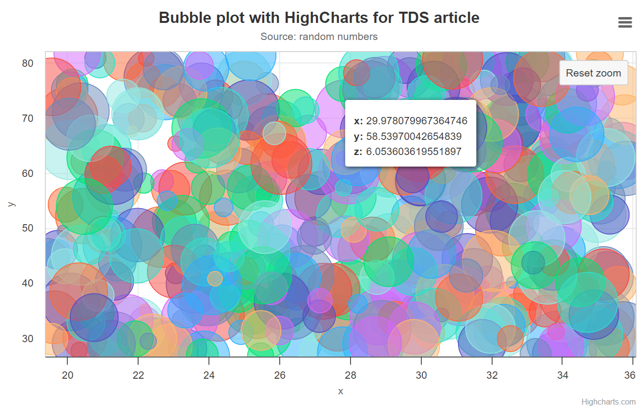
The workaround that HighCharts' support chatbot gave me (through natural language) consists in activating a WebGL-powered "boost module" that allows HighCharts to render views with, supposedly, even millions of data points. On trying this boost mode (I needed to code an extra function to get random colors, which were provided automatically by the non-boosted version) I found that the library can effectively run fluent visualization, mouse browsing and panning/zooming for up to 1,000,000 bubbles, then suddenly loosing performance rapidly. This capability compares favorably with CanvasJS's, which also allowed a huge number of bubbles but without any zooming commands.
You can try this boost mode with 500,000 bubbles here, that will look like this before zooming:

Website, licensing and cost
Students and educators can use HighCharts for free; you can indeed run tests for free as I just showed you above. Then, there are various license levels that you can consult at https://www.highcharts.com/.
Conclusion
You've seen the crazy amount of features offered by these libraries, regarding the variety of available visualizations for general and field-specific applications. We also saw unique features for accessibility in HighCharts, strong and unique data auditing capabilities and a vast offer of built-in functions for data analysis in CanvasXpress. We've also seen all these libraries are quite performant, but with quite some variability, being the top performants (at least for my specific tests) HighCharts and CanvasXpress. Personally, I think amCharts' and HighCharts' graphics are the most appealing ones, but be warned that I didn't spend a single minute on how my examples look so it might well be that with proper tuning CanvasJS and CanvasXpress can also look as appealing.
I also experienced first-hands while working on this article the very rich resources that all these libraries' websites and blog provide, with the highlight being HighCharts' chatbot specialized to help you solve problems 24/7 – important because although LLMs like ChatGPT do know about these libraries, they might not know them deep enough to help you code as they can do with very popular libraries like Plotly or Google Charts.
A feature common to all four libraries presented here, is that they can all be loaded as modules for compilation, or right from a CDN in script tags, some but not all with the option to load only the modules needed for a given application as we have seen. And something I didn't say explicitly but is obvious from my examples, is that all the libraries have some form for free testing – on top of which some do have free licenses, as explained for each.
Sometimes it's worth paying for products and components, and this might hold for web-based visualization libraries if you need some of the special features you've seen here. Or perhaps, you or your project qualify for free versions as some of these libraries offer.
The arena of web libraries for data visualization is extremely competitive, with easily 30 libraries that we could count without even going too deep into the WWW. That's all for our benefit as users and programmers, so let's decide carefully for what we want: Simplicity when coding? Simplicity when using? Perhaps appealing or interactive graphics are key for our application? Perhaps we seek built-in functions for complex analyses that we don't want to code and optimize? A world of options is out there, and here you've had a deep analysis of a selected set.
Other blog posts of mine you may like
Direct Uses of Large Language Models in Modern Science and Technology
First Scientific Study Involving Large Computational Loads Completed Over a Decentralized…
New DeepMind Work Unveils Supreme Prompt Seeds for Language Models
www.lucianoabriata.com I write about everything that lies in my broad sphere of interests: nature, science, technology, programming, etc. Subscribe to get my new stories by email. To consult about small jobs check my services page here. You can contact me here. You can tip me here.
