Visualize a business process through data serialization
Sometimes, we want to visualize a business process in Power BI. This is challenging, depending on the visualization needed and when we model our data in the usual way. Let's see how we can make it happen by changing the modeling.

Introduction
Our Business is made up of processes. Some are obvious, like a production process, and others are more virtual.
For example, when I want to calculate the Margin, there is a "process" to do it.
In a very simplistic way, when I take my income and subtract my expenses, what's remaining is my margin.
My current target is to visualize this process in a chart.
The chart should display the composition of the Margin as a Process. For this, I like to show the values from the Sales Amount to the Margin as a Waterfall.
Something like this Mockup, which I created in Excel:

I start with the Sales Amount, and all expenses will be deducted until I get the Margin.
There are some challenges to realizing this in Power Bi.
First, I must change my data model. Then, I can write a few Measures. Finally, I can create the visualization.
Ultimately, I will collect information about the data model and its performance to assess the quality of my approach.
Let's go through these steps.
Data Challenge
Firstly, the Standard Waterfall chart doesn't allow for the addition of multiple measures to build this chart.
At least one custom visual can do this, but it's a paid visual, and I want to go with the standard waterfall visual. The majority of my clients are reluctant to buy custom visuals.
So, I need to change how the data is stored to complete the job.
Usually, we store our data with one Value per column.
Something like this:

I create different DAX measures to aggregate the columns to get the result.
Ultimately, I can calculate the Margin by deducing the expenditures from the Sales Amount to calculate the Margin.
However, this approach doesn't solve my problem. Therefore I need to use a different data modeling approach for the waterfall chart.
I can add only one Measure to the visual. For the segments in the Waterfall chart, I must add a column for the categorization/segmentation of the data.
To achieve this, I must Unpivot the data to store the single Measure values vertically in one Value column. The Measure Name is stored in a separate column to contain the categorization information.
Something like this:

This modeling technique is called "Serialization", as the data is serialized vertically instead of horizontally.
There is still one catch: All the values are positive. However, I must turn some of them into negative values when displaying them in the waterfall chart to deduce them from the sales amount.
Moreover, the order of the Measures must be in the correct order to make sure they are not displayed in alphabetical order.
To achieve this, I create a table with my Measures like this:

If your source is a relational database, I recommend creating this table and transforming your data there.
As the exact way of doing it in a database can vary from one platform to another and from the type of data modeling to another, I will not show this here. Contact your database developer for this.
I will show you how to do it in Power Query and DAX in this piece.
Data re-modeling in Power Query
The first steps are straightforward in Power Query:
I use the Unpivot transformation to switch from column- to row-oriented and get the result, as shown in my example above.
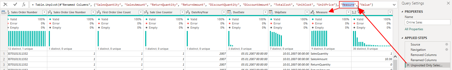
I select all columns with values (Measure-columns) and click the Unpivot button. There, I choose "Unpivot only selected columns":

After some time (Depending on the amount of data and the source), the Measure columns are replaced by two new columns: Attribute and Value.
I change the M-Code to rename the "Attribute" column to "Measure":
To see the formula bar in Power Query, you must enable the following option:

As my model with the Contoso demo data contains two fact tables (Online and Retail Sales), I repeat these steps with the other table.
Next, I create the table with the list of all Measures.
I right-click on the Online Sales table and click on "Reference". I create a reference, as it reuses the data already read from the source. "Duplicate" would re-read the complete table from the source, which is unnecessary.
A new table is added to Power Query.
I rename this table to "MeasureList".
I need only the Measure column. Therefore, I right-click on the Measure column and click on "Remove other columns":

I repeat the same steps for the Retail Sales table. But this time, I rename the table to "Retail Measures".
This table will be appended to the MeasureList table. So, I turn off the Load of this table:

Now I append the second referenced table to the table "MeasureList":

I select the second table, "Retail Measures", in the following dialog box.
The last step here is to remove the Duplicates from the resulting table:

The result is the combined list of all Measures from both tables:

Now, I must add a conditional column to add the MeasureSort column:

The order for all Measures is the following:
- "SalesAmount": 1
- "SalesQuantity": 2
- "ReturnAmount": 3
- "ReturnQuantity": 4
- "UnitPrice": 5
- "TotalCost": 6
- "UnitCost": 7
- "DiscountAmount": 8
- "DiscountQuantity": 9
In my case, Power Query needs a lot of time to get all the data.
The reason is that I get two huge tables from the operations done.
Let's do some math:
The Online Sales table has 12 million rows multiplied by nine Measure columns, and I get over 108 million rows.
The Retail Sales table has almost 3.5 million rows. Multiplied by nine, I get 31.5 million rows.
I will return to these numbers later when we look at this model's statistics and performance.
Therefore, I calculate the column Factor in DAX to save time.
I would have added a further Conditional column with the logic to set the correct values in Power Query, but I did not do it to save time.
Add the calculated column in DAX
I add the Factor column to the new MeasaureList table as a calculated column in Power BI.
As I have only two possible values, I use IF() to calculate the result:
Factor = IF('MeasureList'[Measure] IN {"SalesAmount", "SalesQuantity", "UnitPrice"}, 1, -1)After hiding the MeasureOrder column, the MeasureList table looks like this now:

Now, I must set the "Sort by Column" for the Measure column to the MeasureOrder column:

Next, I add Relationships from the "MeasureList" table to the table Online Sales and Retail Sales. I Hide the Measure columns from both Fact tables.
I add two Base Measures to summarize the Value columns from both Fact tables:
Sum Online Value = SUM('Online Sales'[Value])I must change all Measures, which accessed the separate Measure columns, to a Measure, which filters the Measure.
Something like this:
Online Sales = CALCULATE([Sum Online Value])
                        ,'MeasureList'[Measure] = "SalesAmount"
                        )
But, to calculate the correct value for the Waterfall chart, I need to include the Factor by Measure in my final Measure:
Value with Factor =
  VAR Factor = SELECTEDVALUE('MeasureList'[Factor])
RETURN
  [Sum Online Value] * Factor
Now we can create the Waterfall Visualization.
Visualization
I add the Waterfall Visual to a new Report page.
I set the Measure [Value with Factor] for the Y-Axis and the Measure column from the MeasureList table as Category:

But now, we see all the Measures in the "MeasureList" table.
As I want to see only a subset of them, I use the Filter pane to narrow down to the needed Measures:

After adding a Slicer for the Calendar year to filter for the year 2008 and sorting the chart by the Measure name, I got the result I wanted (After enabling the Data labels and removing the axis legends, etc.):

This is almost what I expected.
Unfortunately, renaming the Total column to, for example, "Margin" is impossible.
I tried adding a Text box with the word "Margin" on top of the word "Total". But first, it is a tedious task (I must match the font, the font size, and the color, and I have to put it in the correct position). Second, when a User clicks on the waterfall visual, it automatically switches to the front, hiding the Text box.
Alternatively, I write a good title to ensure the users understand what they see.
Let's talk about statistics
Before we shout, "Yes, this solves all my problems. I will do it only in this way from now on!" Let's look at some statistics and performance numbers.
I use Vertipaq Analyzer to analyze the statistics on the original and modified data models.
First, the difference in the size of the saved pbix files is not that much:
- 290 MB for the Original
- 340 MB for the modified model
But, when I look at the In-memory size from Vertipaq Analyzes, I get different numbers:
- 350 MB for the Original
- 950 MB for the modified model
Memory usage has almost tripled.
This indicates that the data cannot be compressed as well as before.
And, when we look at the table statistics, we see what happens:

On top of the picture, you see the statistics of the original model, and below, you see the modified model.
As shown before, the row number is multiplied by the number of Measure columns.
But the size of the tables is almost four times larger.
When I dig deeper into the data, I can see that the Value columns use a lot more memory, but the Sales Order Number, Sales Order Number, and the ProductKey columns of the Online Sales table use 42.5 % of the entire database. This percentage was much lower before changing the data modeling.
I can try to change the table's order. However, Power BI usually makes a good decision after analyzing the data and deciding which column to sort the data by to achieve the best compression.
It takes almost an hour to reload these two tables, so I will not do it now.
I will possibly do it in the future and publish the results here.
But first, let's do some performance measurements.
I use DAX Studio and the method described here to get performance data:
The first test is to compare the Online Sales amount:
I get the query from a Visual showing the Sales Amount by Year and month.
The execution statistics for the original data model are:

Here are the execution statistics for the modified data model:

As you can see, the Total time is considerably higher. When we look at the SE numbers, we see that the parallelism is much lower than before, which indicates that the model is less efficient.
Now, I add more Measures. For example, the Margin, PY, YoY change, and some more:

Here for the modified data model:

As you can see, the performance difference between the two data models is again huge.
And these are very simple calculations.
The difference is much higher when I look at more complex calculations. I observed 3–4 times worse performance.
Conclusion
While this approach opens several possibilities, I would only recommend using it for some specific scenarios.
I suggest using it only when fulfilling a requirement is impossible with a standard model.
The risk for performance degradation is tangible and cannot be ignored.
Don't be fooled by the thinking: "I have only a few thousand rows of data."
In my experience, the amount of data is irrelevant in Power BI. More important is the number of distinct values in the data. Otherwise called "Cardinality".
Let's look at the column Order number. Each order has a different Order number. So, the cardinality is very high, and this column cannot be compressed efficiently.
Then, a complex calculation can lead to poor performance even with a few thousand rows.
Consequently, each situation is different and must be tested accordingly.
Anyway, this route is sometimes necessary to allow charts like the one requested in my case.
One of my clients has data over which he wants to create two Waterfall charts like the one shown above.
However, the two tables involved in his business case have 25 Measure columns, which would mean a 25fold increase in data rows.
In that case, he needs two waterfall charts for eight Measures. I will leave the original table and duplicate only the required data to create the requested charts.
Therefore, all "normal" calculations will perform as usual while being able to fulfill his requirements.
Another positive reason to do it this way is that I can combine (Append in Power Query) the fact tables into one table. In such a case, I would add a column with the source, for example, "Online Sales" and "Retail Sales", before combining them into one table. This can lead to a simpler data model.
But as we know now, we need to test, repeat, and test again with other scenarios, etc., until we know the consequences of this modeling approach.

References
I use the Contoso sample dataset, as I did in my previous articles. You can download the ContosoRetailDW Dataset for free from Microsoft here.
The Contoso Data can be freely used under the MIT License, as described here.
I make my articles accessible to everyone, even though Medium has a paywall. This allows me to earn a little for each reader, but I turn it off so you can read my pieces without cost.
You can support my work, which I do during my free time, through
https://buymeacoffee.com/salvatorecagliari
Or scan this QR Code:

Any support is greatly appreciated and helps me find more time to create more content for you.
Thank you a lot.
