Creating Scores and Rankings with PCA

Introduction
The more I study about Principal Component Analysis [PCA], the more I like that tool. I have already written other posts about this matter, but I keep learning more about what's "under the hood" of this beautiful math and, of course, I will share that knowledge with you.
PCA is a set of mathematical transformations that work based on covariance and correlation of the data. So it basically looks at the data points and finds where there is the most variability. Once that is accomplished, the data is projected in that direction. The new data is projected on a new axis, called Principal Component.
The data is projected on a new axis to explain the most variability possible.
The projection itself, is the transformation. And the new data has many properties that can help us, data scientists, to better analyze the data. We can, for instance, perform a Factor Analysis, where similar variables are combined to form a single factor, reducing the dimensions of our data.
Another interesting property is the possibility to create ranks by similarity of the observations, like we are about to see in this post.
Scores and Rankings with PCA
Dataset
In this exercise, we will use the mtcars, a famous "toy dataset" with some information about cars. Despite this is a very well-known data already, it is still very good for us to work as a didactic example and it's also open, under license GPL 3.0.
We can also load the library tidyverse for any data wrangling needed and psych for the PCA.
# imports
library(tidyverse)
library(psych)

# dataset
data("mtcars")
Here is a small extract of the data.

Coding
Now, let's get coding.
Important to say, PCA and Factor Analysis only work for quantitative data. So, if you have qualitative or categorical data, maybe Corresponce Analysis is a better fit for your case.
A good factors extraction using PCA requires that there will be statistically significant correlations between pairs of variables. If the correlations matrix have too many low correlations, the factors extracted may not be very good.
Bartlett's Test
But how to make sure they are? We can use the Bartlett's test, under the Ho that the correlations are statistically equal to zero __ [p-value > 0.05] and Ha that the correlations are different than 0 [p-value ≤ 0.05].
# Bartlett Test
cortest.bartlett(mtcars)

# RESULT
$chisq
[1] 408.0116

$p.value
[1] 2.226927e-55

$df
[1] 55
As we see, our result is a p-value equal to 0, so the Ho can be rejected and we can understand that the factors extracted will be adequate.
Next, we can run the PCA portion using the library psych. We can use the function pca() for that task. We will input:
- The dataset (with only numerical values)
- The number of factors wanted. In this case, all the 11, so we are using the second position of the dimensions of the data (
dim(mtcars)[2]) - The rotation method:
none. Now this can change our results, as we will also see. The default rotation is"varimax", which aims to maximize the variance of the loadings on the factors, resulting in a simpler matrix, where each variable is highly associated with only one or a few factors, making it easier to interpret.
#PCA
pca <- pca(mtcars, nfactors=dim(mtcars)[2], rotate='none')
Once the code is run, we can check the Scree Plot, which will tell us how much variance was captured by each PC.
# Scree Plot
barplot(pca$Vaccounted[2,], col='gold')
Next, the result is displayed.

Kaiser's criterium
The next step is looking at the PCs that we will keep for our analysis. A good way to do that is to look at the eigenvalues and determine which ones are over 1. This rule is also known as the Kaiser's Latent Root Criterion.
# Eigenvalues
pca$values

[1] 6.60840025 2.65046789 0.62719727 0.26959744 0.22345110 0.21159612
[7] 0.13526199 0.12290143 0.07704665 0.05203544 0.02204441
Notice that: (1) there are 11 eigenvalues, one for each PC extracted; (2) only the first two make the cut for the Kaiser's rule. So let's run the PCA again for only two components.
# PCA after Kaiser's rule applied
pca2 <- pca(mtcars, nfactors=2, rotate='none')

# Variance
pca2$Vaccounted

                            PC1       PC2
Proportion Var        0.6007637 0.2409516
Cumulative Var        0.6007637 0.8417153
Plotting the variables
To plot the variables, we will need to first collect the loadings. The loadings matrix show how correlated each variable is with each component. So the numbers will be between -1 and 1, keeping in mind that the closer to zero, the less correlated the PC and Variable are. The closer to 1/-1, the more correlated they are.
Loadings are how much correlated the variable is with the Principal Component.
# PCA Not rotated
loadings <- as.data.frame(unclass(pca2$loadings))
# Adding row names as a column
loadings <- loadings %>% rownames_to_column('vars')

# RESULT
   vars        PC1         PC2
1   mpg -0.9319502  0.02625094
2   cyl  0.9612188  0.07121589
3  disp  0.9464866 -0.08030095
4    hp  0.8484710  0.40502680
5  drat -0.7561693  0.44720905
6    wt  0.8897212 -0.23286996
7  qsec -0.5153093 -0.75438614
8    vs -0.7879428 -0.37712727
9    am -0.6039632  0.69910300
10 gear -0.5319156  0.75271549
11 carb  0.5501711  0.67330434
Then, since we only have two dimensions, we can easily plot them using ggplot2.
# Plot variables
ggplot(loadings, aes(x = PC1, y = PC2, label = vars)) +
  geom_point(color='purple', size=3) +
  geom_text_repel() +
  theme_classic()
The graphic displayed is as follows.
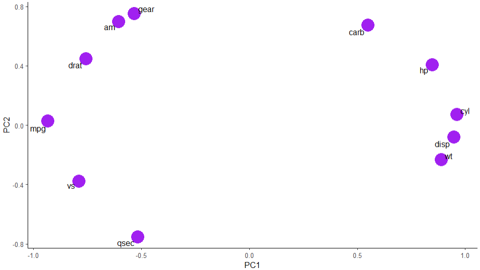
Amazing! Now we have a good idea of which variables are more correlated with each other. Miles Per Gallon, for example, is more related to number of gears, type of engine, type of transmission, drat. On the other hand, it is on the opposite side of HP and weight, what makes a lot of sense. Let's think for a minute: the more power a car has, the more gas it needs to burn. The same iss valid for weight. It is needed more power and more gas to move a heavier car, resulting in lower miles per gallon ratio.
Rotated Version
Ok, now that we looked through the PCA version without rotation, let's look at the rotated version with the default "varimax" rotation.
# Rotation Varimax
prin2 <- pca(mtcars, nfactors=2, rotate='varimax')

# Variance
prin2$Vaccounted
                            RC1       RC2
Proportion Var        0.4248262 0.4168891
Cumulative Var        0.4248262 0.8417153

# PCA Rotated
loadings2 <- as.data.frame(unclass(prin2$loadings))
loadings2 <- loadings2 %>% rownames_to_column('vars')

# Plot
ggplot(loadings2, aes(x = RC1, y = RC2, label = vars))+
  geom_point(color='tomato', size=8)+
  geom_text_repel() +
  theme_classic()
The same variance captured by 2 components (84%). But notice that the distribution of the variance now is more spread. Rotated Component RC1 [42%] and RC2 [41%]; against PC1 [60%] and PC2[24%] in the version without rotation. However, the variables keep in similar positions, but now rotated a little.

Communalities
The last comparison to make between both PCAs [with rotation | without rotation] is about the communalities. Communality will show how much of the variance was lost in each variable after we applied the Kaiser's rule and excluded some principal components from the analysis.
# Comparison of communalities
communalities <- as.data.frame(unclass(pca2$communality)) %>%
  rename(comm_no_rot = 1) %>%
  cbind(unclass(prin2$communality)) %>%
  rename(comm_varimax = 2)

     comm_no_rot comm_varimax
mpg    0.8692204    0.8692204
cyl    0.9290133    0.9290133
disp   0.9022852    0.9022852
hp     0.8839498    0.8839498
drat   0.7717880    0.7717880
wt     0.8458322    0.8458322
qsec   0.8346421    0.8346421
vs     0.7630788    0.7630788
am     0.8535166    0.8535166
gear   0.8495148    0.8495148
carb   0.7560270    0.7560270
As seen, the variances captured are the very same in both methods.
Great. But does it affect the Rankings? Let's check next.
Rankings
Once we ran the PCA transformation, to create rankings it is really simple. All we need to do is to collect the Proportion of variance of the components with pca2$Vaccounted[2,] and the pca$scores and multiply them. So, for each score in PC1, we multiply it by the correspondent proportion of variance for that PCA run. Finally, we'll add both scores to the original dataset mtcars.
### Rankings ####

#Prop. Variance Not rotated
variance <- pca2$Vaccounted[2,]

# Scores
factor_scores <- as.data.frame(pca2$scores)

# Rank
mtcars <- mtcars %>%
  mutate(score_no_rot = (factor_scores$PC1 * variance[1] +
                           factor_scores$PC2 * variance[2]))

#Prop. Variance Varimax
variance2 <- prin2$Vaccounted[2,]

# Scores Varimax
factor_scores2 <- as.data.frame(prin2$scores)

# Rank Varimax
mtcars <- mtcars %>%
  mutate(score_rot = (factor_scores2$RC1 * variance2[1] +
                        factor_scores2$RC2 * variance2[2]))

# Numbered Ranking
mtcars <- mtcars %>%
  mutate(rank1 = dense_rank(desc(score_no_rot)),
         rank2 = dense_rank(desc(score_rot)) )
The result is displayed next.

The top table is the TOP10 for the not rotated PCA. Observe how it's highlighting cars with low mpg, high hp, cyl, wt, disp, just like the loadings suggested.
The bottom table is the TOP10 for the varimax rotated PCA. Because the variances are more spread between the two components, we see some differences. As an example, the disp variable is not so uniform anymore. In the not rotated version, PC1 loadings was dominating that variable, with 94% correlation and almost not correlated in PC2. For the varimax, it is -73% in RC1 and 60% RC2, so a bit confusing, thus it shows high and low numbers despite of the ranking. The same can be said about mpg.
Ranking by Correlated Variables
After we did all of this analysis, we can also set better criteria for the ranking creation. In our case of study, we could say: we want the best mpg, drat and am manual transmission (1). We already know that these variables are correlated, so it's easier to use them combined for ranking.
# Use only MPG and drat, am

# PCA after Kaiser's rule applied: Keep eigenvalues > 1
pca3 <- pca(mtcars[,c(1,5,9)], nfactors=2, rotate='none')

#Prop. Variance Not rotated
variance3 <- pca3$Vaccounted[2,]

# Scores
factor_scores3 <- as.data.frame(pca3$scores)

# Rank
mtcars <- mtcars %>%
  mutate(score_ = (factor_scores3$PC1 * variance3[1] +
                           factor_scores3$PC2 * variance3[2])) %>%
  mutate(rank = dense_rank(desc(score_)) )
And the result.

Now the results make a lot of sense. Take the Honda Civic: it has high MPG, the highest drat in the dataset and am = 1. Now look at the cars ranked as 4 and 5. The Porsche has a lower mpg, but much higher drat. The Lotus is the opposite. Success!
Before You Go
This post has the intention to show you an introduction to Factor Analysis with PCA. We could see the power of the tool in this tutorial.
However, before performing the analysis, it is important to study the correlations of the variables and then set the criteria for ranking creation. It is also important to be aware that PCA is highly influenced by outliers. So if your data contains too many outliers, the ranks can get distorted. A solution to that is scaling the data (standardization).
If you liked this content, don't forget to follow my blog for more.
Find me on Linkedin as well.
Here is the Git Hub repo for this code.
Studying/R/Factor Analysis PCA at master · gurezende/Studying
Reference
FÁVERO, L.; BELFIORE, P. 2022. Manual de Análise de Dados. 1ed. LTC.
