Visualizing AI and Tech Hype Using Google Trends
Visualization Tutorials
Apprehension lingered in the air at the close of 2021 when Mark Zuckerberg gave us a glimpse into the ‘Metaverse‘ – a digital universe, accessible through virtual reality headsets, that aims to create a convincing sense of physical presence in lifelike virtual environments. As a consequence, in 2022, we witnessed a resurgence of interest in virtual reality, sparking both excitement and existential dread.

While the metaverse stirred interest in 2022, it was not the only transformative force at play; the explosion of generative AI had swiftly altered the collective focus.
In Metaverse and Generative AI: Envisioning the Future of Human-Computer Interaction, Ian Hughes and Sudeep Kesh explain,
"2022 and 2023 have been particularly eventful years in certain branches of artificial intelligence. While much of AI and machine learning […] has been hidden away from broad public attention up to now, the general online population has suddenly been able to engage with large language models (LLMs) via interfaces such as OpenAI's ChatGPT and Google's Bard. […] This development was accompanied by the rise of generative AI for images, with the likes of DALL-E and Midjourney leading the pack. […] Some search engines have started to implement this technology. […] Like the metaverse, generative AI has the potential to affect every interaction we have with digital content and with one another."
These last few years have been a testament to the remarkable speed at which the tech landscape evolves and trends transform. Amidst the constant chatter, we naturally develop an intuitive sense of trend fluctuations. However, this growing intuition often sparks a demand for a more objective and qualitative understanding of these shifts.
Fortunately, we have access to the data and software that allow us to quantify and visualize the rise and fall of interest in trending topics. In this article, I'd like to introduce two tools that, when used together, can help us capture public interest through web searches: Google Trends and the Slopegraph.
What is Google Trends?

Google Trends is a tool that highlights what people are curious about and searching for. It's commonly used for market research and content planning since it enables users to take a glance at the shifts in public interest and online search behavior.

In the screenshot above, you can see that Google Trends provides an "Interest Over Time" score that represents the relative popularity or search interest for a specific term over a specified period and region. The score is normalized and scaled, with 100 representing the peak popularity of the term.
This means this metric provides relative data, not absolute search volumes. The scores are relative to the highest point in the time series, and the actual search volumes or the number of searches for the term are not disclosed. Additionally, Google Trends allows you to compare the search interest of multiple terms within the same chart, making it easier to see how their popularity compares over time.
What is a slopegraph?
A slopegraph is an effective visualization tool for comparing changes in rankings between categories over two points in time. It not only shows how categories rank against each other in each period but also how those rankings have changed between the two periods.

Initial Rankings – The vertical position of each point on the left side of the slope graph represents the initial ranking of a category in the first period.
Final Rankings – The vertical position of the same data point on the right side represents the final ranking of the category in the second period.
Lines – The lines connecting these points show the change in rankings. The slope of the line indicates whether a category or item has moved up or down in rank, and the steepness of the slope reflects the degree of change.
By examining the slope and direction of the lines, we can quickly identify which categories or items have changed in their rankings and what direction (e.g., improved or declined). This makes slopegraphs valuable for conveying how the relative positions of categories or items have evolved.
Using Color to Emphasize a Notable Shift
Moreover, you can use color to highlight specific slopes, thereby emphasizing particular changes or trends. For example, you might use a bold color (e.g. purple) to highlight a category that experienced a significant improvement in rank.

At last, onto the tutorial…
Visualizing AI / Tech Trends Application
Pull the Data from Google Trends
The first thing you'll do is click the + Compare button and add all of the terms you're interested in comparing.

In the screenshot below, I've added the following terms: Generative AI, Virtual Reality, AI Ethics, Computer Vision, and NLP.

Next, select the time range you're interested in for the analysis.


Lastly, export the data using the download icon, highlighted in blue.

Preprocess the Data for Visualization
1. Load the data
df = pd.read_csv('data.csv', skiprows=1)
2. Preprocess the Data
# Rename columns
df.columns = ['week',
              'generative_ai',
              'virtual_reality',
              'ai_ethics',
              'computer_vision',
              'nlp']

# Replace `<1` values with `1`
df = df.replace('<1', 1)

# Set index to the week
df = df.set_index('week')

# Change all data types to 'int'
df = df.astype(int)

# Extract Month and Year Columns
df['month'] = df.index.astype('datetime64[ns]').month
df['year'] = df.index.astype('datetime64[ns]').year.astype(str)

# Filter to use only data in the last 4 months of the year
df_end_year = df[df['month'].isin([9, 10, 11, 12])]

# Group by year and take the average interest score
df_average_interest = df_end_year.groupby('year').mean().round(1)

# Drop the month column
df_average_interest = df_average_interest.drop(columns='month')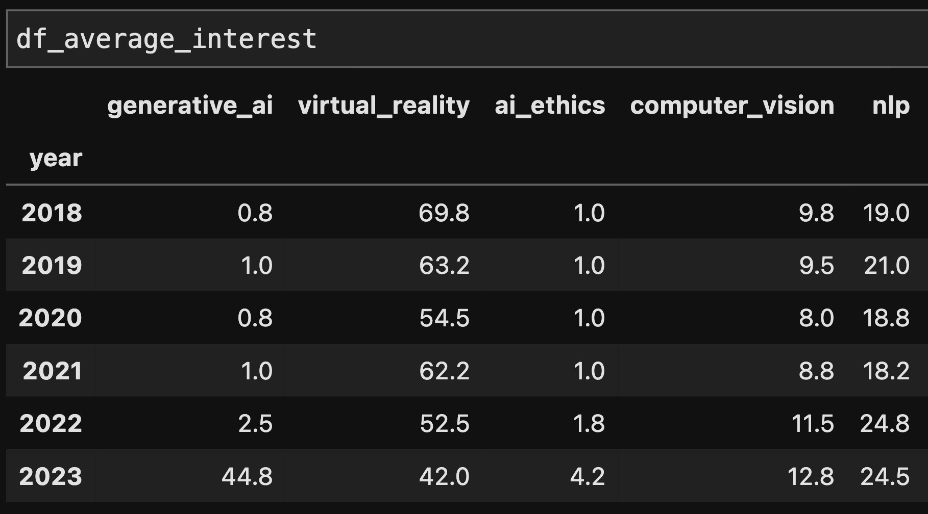
# Change all values into integers and tranpose the dataframe
df_combined = df_average_interest.astype(int).T.reset_index()

# Rename the 'index' column to 'category'
df_combined = df_combined.rename(columns={'index': 'category'})

# Filter dataframe to only the years of interest
year1 = '2022'
year2 = '2023'
df_final = df_combined[['category', year1, year2]].copy()

def percent_change(new, old):
    return (100 * ((new - old)/old)).astype(int)

# Calculate the interest change between the two years and the % change
df_final['change'] = df_final[year2] - df_final[year1]
df_final['percent_change'] = percent_change(df_final[year2], df_final[year1])

# Sort the DataFrame by the absolute change for better visualization
df_final = df_final.sort_values(by='change', ascending=False)
3. Create the Slopegraph
# Create a dictionary to map categories to colors
dict_colors = {
    'generative_ai': 'seagreen',
    'ai_ethics': 'grey',
    'computer_vision': 'grey',
    'nlp': 'grey',
    'virtual_reality': 'purple'
}

# Set the figure size
plt.figure(figsize=(5, 7))

# Create a slopegraph by plotting lines between 2022 and 2023 values
for index, row in df_final.iterrows():

    # set color
    color = dict_colors[row['category']]

    # Set the label color and pct change labels to match the line color
    plt.text(-.03,
             row[year1],
             str(row[year1]),
             ha='right',
             va='center',
             color=color,
             fontsize=12)
    plt.text(1.03,
             row[year2],
             str(row[year2]),
             ha='left',
             va='center',
             color=color,
             fontsize=12)
    plt.text(1.2,
             row[year2],
             f'{row["percent_change"]:.0f}%',
             ha='center',
             va='center',
             color=color,
             fontsize=12)
    plt.text(-.12,
             row[year1],
             row['category'],
             ha='right',
             va='center',
             fontsize=12,
             color=color)

    # plot lineplot for each category
    x_values = [0, 1]
    y_values = [row[year1], row[year2]]
    plt.plot(x_values, y_values, marker='o', color=color)

# Set x and y ticks
plt.yticks([])
plt.xticks([0, 1], ['2022', '2023'])

# Remove spines
for spine in plt.gca().spines.values():
    spine.set_visible(False)

# Add vertical light grey lines at x-values 0 and 1
plt.axvline(x=0, color='lightgrey', linestyle='--', alpha=0.6)
plt.axvline(x=1, color='lightgrey', linestyle='--', alpha=0.6)

# Set title
plt.text(x=-.45,
         y=58,
         s='AI / Tech Trends Interest Change',
         ha='left',
         va='center',
         color='black',
         fontsize=30)

# Show plot
plt.show()
In the visualization below, I've repositioned the title upward and introduced subtitles to enhance the efficacy of the visualization narrative. Subtitles provide context, steer interpretation, and contribute to the overall narrative flow, making the data more accessible and engaging for a broader audience while enhancing the visual aesthetics of the graph.

Slopegraph Analysis
Rise of Generative AI
Generative AI is a subfield of Artificial Intelligence that contains algorithms that can create original outputs based on the underlying learned patterns and structures within the data. The 2100% surge in generative AI interest followed the late 2022 launch of OpenAI's ChatGPT, a publicly accessible chatbot distinguished for its advanced language generation capabilities.
The heightened interest in generative AI is reinforced by the positive feedback from influential tech leaders. Elon Musk hails it as "the most powerful tool for creativity that has ever been created". Bill Gates envisions it transforming the world in unimaginable ways, from everyday conveniences to solving major global issues. He claims, "Generative AI has the potential to change the world in ways that we can't even imagine. It has the power to create new ideas, products, and services that will make our lives easier, more productive, and more creative. It also has the potential to solve some of the world's biggest problems, such as climate change, poverty, and disease."
Multifaced Digital Era
In contrast, virtual reality (VR) saw a 19% decrease in interest yet still maintains a strong relative position in public interest within the tech sector. Its ability to create immersive environments continues to revolutionize fields such as gaming, education, and medical training. As we witness the ascent of generative AI, VR's immersive capabilities continue to hold transformative promise, offering unique experiences that other technologies cannot replicate. Between VR's established presence and the emerging dominance of generative AI, we can look forward to (or nervously anticipate) a multifaceted digital era.
An Overview of the Slopegraph
Suitability and Strengths
Slopegraphs are ideal for visualizing change over time in multiple data series. They excel in situations where you want to emphasize overall trends, such as a particular series rising or falling significantly, rather than focusing on the variations in each period. This approach reduces visual clutter common in line graphs with fluctuating values.
Limitations of Slopegraphs
- Excludes Mid-Period Data: One key limitation of slopegraphs is their focus on the start and end points, ignoring mid-period data. This can be problematic if the omitted data is crucial for context. In such cases, a line chart might be a better choice.
- Inappropriate for Unconnected Categorical Data: Slopegraphs are less effective for categorical data without intrinsic connections. When used inappropriately, they can result in a confusing, spaghetti-like visual.
- Emphasis on Relative Change: Slopegraphs highlight relative changes or comparative rates across series, not absolute values. For precise quantification (e.g., exact sales growth percentages), bar charts are preferable.
Final Remarks
I hope this article has been both an informative and empowering guide through the nuances of using slopegraphs effectively.
If you're looking for some ideas to jazz up your next project, I highly recommend perusing Storytelling with Data's June SWDChallenge Recap on Slopegraphs. This resource contains a diverse portfolio of slopegraphs created by Data Visualization enthusiasts from around the world.
Storytelling with Data
For those unfamiliar, the Storytelling with Data community is a hub for data visualization enthusiasts who share and learn from each other's work. Each month, they host a challenge that encourages participants to explore and display data in creative and insightful ways. In the slopegraph challenge, the "#BREAKTHESTIGMA" entry stood out most to me, highlighting the alarming rise in self-harm incidents in the Philippines between 2014 and 2015. This submission illustrates how data storytelling can be a powerful catalyst for promoting dialogue on critical social and mental health issues.
I hope this article and the portfolio of slopegraphs inspire you to create your own! If so, please do reach out and I'd love to hear about it either here, through LinkedIn, or at [email protected].
